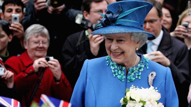
Bright, bold and beautiful -- the Queen has never shied away from strong colors and daring hats.
STORY HIGHLIGHTS
- Famed for her unique hats and bold colors, the queen has a trademark fashion style
- For years her clothes were made by British designer Hardy Amies, now couturier Stewart Parvin makes her eye-catching outfits
- Designers are given royal warrants to become dressers to the queen and it is no easy feat getting one
London, England (CNN) -- Her outfits don't send royal fashion watchers into a frenzy like those of the Duchess of Cambridge or Princess Diana before her, but Queen Elizabeth II has developed a signature style that has withstood the test of time.
Her attire over the last 60 years has reflected the sovereign as a British symbol of refined, regal elegance. The looks she has worn have steadily evolved into her trademark -- monochromatic color with matching coat and hat.
Not one to wear sombre, muted hues like black or beige, the queen has always had a preference for vivid blues, intense greens and dazzling purples in a variety of dramatic shades.
Over the past six decades, Her Majesty has employed the talents of several British designers.
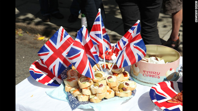
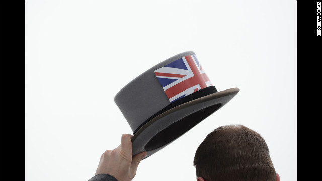
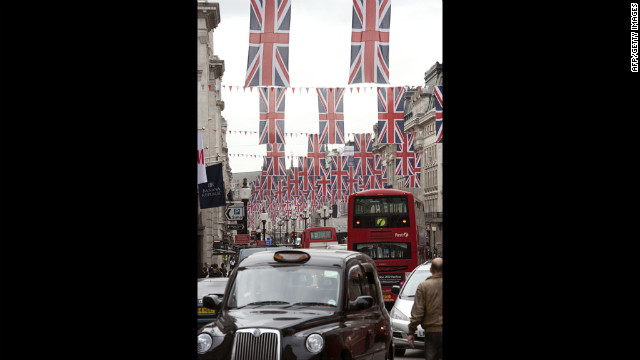
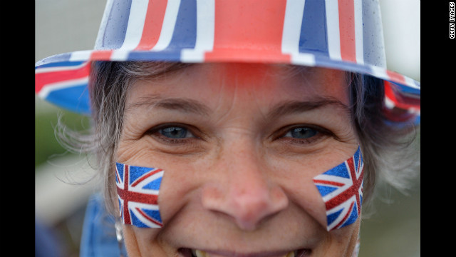
Union Jacks everywhere
Union Jacks everywhere
Union Jacks everywhere
Union Jacks everywhere
Union Jacks everywhere
Union Jacks everywhere
Union Jacks everywhere
Union Jacks everywhere
Union Jacks everywhere
Union Jacks everywhere
Union Jacks everywhere
Union Jacks everywhere
Union Jacks everywhere
Union Jacks everywhere
Union Jacks everywhere
Union Jacks everywhere
Union Jacks everywhere
Union Jacks everywhere
Union Jacks everywhere
Union Jacks everywhere
Union Jacks everywhere
HIDE CAPTION
One of her first designers was Norman Hartnell, who worked for her in the 1940s and created many of the full-skirted evening silk dresses she wore to various events as a glamorous young princess.
As a newly crowned queen in the early 1950s, she chose Savile Row tailor Hardy Amies to create elegant evening gowns for her waspish 23-inch (58cm) waist. He was granted the coveted
Royal Warrant in 1955. Amies once famously declared: "I do not dress the queen. The queen dresses herself. We supply her with her clothes -- there is a difference."
Two decades later the queen chose a young designer, Ian Thomas, to soften her look with "flowing chiffon dresses," according to the
British Monarchy website.
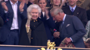
 Queen marks diamond jubilee
Couture designer Karl-Ludwig Rehse started making outfits for Her Majesty in 1988 and the queen still wears his designs. He also dressed the late Queen Mother and describes the queen's clothes as a work uniform.
He told CNN: "They have to be comfortable in as much as when the queen puts on the clothes she wants to forget about them.
"You have to take into account the different countries and the different climates in which they'll be worn. The queen always makes sure that she follows the tradition."
While most people would be hard pressed to imagine what they will be wearing the next day, the queen's wardrobe is planned out months in advance, says Rehse.
"It's not the case that the queen is going somewhere next week and thinks 'What am I going to wear?' Sometimes it is six months, 12 months or longer."
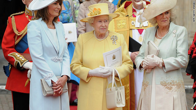
Her Majesty, wearing a design by senior dresser and personal assistant, Angela Kelly, stands with the Duchess of Cornwall, Camilla and mother of the bride, Carole Middleton on William and Kate's wedding day in April 2011.
AFP/GETTY IMAGES
A very VIP patron
One person who is currently in the queen's fashion inner circle is
couturier and wedding dress designer Stewart Parvin. He first started making royal outfits in 2000 and recalls the secretive selection process that took place before he started working for the queen.
She has a very informed opinion and she knows when it's right and she knows when it's wrong.
Stewart Parvin, royal designer
"At first I wasn't told who it was for," Parvin told CNN.
"It was, 'Could you design for someone who is a really prominent person in the public eye and wants a very chic image?' I thought it was going to be a politician or a tycoon's wife. I put together a packet of sketches but it wasn't until they were chosen I knew who they were for."
"She is someone who is very interested in her clothes. She always has an opinion on it and she has a very informed opinion and she knows when it's right and she knows when it's wrong," said Parvin, who designs two couture collections a year and was in 2007 awarded the Royal Warrant -- given to designers who have worked with the queen for five years or more.
An ensemble fit for a queen
Both Parvin and Rehse told CNN the queen is very involved in the design process, culminating with fittings at Buckingham Palace.
Queen Elizabeth II leaves the BBC Broadcasting House, London in 2006 wearing her trademark ensemble of monochromatic color and matching coat and hat.
AFP/GETTY IMAGES
"Sometimes I choose the fabric and then propose ideas for them, as I would do for any client," said Parvin. "I put together a scheme, maybe four designs for one fabric combination, then she would look at them and either choose a design straight away or suggest some changes."
I put together a scheme... She would look at them and either choose a design straight away or suggest some changes."
Stewart Parvin, royal designer
Rehse says the queen asks him to come up with two or three different alternatives for a particular fabric she likes before settling on a final design.
"I do get a lot of input from the queen," said Rehse. "The pressure is there but I take great joy out of it and it's very rewarding to see Her Majesty wearing my clothes in public."
In addition to warrant-holding royal designers, Her Majesty also has a senior dresser and personal assistant, Angela Kelly.
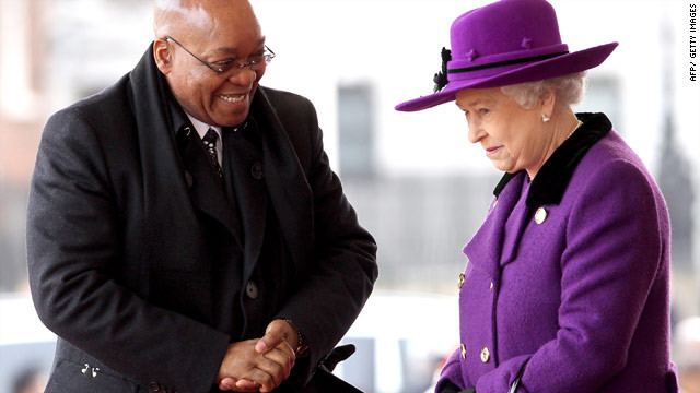
Queen Elizabeth II tends to break sartorial rules choosing to wear vibrant colors like bright purple during the March 2010 state visit by South African President Jacob Zuma.
AFP/GETTY IMAGES
The daughter of a Liverpool dockworker, dressmaker Kelly originally joined the royal household as a maid before working her way up to her current position. She established the first ever in-house couturier and has gone on to design outfits for some of the most enviable royal events including last
year's wedding of Prince William to Kate Middleton.
Known to have a close relationship with the queen, it has been noted by some royal observers that Kelly has slipped into the vacancies left by the deaths of the
queen's sister and mother. Kelly and her team use old and new fabrics when designing for the queen using material given to her from when she was a princess, according to the Buckingham Palace website.
The queen is very involved in the design process according to royal designers Parvin and Rehse who spoke to CNN. Parvin says: "She knows when it's right and she knows when it's wrong."
GETTY IMAGES
Hats off to Her Majesty!
Milliner Philip Somerville received a royal warrant following 12 years working for the queen. Now, when the queen steps out she's usually wearing a Somerville creation.
"You have to realize that you are never sure when Her Majesty will wear (a particular hat)," he said. "It depends on the weather on many occasions. You are also creating something that has to be very wearable and must be in colors that suit her. She must be noticed in a crowd."
After 33 years in the business, Somerville stepped down as the queen's hatter handing the business over to Dillon Wallwork.
"I've been here for some time now and we've always had a Philip Somerville look which is very clean, understated and elegant," said Wallwork.
Creating a hat fit for a queen is not without its pressures, Wallwork says.
"You know you are under a certain pressure because of the press and what people are going to say," he said. "You know she is going to be looked at. There are certain styles that you can and can't do but within those limits there's lots that you can do. It's quite a challenge but the queen can be quite adventurous."
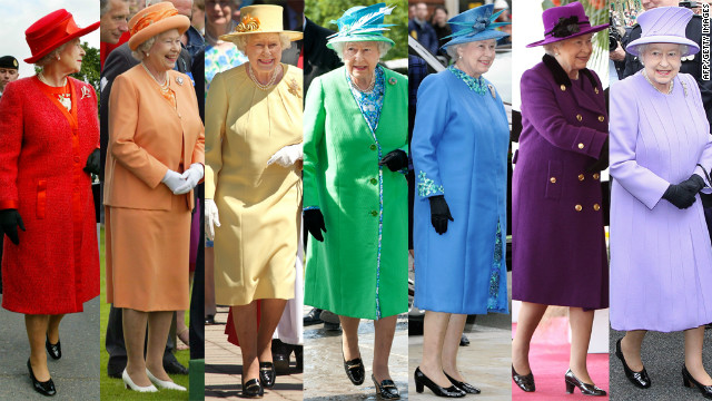
Of the 20 hats shown above, I would say the queen is a "Summer" in her coloring. The white hat washes her out and the pale pink with dark red lipstick is not one of my favorites. What do you think?


 Venus at her Mirror

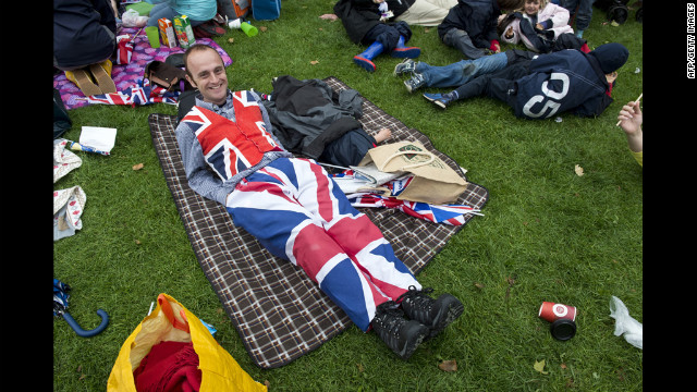
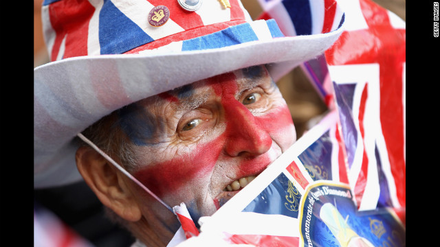 A man decked out in full Union Jack regailia celebrates the Diamond Jubilee.
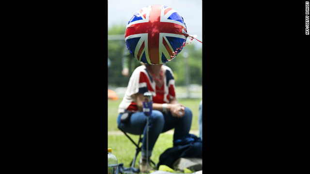 A Union Jack balloon floats in front of a woman wearing a Union Jack T-shirt as she waits for a giant picnic in Hyde Park.
 Two small dogs show their support of the Queen.
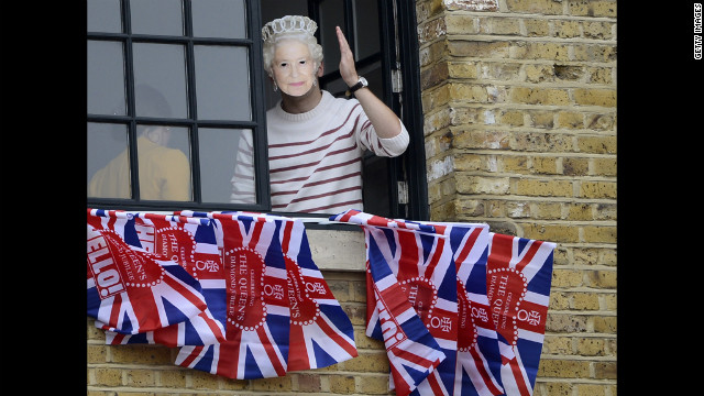 A woman wearing a mask of Queen Elizabeth II waves from a window near Tower Bridge.
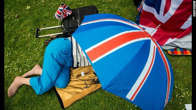 A woman takes refuge under a Union Jack umbrella in St Jame's Park.
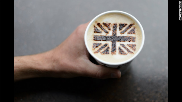 A coffee shop created a chocolate Union Jack to top this cappuccino.
 A man watches the River Pageant projected on a screen in Battersea Park.
 A boy waits for the start of the Queen's Diamond Jubilee Concert at Buckingham Palace.
 A man poses on the Mall outside Buckingham Palace.
 Residents of Horringord Road celebrate the Diamond Jubilee.
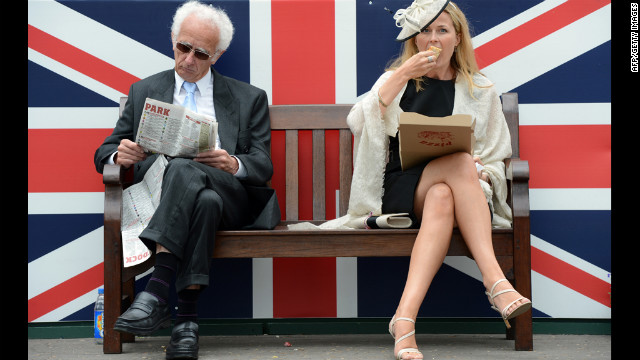
 A racegoer attends Derby Day, the second day of the Epsom Derby horse racing festival.
 Union Jacks line a street in preparation for the Diamon Jubilee.
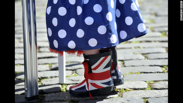 A small girl wears Union Jack boots and a skirt in Britain's colors during a street party.
 Two racegoiers sit in front of a Union Jack during Derby Day.
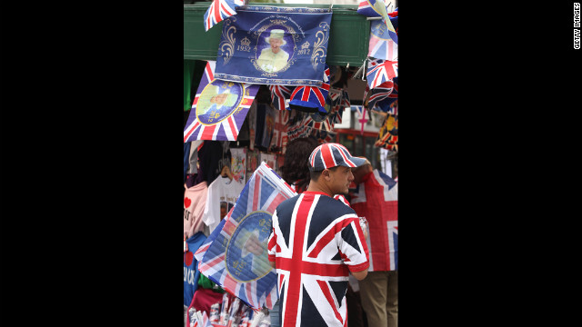 A vendor sells Union Jack and Diamond Jubilee memoribilia.
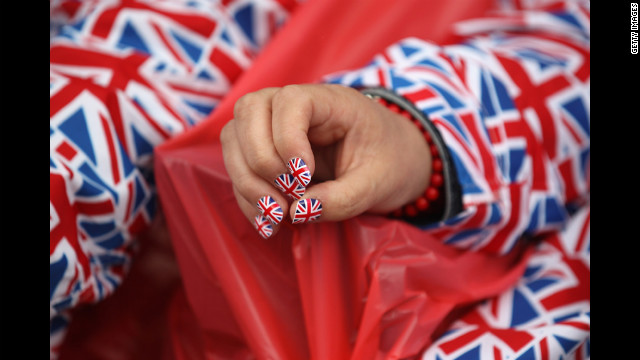 A woman with Union Jack painted nails waits for The Diamond Jubilee Concert to start.
 A woman watches the River Pageant from the Westminster Bridge.
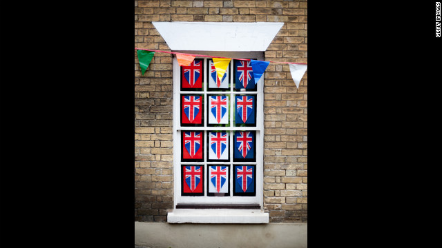 A window decorated in celebration of the Diamond Jubilee.
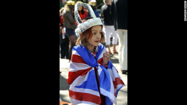 A young girl wearing a crown is wrapped in a Union flag during a street party to celebrate the Queen's Diamond Jubilee in Edinburgh.
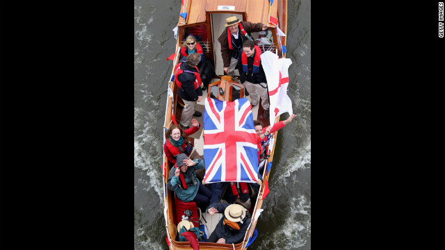 Revellers enjoy the River Pageant on the River Thames.
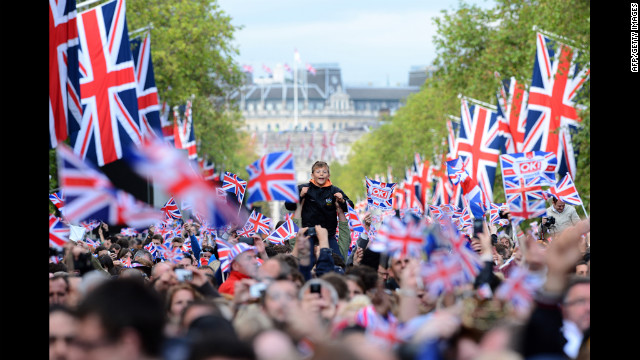
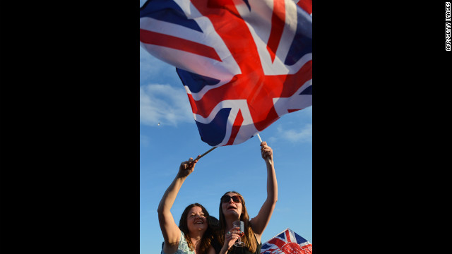 Spectators wave Britain's Union flag in London's Hyde Park as they watch the Diamond Jubilee Concert.