Wednesday, August 26, 2015

Marsala-The Color of the Year 2015 and a wine with a history


Shall we cook with Marsala, or drink it? Why not both? 
Marsala was named “Color of the Year” by Pantone in 2015. The burgundy-color intrigued me enough to lead me to investigate its history. The abbreviated version from About.com follows:

Marsala wine is Italy's most famous version of fortified wine, hailing from Italy’s sunny southern region, Marsala is an ancient city on the coast of Sicily. Like its other fortified cousins, Port, Sherry and Madeira, Marsala is a higher alcohol fortified wine (usually around 17- 20%) that is available in both sweet or dry variations. While Marsala wine is often recognized more for its use in various cooking and culinary combinations than its sipping status, this has not always been the case.
The History of Marsala Wine:
During the early 1800s, England had a significant military contingent established in Marsala in response to Napolean and the French occupation of Italy. Consequently, as the British discovered the regional wine and wanted to ship it back to the homeland they employed the same strategy that they discovered for making Port in Portugal. This strategy basically consisted of adding a little grape brandy to the local still wine and voila you have a fortified wine that can endure the arduous adventure of ocean shipping without becoming unpalatable gut-rot in the process.
And, if you curious about how Marsala Wine is made, read on:
Marsala is crafted from local, indigenous white grapes – like Catarratto, Grillo (the most sought after grape for Marsala production) or the highly aromatic Inzolia grape. The ruby-colored Marsalas hail from any combination of three local red grape varietals. The fermentation of Marsala is halted by the addition of a grape brandy when the residual sugar content reaches the pre-determined levels according to the sweet/dry style the maker is shooting for. Similar to the solera system of blending various vintages of Sherry, Marsala often goes through a perpetuum system, where a series of vintage blending takes place.
How Marsala Wine is Classified:
Marsala is generally classified according to its color, agealcohol content and sweetness/style.
Marsala Color Classifications:
·  Ambra (Amber colored) – made with white grapes.
·  Oro (Gold hues) – made with white grapes.
·  Rubino (Ruby colored) – made with red grapes, like Pignatello or Nerello Mascalese. (The Pantone color is based on this one! BBL)

·        Marsala Age Classifications
·        Marsala Fine – designates a Marsala wine that is aged for a minimum of one year. This is a typical cooking wine classification.
·        Marsala Superiore – refers to a Marsala wine that has spent up to three years in oak, but has a baseline minimum of two years in wood.
·        Marsala Superiore Riserva – has a minimum requirement of four years in oak and some producers will give it up to six years. This really starts the Marsala tier that you would look for to use as either an aperitif or dessert foritified wine option.
·        Marsala Vergine – has a minimum aging requirement of five years and may go up to seven years in oak.
·        Marsala Vergine Soleras – as the name implies is a Marsala blend of multiple vintages, with a minimum of five years of aging.
·        Marsala Stravecchio – aged a minimum of 10 years in oak.
·        Marsala Alcohol Content
The lowest aging classifications typically has the lowest alcohol content. For example, Marsala Fine is typically around 17% abv and the Superiore Riserva designation starts the alcohol content of 18%+ abv.
·        Marsala Sweet/Dry Style Designations: 
Like other wine sweet/dry designations, Marsala shares the terms: Dolce (sweet – typically denotes a residual sugar content of 100+ grams of sugar per liter), Semi Secco (semi-sweet/demi-sec – typically between 50-100 grams of sugar per liter) and Secco (dry – has a res. sugar content under the 40 grams per liter cut off). While Marsala is still known and loved as a cooking wine, in recent years the Italian wine designations have improved for this historic wine and as a result Marsala has been gaining quality ground and catching glimpses of its former glory in the form of both an acclaimed aperitif and dessert wine.
Marsala Food Pairings:
Smoked meats, walnuts, almonds, assorted olives and soft goat cheese are good options for a dry (secco) Marsala. Opt for chocolate-based desserts and Roquefort cheese for a sweeter Marsala wine pairing.

·        Marsala Producers to Try: (Recommended by wine experts)
Florio, Lombardo, Marco De Bartoli, and Pelligrino
My friends, I'm including a delicious recipe for
Chicken Marsala-Siciliano

Put thawed chicken breasts in a large ziploc bag and pound chicken into thinner portions with a mallet or rolling pin. Next, crush the croutons in another ziploc bag until they are fairly fine. Melt a half cup of butter in a saucepan with the crushed garlic clove. Then, dredge the chicken through the butter and place in the ziploc bag with the crushed croutons to thoroughly coat the chicken. Place the crouton crusted chicken into a shallow baking dish. Melt a little more butter and add a touch of olive oil to saute the mushrooms and add the sherry once the mushrooms get soft. Let it all simmer for another minute or so. Pour the sauteed mushroom mixture over the coated chicken breasts. Add salt and pepper and a dash of paprika if you like, and then bake for 40 minutes at 350 degrees. Top with fresh parsley.
Tip:
This dish is also EXCELLENT with chardonnay in place of Marsala or sherry if you prefer tangy over sweet sauce.

Wednesday, August 19, 2015

The Grey Trend

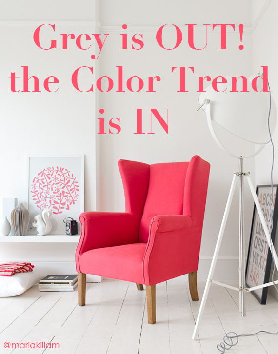
I'm going to stop calling it The Grey Trend and start calling it The Colour Trend instead.
Why? I want this discussion to be less about the colour grey itself, and more about the fact that there has always been and will always be a colour trend of some kind. And as long as there are trends, there will be people eager to be the first to declare them in or out.
The real scoop is that we're currently in the middle of a 10-year neutral trend cycle with grey. Before grey, we were all about brown, and before that, maybe you remember sage green. Many of us can even recall the forest green trend of the 80s.
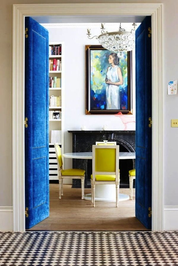
The reason grey is trendy right now is that it provides a crisp backdrop to the bold, clean and colourful hues we're all decorating with now. The media focuses on grey and whether it's in or out, but the real news is that bright and happy colour is here to stay. Those happy colours need grey as a backdrop because the beiges we were using as part of the brown trend generally die when combined with clean colours. Pale beiges are allowed, but the darker ones mostly look dirty.

GET MORE MILEAGE OUT OF GREY


Used as a neutral backdrop, grey will be on trend for a long time yet. (Exactly how long depends on where you live.)
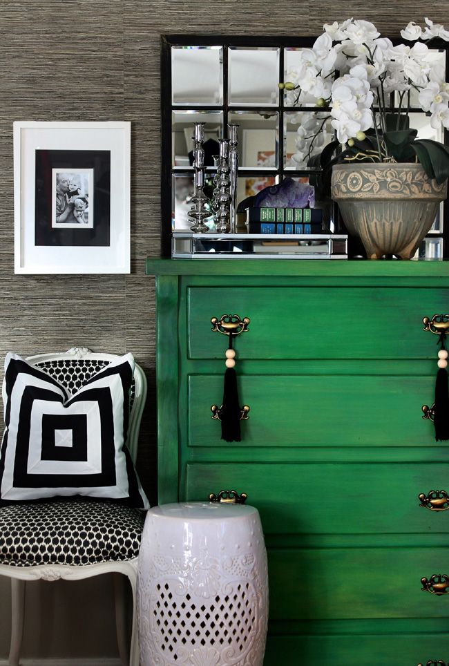
Use grey to decorate your space from top to bottom, though, and it'll not only be trying too hard to be trendy, it'll also be just bad. Grey by itself is debilitating; it works best when used as a crisp backdrop for colour.
One of my lovely readers recently posted this comment:
"I went to my dentist and was horrified to see that they had re-done the office in dark gray on gray on gray! No color whatsoever, but a gray plaid fabric on some of the walls, and a frenetic-patterned gray carpet.
When I talked with the dentist about it, she commented that they had used an interior designer, and that gray was on trend. It made my heart sink, and I sometimes get discouraged when I hear stuff like this. How much longer do you think the gray trend is going to last?"
If you walk into a room and the first thing you notice is GREY, that's a room decorated entirely in a trendy neutral. It's too much, and will date very quickly.
The same goes for brown. One year ago, a restaurant in our neighbourhood was purchased and re-painted by the new owners. They painted all the wainscotting and the ceiling a dark, oppressive brown. The colour was obviously chosen by someone who had no idea where the trends are and mostly no idea how to work with brown so that it would at least be attractive. The last time I had breakfast there, I vowed never to return. The atmosphere is so bad! Their food quality has gone down because their customers are dwindling, and my prediction is that they'll get through summer with the tourists and then it'll be over after that.
Whatever colour you're using, you need to know what you're doing and why.
Every single decade has its own trendy neutral that most people will use as the foundation neutral for tile, countertops, millwork, etc. Some think brown is still that trendy neutral. If a consumer has been coveting the look of rich brown cabinets and she finally has the money to renovate but doesn't realize brown is out, she will still install a brown kitchen without knowing that it will instantly look over 10 years old, and really, probably closer to 15.
But does that mean we shouldn't use brown at all anymore? No. Brown has always been the colour of dining room tables, consoles, end tables, and coffee tables, and there's no reason to throw all of that out. Lighter (instead of mid-tone dark) beiges will still work with the greys and brighter colours we're seeing everywhere today, but if your home is filled top to bottom with matching espresso brown furniture, or if you're using exclusively distressed, grey-washed wood furniture, that's trendy.

Grey is OUT! The Colour Trend is IN | Maria Killam

HOW TO USE THE COLOUR TREND IN YOUR HOME


Most likely, your home has some brown in it, and maybe some of the trendy neutrals from previous decades, too. And now you want to introduce grey without going overboard.
You don't have to change everything just to be able to use grey, but you DO have to understand how clean and dirty colours work together before you do anything drastic. Grey dies when paired with dull, earthy, muddy colours. You can't suddenly paint your walls charcoal if you have a sage green sofa from the 90s, and you shouldn't buy a charcoal sofa if your carpet is a muted 80s blue. You can't just throw some grey in any room and expect it to look instantly transformed.
What you can do is find a fabric or an area rug that will introduce some fresh colour while still relating to your old colours.
I have curated tons of different colours on my Etsy boards, and I have one board full of pillows with earthy colours that'll also bring in some brights. Start there when creating a new inspiration center for your house. If grey fits in somewhere, you'll know when you find the pillow (or area rug) that brings in the new and the old.
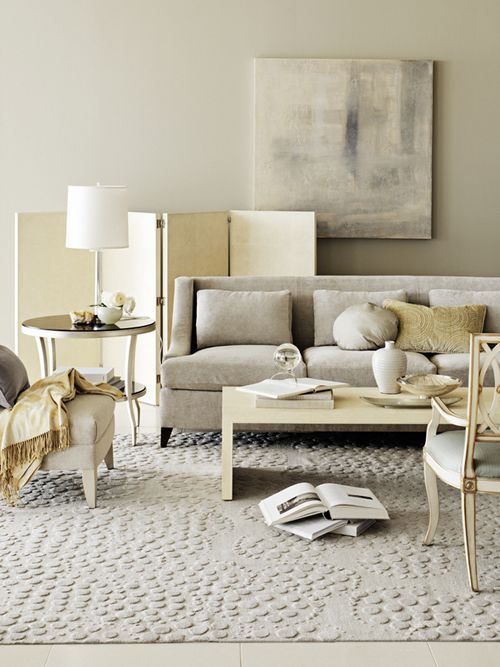
To make it even more confusing, can you deliberately mix beige and grey?
Yes. Here's proof:
Grey is OUT! The Colour Trend is IN | Maria KillamMy favourite image of grey + beige {Barbara Barry}
When you already have earth tones and you want to introduce grey, you'd better know what you're doing. When you already have beige and you want to add some clean and bright colours, you can't do it without some serious advance planning. But you CAN do it.
- See more at: http://www.mariakillam.com/greyisout/?inf_contact_key=304c1cd3f7a91a14976b0e423af072b4ec74271daca505493319298cbc0a3603#sthash.h4LA825c.dpuf

Maria Killam is a vibrant Canadian decorator whose website and newsletter are always informative. Grey is a neutral that can be dead-looking without color. Think of blighted trees, they look dead because of their lack of color! I noticed loads of Oak Wilt casualties along the highways and decided grey connotes death! 

Wednesday, August 12, 2015

Color Change for Survival

Changeable Charlie Chameleons have a reason for their unique color shows:


Chameleons rapidly change color by actively tuning photonic crystal-like structures in their skin, finds new research.
The study, published in the journal Nature Communications, reveals that -- unlike other creatures that rely on the accumulation or dispersion of pigments -- chameleon color shifts happen due to structural changes that affect how their skin reflects light.
Usually chameleons like to blend in with their surroundings, but threats or the possibility of mating will cause males to put on their bolder color display.
"Only mature males can change color, and they do so when they see another mature male or a potentially receptive female," senior author Michel Milinkovitch told Discovery News.
"The very visible colors impress the other male (to chase him away) or the female (to attract her)," Milinkovitch, a professor in the Department of Genetics & Evolution at the University of Geneva, said.


Wednesday, August 5, 2015

If it's shiny and in color, will it sell better?

Dear readers, one of my purposes for 
composing my blog is to enlighten myself
 and others about the tricks that can be
 played on us/consumers by marketers.
 I found the following information helpful 
and pass it on to you. "Buyer beware" is  
my motto!

When it comes to buying things, our brains can't see the big, black-and-white forest for all the tiny, colorful trees, according to marketing  scholars at  Ohio State University, who say that people who were shown product images in color were more likely to focus on small product details--even superfluous ones--instead of practical concerns such as cost and functionality.
The findings in the Journal of Consumer Research mesh well with science, they believe, namely in how vision evolved in the brain. They suggest that viewing objects in black and white helps our brains focus on what's most important. 
Marketing academics at  Ohio State University say the answer depends on whether you see them in color or black and white. Credit: The Ohio State University
"Color images help us notice details," said co-author Xiaoyan Deng, an assistant professor of marketing at Ohio State. "But black-and-white images let us see the 'big picture' without getting bogged down by those details."
The findings also suggest how marketers can strategically use color--or its absence--to change how we feel about a product.
"Marketers may take it for granted that color is always the best presentation format for advertising," Deng added. "This study shows that while color is desirable in most situations, it's not desirable in all situations."
If a product has broad features that set it apart from the competition, then black-and-white images will help customers cast aside minor details and focus on those key features, the researchers found. If a product's details are what set it apart, color images will make those details stand out.
In one part of the study, 94 college students were asked to imagine that they were traveling to a remote campsite where they could receive only one radio station. There, the campsite manager offered two radios for rent: a basic analog radio for $10 a day, or a fancy digital radio with many station preset buttons for $18 a day. Not only was the digital radio more expensive, but its preset buttons would be useless at the campsite.
Students who saw pictures of the radios in black and white tended to make the practical choice--the analog radio. Only 25 percent chose the digital radio.
But among students who saw the radios in color, twice as many chose the digital radio. In that scenario, 50 percent of students were willing to pay a higher price for a radio with features that they could not use.
"Color drew their focus away from the more important features to the less important features, and their choice shifted to the more expensive radio," Deng said. "I think that's surprising--that just by manipulating whether the product presentation is in color or black and white, we can affect people's choice."
Color also proved to be a distraction when study participants were asked to sort objects into groups.
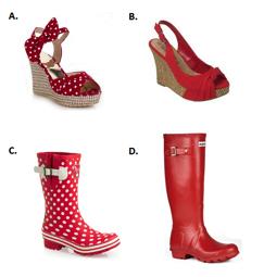
The 287 participants were shown pictures of shoes and asked to sort them. Each grouping contained two types of shoes that differed greatly in form and function, such as open-toe high heels and rain boots. In that particular example, half of the high heels and the boots were a solid red color, and the other half were red with white polka dots.
When people viewed the shoes in black and white, they sorted the high heels into one group and the rain boots into another 97 percent of the time. But when they saw the shoes in color, that number dropped to 89 percent, with 11 percent sorting the solid-color high heels and boots into one group and the polka-dot heels and boots into another.
The polka dots were clearly visible in black and white, but they had more impact on participants' decision-making when they were seen in color.
Study co-author Kentaro Fujita, associate professor of psychology at Ohio State, has an idea why. It has to do with the origin of our visual systems, and how our brains process night vision.
Of the light-sensitive rod and cone structures in the retina, it's the cones that detect color and the rods that give us night vision, peripheral vision and motion detection. Rods outnumber cones in the eye 20 to 1, and at night, when the cones don't receive enough light to let us distinguish colors properly, we rely on the rods to see what's happening around us--in black and white.
This would have been especially true for early humans, who didn't have sources of artificial light. At night, being able to tell the difference between objects by shape would have been key to survival.
"Our visual systems evolved to work in both optimal and sub-optimal conditions," Fujita explained. "Optimal conditions might be during the day, when I want to distinguish a red apple from a not-so-red apple. The form of the object tells me it's an apple, but I can focus on the color because that's what's important to me. Sub-optimal conditions might be at night, when I have to tell whether that object that's moving toward me is my friend or a hungry lion. Then the form of the object is critical."
He suspects that when our eyes see black-and-white images, our brains interpret them in ways similar to night vision: We focus on form and function, and tend to ignore details.
Deng pointed out another circumstance in which people "see" in black and white: when we imagine the distant future. Other studies have shown that people who are asked to think of an event from the near or distant future and then presented with a series of photographs tend to pick less colorful photos as most closely matching their vision.
"It's almost like seeing in black and white is a vehicle for time travel," she said. "When you need to visualize ambiguous, uncertain future events, you want to get away from all those details, to construct that future event in your mind in a meaningful way. Seeing in black and white allows you to construct that event."
Marketers can take advantage of our ability to time travel, too. Deng said that black-and-white images would probably work well in ads for products that will be used in the distant future, such as retirement plans, investments or insurance.
Co-authors on the paper included marketing doctoral student Hyojin Lee, who performed this research for her dissertation, and H. Rao Unnava, senior associate dean and W. Arthur Cullman Professor of Marketing in Ohio State's Fisher College of Business.