Wednesday, July 25, 2012

Be Aware, Be Very Aware

Ads coax us to buy things, so be alert to the colors used which subconsciously affect our sales resistance. The following article gives great examples of color use.

The Psychology of Color in Web Design


Web design needs to do several things at once. It must look good. It must make sure the navigation of the website is clear. It must hold an internet user’s attention for as long as possible. And it must gently lead the user down the conversion funnel, quietly urging the user to do whatever action the site owners have as the goal of the site.
Because web design needs to have an influence over people’s behaviour, more and more designers have been looking to the psychology of color to help them create websites. They can play on cultural references to suggest trust, urgency or mystery to the target audience.
Read on to find out which colors are associated with which feelings. Please note, cultural differences can also have a big impact on these details.

Red

Red is a stimulating, exciting color. It is associated with passion, power and sometimes anger. It can be used for warnings or to show danger, but it can also suggest strength, determination and boldness.
Warmer reds, like brick or maroon, and strong and comforting – good for sites that want to suggest the lasting qualities of a brick wall. Brighter reds, like true red or tomato, are great for youthful websites that want to suggest energy and eagerness to leap before they look.
The Psychology of Color in Web Design

Pink

Pink is associated very strongly with youthful femininity. It is playful and brings to mind bubble gum and innocence.
It is ideal for websites that hearken back to olden days or that target a particularly feminine audience.
The Psychology of Color in Web Design

Orange

Orange is a more balanced and less overwhelming colour than red. Vibrant, energetic, friendly and inviting, it is ideal for designs that need movement and energy.
Websites that want to showcase their creativity often choose orange because it is unique and exciting, but it still has the comfort of a warm color.
The Psychology of Color in Web Design

Yellow

Yellow is often considered the most energising color. From the earliest ages, people learn to associate yellow with the sun, so it becomes associated with warmth and happiness. That makes bright yellow perfect for sites designed for children, as it grabs their attention.
More subtle shades of yellow have more complex associations. Darker shades can suggest antiquity, suggesting yellowed parchment. Because of that, it can also be associated with wisdom and curiosity. It therefore is great for sites that want to demonstrate a sense of authority and intelligence.
The Psychology of Color in Web Design

Green

Green is strongly associated with plant leaves and subsequently has lots of positive associations. It can give users feelings of calm, rejuvenation, affluence and optimism.
Darker shades are more linked to money, so sites that want to suggest affluence, growth and stability often use those shades. Lighter shades are more associated with spring and growth, so websites that want to reflect relaxation, freshness and honesty often use lighter shades.
Green is also directly associated with the environmental movement, so sites that aim to broadcast ethical standards often use green.
The Psychology of Color in Web Design

Blue

Blue calls to mind dependability, trustworthiness and security. It is also calming and has an element of spirituality about it.
Most corporate and business websites use dark blues to call to mind their experience, success and reliability. Light blues are best for friendly, open websites, like social media sites.
The Psychology of Color in Web Design

Purple

Purple has long been associated with nobility, so it is no surprise that dark shades of purple imply wealth and luxury. Lighter shades suggest fields of lavender and are associated with spring and romance.
Websites that look mysterious yet elegant use dark purples. Those sites that opt for lighter shades will speak to people looking for romantic items or ideas.
The Psychology of Color in Web Design

Black, White, and Gray

Black, white and grey are usually background colors, allowing brighter colors to make the real impact. Still, they call to mind their own associations.
Black suggests power, modernity and sophistication, while white suggests cleanliness, simplicity and innocence. These competing associations play off of each other as nicely as the colors themselves do, making black and white designs especially strong.
Grey is a neutral color. When used well, it is associated with tradition, sombreness and calmness. When used badly, however, it can cause a design to lack energy.
All of these colors are best for websites that want to call to mind tradition and seriousness, like news sites.
The Psychology of Color in Web Design

Browns

Browns, which include creams and tans, are often used for textured backgrounds. Backgrounds that mimic paper, fabric or stone are usually brown, and as such, browns give a site a sense of wholesomeness and cosiness.
Creams are calm, elegant and pure, making them a great background color for a website that wants to imply a sense of tradition. Tans are conservative and bring to mind piety. They can be dull, but they can also be reassuring, which makes them ideal for a site that doesn’t want to be too bold or outrageous. Dark brown feels wholesome and reliable, like a loaf of bread. It is associated with warmth and comfort. Sites that want to demonstrate experience and reassurance often use brown.
The Psychology of Color in Web Design

Conclusion

Colors can create a very specific mood or impression on a website. If a site’s color gives the wrong impression, it can result in high bounce rates, as the site will suggest inexperience, unprofessionalism or even untrustworthiness. If the impression is the right one, it lets users know that the site is trustworthy and that it ‘gets’ its niche. Little wonder, then, that the psychology of color will remain a major concern for web designers.

About the Author:

This is a guest post contributed by Neeru from Print Express. Neeru works in marketing and design. She likes sharing her knowledge of web and graphic design.


Okay, now you know how color engineers your emotions. Do you have stories about how color knowledge works for you? If so, post below. I would like to hear how you are using color wisely.

Saturday, July 21, 2012

Red's Powerful Influence on Sales

Red is the color to use if you are listing items for sale on eBay. Be aware when you are the buyer at this auction site!

One of my goals for this blog is to help you use colors wisely, so this article is a public service announcement from me. Enjoy!

Study of the Day: Using Red on eBay Pages Results in Higher Bids

By Lindsay Abrams
 
Jul 18 2012, 8:40 AM ET

In online auctions, the spoils go to the sellers who can inspire aggressive bidding wars over their products. New research shows that they can use the color red to get their buyers' blood boiling.
2607371536_8cf52caa49_zmain.jpgshoplifter_too/FlickrPROBLEM: Research has already indicated that the color red induces aggression, and blue is commonly thought to have a calming effect. But can the strategic use of these colors influence the outcomes of online sales?
METHODOLOGY: For the first part of this study, the researchers put 28 Nintendo Wii's up for auction, with each sale differing only in background color (red and blue). Aggression was measured by how high bidders were willing to jump from the previous bid in making their new offer. This was then repeated, with similar results, in the lab. In the second part, they showed 89 people a vacation package set at a certain price, and then gave them one opportunity to make their best offer. Again, the background color of the postings varied between red and blue. In the third and largest part of the study, 512 participants were asked to imagine that they were attempting to purchase a Wii on eBay. A banner at the top of the web page was alternately red, blue, gray, or absent, and participants were assigned different scenarios. In one, they had to either enter a maximum bid for the Wii or decide to "buy it now" for a higher price. In another, they had to either "buy it now" or make their best offer to the seller. The remaining participants were only presented with the "buy it now" price. These participants' emotions were evaluated after the mock auctions.
RESULTS: The color red was demonstrated to increase levels of aggression in participants, and was positively associated with their willingness to pay more along with their overall likelihood to purchase the products. In other words, those shown the color red bid more and by higher increments in the first and third studies, and made lower offers in the second study.
CONCLUSION: When the competition is between potential buyers, as is the case in online auctions, sellers can use the color red to their advantage. The aggression it induces amps up the bidding war and thus the ultimate selling price. When the seller is negotiating with a buyer, however, a calming blue background is the way to go.
The full study, "The Effect of Red Background Color on Willingness-to-Pay: The Moderating Role of Selling Mechanism," will be published in the Journal of Consumer Research.


Remember that blue has a calming effect, so don't use that hue if you are seeking sales of items! However, if you want to shed pounds, blue plates dull one's appetite. It pays to be color-smart!

Wednesday, July 18, 2012

Making Accidental Colors

When mixing paint, one sometimes stumbles upon a "happy accident." The story of Prussian Blue's discovery is quite surprising.

Artist's Pigments: The Accidental Discovery of Prussian Blue Paint

How an attempt to make a red pigment, created Prussian blue instead.

By , About.com Guide
 
Prussian blue paint
Prussian blue paint
 
Any artist who enjoys using Prussian blue will find it hard to imagine that such a beautiful blue was actually the result of an experiment gone wrong. The discoverer of Prussian blue, the colormaker Diesbach, was in fact not trying to make a blue, but a red. The creation of Prussian blue, the first modern, synthetic color was completely accidental.
Diesbach, working in Berlin, was attempting to create cochineal red lake in his laboratory. ("Lake" was once a label for any dye-based pigment; "cochineal" was originally obtained by crushing the bodies of cochineal insects.) The ingredients he needed were iron sulphate and potash. In a move that'll bring a smile to any artist's who's ever tried to save money by buying cheap materials, he obtained some contaminated potash from the alchemist in whose laboratory he was working, Johann Konrad Dippel. The potash had been contaminated with animal oil and was due to be thrown out.
When Diesbach mixed the contaminated potash with the iron sulphate, instead of the strong red he was expecting, he got one that was very pale. He then attempted to concentrate it, but instead of a darker red he was expecting, he first got a purple, then a deep blue. He'd accidentally created the first synthetic blue pigment, Prussian blue.

Traditional Blues
It's hard to imagine now, given the range of stable, lightfast colors we can buy, that in the early eighteenth century artists didn't have an affordable or stable blue to use. Ultramarine, which is extracted from the stone lapis lazuli, was more expensive than vermilion and even gold. (In the Middle Ages, there was only one known source of lapis lazuli, which means simply 'blue stone'. This was Badakshan, in what is now Afghanistan. Other deposits have subsequently been found in Chile and Siberia). Indigo had a tendency to turn black, was not lightfast, and had a greenish tinge. Azurite turned green when mixed with water so couldn't be used for frescoes. Smalt was difficult to work with and had a tendency to fade. And not enough was yet known about the chemical properties of copper to consistently create a blue instead of a green (it's now know that the result depends on the temperature it was made at).

The Chemistry Behind the Creation of Prussian Blue
Neither Diesbach nor Dippel were able to explain what had happened, but these days we know that the alkali (the potash) reacted with the animal oil (prepared from blood), to create potassium ferrocyanide. Mixing this with the iron sulphate, created the chemical compound iron ferrocyanide, or Prussian blue.

The Popularity of Prussian Blue
Diesbach made his accidental discovery some time between 1704 and 1705. In 1710 it was described as being "equal to or excelling ultramarine". Being about a tenth of the price of ultramarine, it's not wonder that by 1750 it was being widely used across Europe. By 1878 Winsor and Newton were selling Prussian blue and other paints based on it such as Antwerp blue (Prussian blue mixed with white). Famous artists who have used it include Gainsborough, Constable, Monet, Van Gogh, and Picasso (in his 'Blue Period'). Below, Picasso's portrait of his daughter, "Le Gourmet," 1901


The Characteristics of Prussian Blue
Prussian blue is a translucent (semi-transparent) color, but has a high tinting strength (a little has a marked effect when mixed with another color). Originally Prussian blue had a tendency to fade or turn grayish green, particularly when mixed with white, but with modern manufacturing techniques this is no longer an issue.


I've done earlier blogs on the lapis lazuli used, sparingly, by artists because of its enormous cost. The creation of synthetic blue, called Prussian Blue, must have encouraged artists who could finally afford to lavish it on their canvases. The "happy accident" of its discovery has benefitted artists and viewers alike. BLoyd

Friday, July 13, 2012

Faulkner in Color

William Faulkner is considered one of America's finest writers. He was also innovative in suggesting that his books be color coded. I wish he had prevailed with his publishers!

If you  read Neverending Story as a child, the color print designating the unreal world versus the regular black print for the real world made a colorful pattern. I like that.

Jimmy Chen, author of the following excerpt, argues for continuing the black and white tradition of print. What do you think?

Author News & Presses

Faulkner in Color


"In 1929, at the time of its publication, William Faulkner said “I wish publishing was advanced enough to use colored ink” in regards to his vision for The Sound and the Fury, specifically, that each of the many intricately layered timeline threads would be printed in different colors. He resigned to using italics in order to address the past, which was rather confusing, given the blunt binary of italics vs. roman text, and the myriad tiers of pasts therein. Reading Faulkner, I always ignore the italics, as part of the allure in reading him is the palpable confusion of memory — the contradictions, oversights, strange overlaps — as similar to the very way we remember, or mis-remember, our actual experiences. The initial modernists (e.g. Joyce, Woolf, Faulkner) seemed to imbue their books, inadvertently or not, with living matter: the tongue of alliteration; the pulse of cadence; the corrosive and unreliable mind; the insecurity of communication; the unruly heart, the very messy things though which we lived, rather than simply read.

 Eighty-three years since its publication, English publishing house Folio Society is publishing the book as the author intended. It’s gorgeous, $345 dollars, a promised delivery conveniently in the light of August. (perhaps, if more books were printed in color, the prices would drop. B. Loyd)


" I think of William, in a spare bedroom scratching chapter notes for a novel on a wall named after days of the week he clearly lost track of, and am touched. I have this theory where the more awful a roommate a writer would be, the better the literature. (Kafka totally late on rent; Emily Dickinson never leaving the  house; Henry James clearing out the fridge at night.) When a handful of dedicated editors distill Faulkner’s modernism into a color key, he almost comes across looking like a fraud who threw his manuscript across the room, picked up the pieces, and called it done. The reader lends the novel intent in exchange for meaning.

This is of course a cynical view of both Faulkner and this new publication. The hardest fiction is the barest — written in a straight line, with plain paragraphs, some dialog, and clean chapters. Joyce broke the novel, and repairing it seems more difficult than repeatedly smashing the bits and pieces left on the ground. Vonnegut’s doodles, D. F. Wallace’s footnotes, and the manic font changes of Gass, Barthe, and most recently Leyner, all seem slightly archaic in their exuberance.

The novel, like painting, flourishes from its very constraint. You have black and white words, the careful choreography of twenty-six letters, in staunch rows, one on top of the other, fraying downwards, until the physical end of its last page. The object of a book itself is a concession to its medium. And therein lies infinity.

Knowing who and what and at what time you are reading before it has a chance to ruin you takes the humiliation out of reading, that desperate attempt to understand your partner. One may experience the same feeling sitting alone at the table after a date unexpectedly gets up and leaves. Did I do something wrong? You go back, rereading the dog-eared page. The novel, after all, is like dating — better if you imagine beautiful people, perhaps in a translated accent, and under more romantic lighting. All you want is to be loved, so you keep reading. Maybe this time you’ll find the one. I’m glad color printing (and anti-depressants) weren’t around in 1929, and worry for the precocious kid whose parents drop some three hundred dollars on a less confusing experience. Sure, Faulkner wanted it this way. But he was nuts.(Many consider him and genius, look at his list of awards. BLoyd)  I imagine this kid reading it without a snap, closing the book, and going about thinking they understand this cuckoo world."

Saturday, July 7, 2012

A Female Artist's Struggles

Artemisia Gentileschi
The Art History Archive - Biography & Art


Artemisia Gentileschi's birthday is today. Her work is so outstanding, especially for the time she painted, I wanted to share her story with you. Her life was very soap-operish, most through no fault of her own.


Biography of Artemisia Gentileschi:
(Born July 8th 1593, Died 1653) Artemisia Gentileschi was the most important woman painter of Early Modern Europe by virtue of the excellence of her work, the originality of her treatment of traditional subjects, and the number of her paintings that have survived (though only thirty-four of a much larger corpus remain, many of them only recently attributed to her rather than to her male contemporaries).

 She was both praised and disdained by contemporary critical opinion, recognized as having genius, yet seen as monstrous because she was a woman exercising a creative talent thought to be exclusively male. Since then, in the words of Mary D. Garrard, she "has suffered a scholarly neglect that is almost unthinkable for an artist of her caliber."

Artemisia Gentileschi was born on July 8, 1593 to Orazio Gentileschi, painter and to Prudentia Montone, who died when Artemisia was young. She was their only daughter. Her father trained her from an early age as an artist, and introduced her to the numerous artists of Rome, including Caravaggio whose use of dramatic chiaroscuro (light and shadow) influenced her painting.

Like many other women artists of her era who were excluded from apprenticeship in the studios of successful artists, Gentileschi was the daughter of a painter. She was born in Rome on July 8, 1593, the daughter of Orazio and Prudentia Monotone Gentileschi. Her mother died when Artemisia was twelve.

 Her father trained her as an artist and introduced her to the working artists of Rome, including Michelangelo Merisi da Caravaggio, whose chiaroscuro style (contrast of light and shadow) greatly influenced Artemisia Gentileschi's work. Other than artistic training, she had little or no schooling; she did not learn to read and write until she was adult. However, by the time she was seventeen, she had produced one of the works for which she is best known, her stunning interpretation of Susanna and the Elders (1610).
Orazio painted frescos with the artist, Agostino Tassi, whom he asked to teach her daughter perspective.
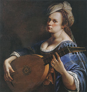
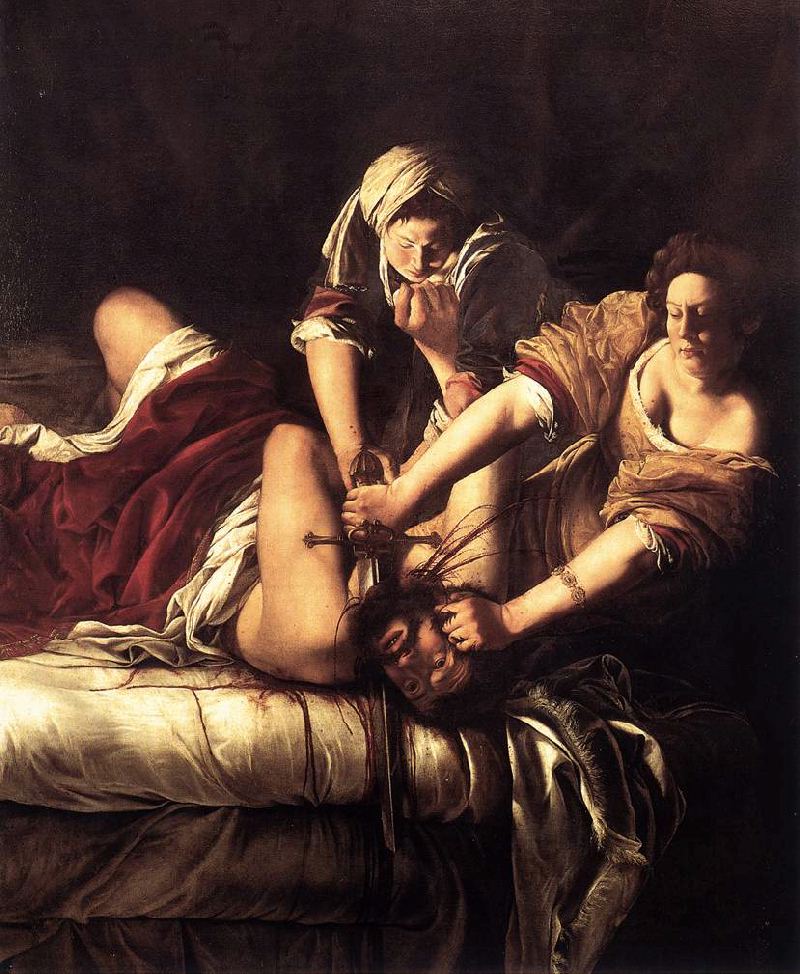
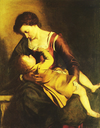
 During these lessons, Tassi raped the 18 year old Artemisia, and promising to soon marry her, continued to demand her sexual favors. When her father found out, Tassi was arrested for rape, and Artemisia was thrust into the middle of a celebrated rape case which received considerable publicity and ruined her reputation. Tassi was convicted, but released by the judge, who also ordered Artemisia to be tortured as a means of proving her honesty. The transcripts of the trial are still available today.
 
Among those with whom Orazio Gentileschi worked was the Florentine artist Agostino Tassi, whom Artemisia accused of raping her in 1612, when she was nineteen. Her father filed suit against Tassi for injury and damage, and, remarkably, the transcripts of the seven-month-long rape trial have survived. According to Artemisia, Tassi, with the help of family friends, attempted to be alone with her repeatedly, and raped her when he finally succeeded in cornering her in her bedroom. He tried to placate her afterwards by promising to marry her, and gained access to her bedroom (and her person) repeatedly on the strength of that promise, but always avoided following through with the actual marriage. The trial followed a pattern familiar even today: she was accused of not having been a virgin at the time of the rape and of having many lovers, and she was examined by midwives to determine whether she had been "deflowered" recently or a long time ago.

 
Perhaps more galling for an artist like Gentileschi, Tassi testified that her skills were so pitiful that he had to teach her the rules of perspective, and was doing so the day she claimed he raped her. Tassi denied ever having had sexual relations with Gentileschi and brought many witnesses to testify that she was "an insatiable whore." Their testimony was refuted by Orazio (who brought countersuit for perjury), and Artemisia's accusations against Tassi were corroborated by a former friend of his who recounted Tassi's boasting about his sexual exploits at Artemisia's expense. Tassi had been imprisoned earlier for incest with his sister-in-law and was charged with arranging the murder of his wife. He was ultimately convicted on the charge of raping Gentileschi; he served under a year in prison and was later invited again into the Gentileschi household by Orazio.
Paintings by Artemisia Gentileschi:

  • Virgin and Child - 1609
  • Madonna and Child - c.1609
  • Woman Playing the Lute - 1609-12
  • Susanna and the Elders - 1610
  • Judith Beheading Holofernes (V.I) - 1612-13
  • Judith and her Maidservant - 1612-13
  • Judith Slaying Holofernes (V.II) - c.1620
  • Allegory of Inclination - 1615-16
  • Self-Portrait with Lute - c.1615–17
  • The Penitent Magdalen - c.1617-20
  • Lucretia - c.1621
  • Portrait of Gonfaloniere / Pietro Gentile - 1622
  • Judith and Her Maidservant with the Head of Holofernes - c.1625
  • Self-Portrait - c.1630
  • St. Cecilia - Date Unknown
  • During and soon after the trial, Gentileschi painted Judith Slaying Holofernes (1612-1613). The painting is remarkable not only for its technical proficiency, but for the original way in which Gentileschi portrays Judith, who had long been a popular subject for art. One month after the long trial ended, in November of 1612, Artemisia was married to a Florentine artist, Pietro Antonio di Vincenzo Stiattesi, and they moved to Florence, probably the next year. While there, she had a daughter named either Prudentia or Palmira. In Florence, Gentileschi returned to the subject of Judith, completing Judith and her Maidservant in 1613 or 1614. Again, Gentileschi's treatment of the familiar subject matter is unexpected and original.
    The pregnant Artemisia was married off one month after the trial to a family friend, Peter Antonio Stiattesi whom she left within a few years. Soon after the trial, she painted her first Judith beheading Holofernes painting, clearly a cathartic expression of her rage and violation.
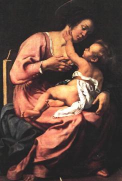
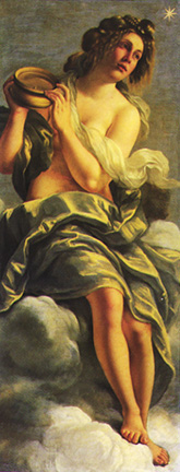
    Both she and her husband worked at the Academy of Design, and Gentileschi became an official member there in 1616--a remarkable honor for a woman of her day probably made possible by the support of her Florentine patron, the Grand Duke Cosimo II of the powerful Medici family. During her years in Florence, he commissioned quite a few paintings from her, and Gentileschi left Florence to return to Rome upon his death in 1621.
    From there she probably moved to Genoa that same year, accompanying her father who was invited there by a Genovese nobleman. While there she painted her first Lucretia (1621) and her first Cleopatra (1621-1622). She also received commissions in nearby Venice during this period and met Anthony Van Dyck, a very successful painter of the era, and also perhaps Sofonisba Anguissola, a generation older than Gentileschi and one of the handful of women who worked as artists. Gentileschi soon returned to Rome and is recorded as living there as head of household with her daughter and two servants. Evidently she and her husband had separated and she eventually lost touch with him altogether. Gentileschi later had another daughter, and both are known to have been painters, though neither their work nor any assessment of it has survived.
    During this stay in Rome, a French artist, Pierre Dumonstier le Neveu, made a drawing of her hand holding a paintbrush, calling it a drawing of the hand of "the excellent and wise noble woman of Rome, Artemisia." Her fame is also evident in a commemorative medal bearing her portrait made some time between 1625 and 1630 that calls her pictrix celebris or "celebrated woman painter." Also at this time, Jerome David painted her portrait with the inscription calling her "the famous Roman painter."
    During the years after the trial, Artemisia lived in Florence, where she gave birth to a daughter, and became the protege of Michelangelo the Younger, nephew of Michelangelo, who favored her and paid her well for her work on the life of Michelangelo for the Casa Buonoratti. Here, she painted the panel/frieze "Inclinazione", pictured on the left.
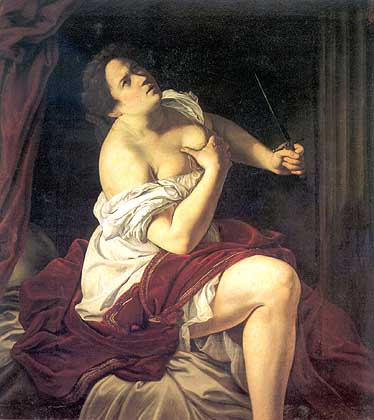
    Artemisia did well in Florence, gaining the support and patronage of Grand Duke Cosimo Medici. When he died in 1621, she painted with her father in Genoa, where she completed her Lucretia and Cleopatra. Forever in search of patronage, she lived again in Florence and Rome during the 1620s, then moved in 1630, to Naples, the second largest city in Europe, where commissions were available. During this time, she was continually struggling to reconcile her own artistic preferences with the preferences of her patrons, who made her livelihood possible. Here in Naples, she painted her Bathsheba, and Lot and His Daughters, and raised the money she sought for her own daughter's marriage in 1637.
    Some time between 1626 and 1630 Gentileschi moved to Naples, where she remained until 1638. She is again listed as "head of household." While there, she painted her Self-Portrait as the Allegory of Painting (1630), a work unique in its fusing of art, muse, and artist, The Annunciation (1630), another Lucretia, another Cleopatra, and many other works. She collaborated with a number of (male) artists while in Naples. In 1637, desperate for money to finance her daughter's wedding, Gentileschi began looking for new patrons. In one letter soliciting commissions, she mentions "a youthful work done by [her] daughter" that she is sending along.
  • The new patron to whom she finally attached herself was King Charles I of England. Gentileschi was in residence at the English court from 1638 to 1641, one of many continental artists invited there by that art-collecting king. She may have gone specifically to assist her father, Orazio, in a massive project to decorate the ceilings of the Queen's house at Greenwich. After civil war had broken out in England in 1641 (a war that would result in the death of Charles I), Artemisia returned to Naples where she lived until her death. She remained very active there, painting at least five variations on Bathsheba and perhaps another Judith. The only record of her death is in two satiric epitaphs--frequently translated and reprinted--that make no mention of her art but figure her in exclusively sexual terms as a nymphomaniac and adulterer. Thirty four of her paintings survive today, as well as the near complete transcript of the rape trial, published in full in Mary Gerrard's Artemisia Gentileschi, The Image of the Female Hero in Italian Baroque Art.
    There has recently been a movie made about Gentileschi called Artemisia, which has been widely criticized for its biographical and historical inaccuracy.
    Although separated from her father for many years, Artemisia joined him in 1638 on a joint painting commission for King Charles I of England, painting ceiling canvases for the Queen's house. Here, Artemisia painted the Allegory of Peace, including most of its Muses - and most notably, Clio, Muse of History. Her ailing father died in 1639, but Artemisia continued to work in England until 1642, when she returned to Naples. During her last ten years, her primary patron was Don Antonio Ruffo; more is known about these years than any others because 28 of her letters to him which still survive.
    The cause and timing of Artemisia's death is not known, but she most likely died in 1652. Unfortunately, however, the rape trial, her unconventional life as a female painter, and her numerous paintings of powerful women struggling against male dominance did not endear her to the male aristocracy. Several derogatory epitaphs were published about her in 1653, such as: "By painting one likeness after another/ I earned no end of merit in the world/ While, to carve two horns upon my husband's head/I put down the brush and took a chisel instead."
    Art historian Charles Moffat believes Artemisia may have committed suicide, which would explain why the cause of her death was not recorded.

    Wednesday, July 4, 2012

    A Long Process

    Lapis Lazuli in raw ore form


    Making the Blue

    “For as long as there have been painters, there have been color men. For years it was thought that the true painter, a master painter, would gather his own pigments, the earths, ochres, insects, snails, plants, and potions that went into making color, and combine them in his studio. But the truth is, the ingredients for colors were often hard to find, difficult to prepare, and rare. To be a master, a painter needs to paint, not waste the light by searching for and preparing pigment. It was the color man who delivered the rainbow into the hands of the artist.

    Mesopatamian pendant of Lapis Lazuli circa 2900 BC

    Ultramarine, true blue, the Sacre Bleu, is made from crushed lapis lazuli, a gemstone, and for centuries, it was rarer and more valuable than gold. Lapis lazuli is found in one place in the world, the remote mountains of Afghanistan, a long, dangerous journey from Europe, where the churches and palaces were being decorated with the Blessed Virgin wearing a Sacred Blue gown.

    It was the color men who sought out the lapis and pulled the color from the stone.


    First they pounded the lapis with a bronze mortar and pestle, then that powder would be sifted until so fine the grains were not visible to the naked eye. The dull bluish-gray powder was then melted into a mixture of pine rosin, gum mastic, and beeswax. Over a period of three weeks, the putty would be massaged, washed with lye, strained, then dried, until all that was left was pure, powdered ultramarine, which a color man could sell as dry pigment, to be mixed by the artist with plaster for fresco, egg yolk for tempera, or linseed or poppy oil to use as oil paint.

    There are other blues, blues from plants, indigo and woad, which fade with time, and inferior blues from minerals like copper and azurite, which can go black with time, but a true blue, a forever blue, ultramarine, was made in this exact way. Every color man knew the recipe, and every color man who traveled Europe from painter to painter with his wares could swear to his clients that this was the process he had used.”

    From Sacre Bleu: A Comedy d’Art by Christopher Moore