"Whether you’re wondering what color to paint the office, or you’re looking to redesign your retail space, the colors you choose can increase your chance of reaching your goals. Color greatly influences human emotion and behavior. If you’re hoping to make your workers more productive, or you want to encourage shoppers to spend money, understanding the basics of color psychology can help you design a space that will maximize your potential.
 |
| Robert Plutchik's Wheel of Emotions Photo Credit: Wikipedia |
I interviewed Sally Augustin, Ph.D., to find out more about color psychology. Augustin is an environmental psychologist and internationally recognized expert on person-centered design. Augustin operates Design With Science, where she teaches individuals and businesses how to use color to their advantage.
Change People’s Perception of Temperature
The color of a wall can actually change how a person perceives the temperature, according to Augustin. Warm colors, such as orange, red and yellow can cause people to think the temperature in the room is warmer than it actually is. Cool colors, such as blue, green and light purple cause people to estimate the temperature is colder.
Business owners can use this to their advantage by saving on heating and cooling costs. For example, if you live in a cold environment, painting an entryway a warm color may cause people to think your establishment is a few degrees warmer than actually is. This may allow you to keep the temperature at a slightly lower setting.
Evoke Emotional Responses
Augustin states that color evokes similar emotional responses in most people. However, there aren’t always universal truths about color. People of different cultures may have different thoughts and emotions about certain colors. Also, a person’s past experience can affect feelings about a certain color. Augustin notes that she dislikes a particular shade of blue for example, because it reminds her of an allergy medicine she had to take as a child. Despite the exceptions, there are some basic generalities about how certain colors evoke specific emotional and behavioral responses.
Green Sparks Creativity
Research has linked green with broader thinking and more creative thought. People generally like green. “There seems to be a positive association between nature and regrowth,” notes Augustin. So if you want your employees to be more productive, consider painting work areas green.
Red Reduces Analytical Thinking
There’s a reason why red sports cars cost more to insure. When humans see the color red, their reactions become faster and more forceful. However, that boost of energy is likely to be short-lived and ultimately, red reduces analytical thinking. Augustin cites research conducted by Andrew Elliot, professor of psychology at the University of Rochester, that shows athletes are more likely to lose when they compete against an opponent wearing red and students exposed to red before a test are likely to perform worse.
Although the research indicates that red can be helpful if you’re trying to attract a mate, it isn’t helpful if you need to stay on task. One possible reason why red makes it hard to concentrate, may be tied to a cultural-specific issue, says Augustin. Those of us who got a lot of answers wrong as children, may associate the color red with the red ink our teachers used to mark up our papers.
Blue is Most Accepted
When asked what their favorite color is, the most common answer around the world is blue. This may be because when our ancestors used to see blue – like a clear blue sky or a watering hole – it was a good sign, according to Augustin. Painting a common area of an office building blue is likely to satisfy the majority of people.
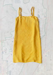
Yellow isn’t Usually a Hit
Yellow isn’t Usually a Hit
Avoid painting public spaces yellow because most people aren’t a fan of the color. However, the people who do like yellow, seem to have a huge preference for it, whereas most people only slightly favor one color over another. Overall, yellow remains the least likely favorite color for most people, so pick a different color if you want to appeal to the masses.
Orange is Associated with Good Value
People associate the color orange with a good value. The orange color in theHome Depot HD -0.87% logo for example, helps customers view them as a low cost provider of valuable goods. Some high-end retailers have been able to overcome this association with orange and they’ve successfully incorporated orange into their brand.
Pink Calms People Down
There’s a reason some sports teams paint the opposing team’s locker room pink – it’s known for draining people of their energy. Baker-Miller pink (the same color of Pepto-Bismol) calms people down for about 30 minutes, according to Augustin. Once people have remained calm for that time frame, they’re often able to remain in a calm state. This could be a great color for lawyers who are conducting mediation or a board room where conversations may get heated.
White May Lead to Boredom
White has a modern appeal. Apple AAPL +0.92%, for example, has used white to brand their clean, sleek look. However, too much of a monochromatic look can cause people to reflect on their own thoughts, warns Augustin. A person shopping in a monochromatic store may become distracted from the task at-hand when their mind begins to wander because of the lack of stimulation.