Monday, April 29, 2013

Purple's Power and Passion

Purple power in Feng Shui
Purple is a color that generates good chi. So, wherever you would like to add extra energy, consider adding purple.
However, if you've ever wondered how purple can help your Feng Shui, then here are eight ways purple can help you in your life.
1. Purple helps you gain MORE RECOGNITION
2. Purple helps you gain CREATIVE, SUCCESSFUL CHILDREN.
3. Purple helps you gain MORE MONEY.
4. Purple helps you gain in BUSINESS.
5. Purple helps you gain PEACE, WISDOM, AND SELF-GROWTH.
6. Purple helps you gain more GOOD LUCK.
7. Purple helps you gain NEW OPPORTUNITIES IN YOUR LIFE.
8. Purple helps you gain a BETTER LOVE LIFE.


Captivating Color and Scent

Roses are awesomely beautiful because of their colors, yet some have limited fragrance. 

"What's that, you say? Aren't all roses fragrant? And don't they all just smell like ... roses? The answer to all three questions, quite simply, is no. Some roses lack any kind of fragrance altogether, and the ones that are fragrant offer an unexpectedly wide variety of scents. Granted, they will all start out with something of a rosy scent, but from there you might be surprised at the additional aromas that exist in the rose world. Here are six kinds of scents you can find and flowers that deliver; take a peek — or a sniff — for yourself.
1. Clove. So many flowers have a sweet scent that it's refreshing to find some that drift over to the spicy side. Spices like clove and cinnamon remind me of the holidays — they offer an instantly homey scent and feel.

'Fragrant Cloud' has a wonderful spicy aroma on 5-inch coral blooms in USDA zones 5 to 9. This early-summer bloomer, growing up to 5 feet tall, is right at home as a hedge or in the back of a border or bed.

Other spicy bloomers include 'Scent from Above', 'America', 'Sweet Intoxication', 'Westerland', 'Strike it Rich' and 'Lilian Austin'.
2. Licorice. Who doesn't love a sweet anise scent? This old-fashioned aroma puts me in my happy place; it's reminiscent of childhood visits to candy stores.

This rose, 'Julia Child', honors its namesake well with its golden 4-inch blooms and quaint scent. It's a smaller shrub rose, growing up to 2 1/2 feet tall and wide, and blooming in late spring to early summer in zones 6 to 9. It's also remarkably heat tolerant and disease resistant — a plus in any garden.

More licorice-scented roses include 'Summer Nights', 'Tahitian Sunset', 'Monkey Business' and 'Butter Cream'.
3. Antique. This is the scent most of us imagine when we think of roses; if you're looking for a strong rosy addition to your garden, these are the flowers you want.

One of the best is 'Melody Parfumee', a gorgeous dark lavender rose growing up to 5 feet tall and 4 feet wide in zones 5 to 10. It's an early- to late-summer bloomer with ruffly flowers in clusters.

More classic rose scent can be had with 'Gertrude Jekyll', 'The Countryman', 'Falstaff', 'Harlow Carr' and 'William Shakespeare'.
4. Fruit. The fruity roses are a large bunch, with scents ranging from apple to citrus. I love these roses because they seem very fresh and clean, marrying well with other scented flowers.

Try 'Midas Touch', a strong yellow hybrid tea rose with 3- to 4-inch blooms from early summer to midfall. This is a smaller rose, growing only 3 feet tall and wide, so it's perfect for the front or middle parts of your beds. Grow it in zones 7 to 10.

Other fruity roses include 'Pink Promise', 'Olympiad', 'Enchanted Evening' and 'Wild Blue Yonder'.
5. Raspberry. Yes, I know raspberry is a fruit and we've just talked about fruity scents, but it'sraspberry. Any flower that smells like a raspberry deserves a separate mention, in my opinion.

Take a look at 'Moondance', a stunner that by virtue of its color and scent reminds me of raspberries and cream. White blooms with creamy centers appear in early to late summer, reaching heights up to 5 feet and widths up to 4 feet. Grow it in zones 4 to 10.

More raspberry-scented roses include 'Alnwick' and 'Madame Isaac Pereire'.
6. Light and sweet.Sometimes you simply want a hint of scent, and here's where these roses deliver. Classic, light and sweet — nothing overpowering or exotic.

'Geoff Hamilton' is a great option with its baby-pink petals and classic rose form. It grows to 6 feet tall, so be sure to give it room in the back of your border. It blooms in late spring to early summer and boasts excellent disease resistance.
More lightly scented roses to try are 'Hot Cocoa', 'Hot Tamale', 'Agatha Christie' and 'Angela Rippon'.ors. 

These shown above offer color and scent, a winning combo. Our rose bushes are loaded with buds, but have not opened yet. I can hardly wait. Some of the roses touted here will be added to my list of roses to purchase for a scent area near our deck so we can enjoy both the gorgeous color and aroma attributes of these beauties.


Saturday, April 27, 2013

Naming a Color

Here is an insider's look at how Sherwin-Williams and other paint companies name their products:

'Wall Street.' It's a place in Lower Manhattan, a movie about greed and a paint color from Sherwin-Williams SHW +3.51% .
Of the 1,500 different colors offered by the Cleveland-based retailer, two-word paint names, such as Wall Street (dark gray) and Stolen Kiss (dark red), are the most popular. These monikers make up roughly 61% of paint colors and 71% of gallon sales, according to Sherwin-Williams, which has more than 3,500 stores nationwide. Next come one-word names, which represent 35% of colors and 26% of sales. Names with three or more words are rarest, making up only 3% of colors and 2% of sales.
The company relies on one person, Jackie Jordan, to come up with the names. Ms. Jordan, director of color marketing, says creative naming helps homeowners develop an attachment to a given hue. The number of words in a name is less important than the meaning it evokes. "It's an emotional thing. People like to have an association with a particular color," she says.
To dub a new color, Ms. Jordan, 52, draws inspiration from pretty much everything, including books, song lyrics, foods and places. She then creates a list, sorting her ideas by color family in her "color bible." "I probably have over 10,000 names," she says.

Explore More Colors

Paint retailers often use creative names to form an emotional bond between homeowners and hues. Click on the photo below for the art behind Indulgent and Laughing Orange.
[image]
Ms. Jordan, who has been with the company for 27 years, and her team figure out what's lacking in Sherwin-Williams's existing palette. They then submit basic parameters—for example, five new blue colors ranging from sky blue to blue-green—to the lab. "Once I see the colors and approve them, I assign a name to each one," she says. "I go through my list until I find a name that fits that particular color. It's an intuitive thing." The names then go to a fact-checker, who makes sure that the color name hasn't been used before, and then back to Ms. Jordan for final approval.
Some names are straightforward, like Blue Sky and Cherry Tomato, while others, like Cut the Mustard and Indulgent (lavender), are more obscure. Names can't be too trendy since most colors have a life span of about 10 to 12 years and names stick with their respective hues forever. On the more practical side, names also have to fit on a paint card. The longest one uses the maximum 28 characters: Colonial Revival Green Stone.
Sandra Salander, a real-estate agent with Town Residential, says she addresses paint colors as soon as she takes on a listing.
"Colors absolutely make a difference," says Ms. Salander, a former interior designer. "When we have good paint colors, we stand a better chance of selling a home and selling it for a higher price."
—Sanette Tanaka


Color Game

This game could become addictive, but I like to use it for increasing color sensitivity. It is for all ages and is currently FREE. Check it out.


If you fancy yourself as a right-brained creative type, there's a new mobile puzzle game that will tickle your artistic side and even teach you something.
Blendoku is a free game for iOS and Android that is a hybrid of puzzles like Sudoku and crosswords. Instead of filling your grid with numbers or letters, in Blendoku you organize colors in a gradient by shade, hue and saturation. If that is hard to entirely grasp, check out the trailer:

The levels start simple like those above, but soon your rows and columns will be intersecting in multiple places, and you'll have to find the meeting place of all the color swatches given to you on each level. When the puzzles get too tough, you can get a free hint, but using more than one per day requires an in-app purchase.

Blendoku was created by Lonely Few, made up of the two-man team of Rod Green and Yeong-Hao Han. Both worked at larger game studios — BioWare and Pandemic — before founding Lonely Few. Green says they were inspired to create Blendoku after thinking about color exercises from art schools.
"In one such exercise, students would be given a number of color swatches in a bag and fill out a chart based on hue, saturation, and value. It was kind of like filling out a jigsaw puzzle with colors," Green said. "With Blendoku, we took these concepts, sped up the process, and created a game out of it."
Their efforts have not gone unnoticed by art teachers everywhere. Green says they've received several notes from art teachers from elementary school to college who they have includedBlendoku in their lessons. He shared some of those with Mashable.
"Blendoku takes one of the difficulties of color theory — color mixing — and encourages users to have fun learning the basics without relying on paint. Along the way, users will also pick up some intuitive hints about color harmonies, too," wrote Richard Keyes, a color theory and design instructor at Art Center College of Design.
Green realizes that Blendoku's gameplay isn't friendly to players who are colorblind, but he and Han are working on a solution.
"Since the game is based on color gradients we're working on a way to 'shift' the colors out of the typical colorblind spectrum so everyone can enjoy the game," he says.
Blendoku is free now for iOS [iTunes link] and Google Play [Google Play link].
Image courtesy of Lonely Few


Wednesday, April 24, 2013

Techniques of Impressionists

Changes in society often affect painting styles. Artist Jerry Fresia offers some fascinating comments on the mid-1870s in Paris. At first ridiculed, today paintings by Impressionists attract huge crowds to exhibitions of their works.

Claude Oscar Monet's palette
 
"Broken color refers to a painting technique 'invented' by the Impressionists that is still used today by some artists. Technically speaking, it goes like this: suppose I have an index card that is a permanent light green color. You can see it from across the room easily enough. Yup. That is green alright. Now we take an index card that is half, say, cerulean blue, and half cadmium yellow light. I put a hole in the middle of the card and I spin it like crazy. In principle, from across the room you will see a similar green but this time the green has more energy. It is alive. It mixes optically at a distance. That is what broken color is suppose to achieve – the actual sensation of light itself.
But without the point of view, the technique is rather empty and vacuous. It is like the dreadful 'style' where someone who thinks they are using an Impressionist method and simple makes a lot of little dabs to create an effect, albeit a rather dead one at that.
The Impact of the Impressionists
It might do us well to forget the term 'Impressionism'. It was a term of approbation, as you know. The 'Impressionists' were also called the 'insurgents' and their new way of painting was called exactly what it was, 'the new painting'.
Now, let’s capture that moment in the mid-1870s Paris. The social edifices of the aristocracy were crumbling. There was a bottom-up, democratic thrust in art let by Manet and others, including many women and the lower classes. Remember that artists were attacking the hierarchy of the art world in Paris. It would be equivalent today if artists such as ourselves were attacking the museums, auction houses, the non-profit mechanism of directing art, local art commissions, academic thinking and the gallery system of distribution.
An example of the art they opposed would be the work of Ingres whose work took months to create, with careful labored drawings, and not a hint of a brush stroke. More important, perhaps, was that painting of the artists in favor such as Ingres were the paintings of classical realism and to make heads or tails out of such work, you had to have a classical education. Everyone else was excluded, just as today much of the public is in effect excluded from the conversation about 'important' art.
What Was Different About the Art of the Impressionists
Now, instead of making smooth paintings that referred to classical literature and history, the Insurgents painted the 'real' life around them from boat parties to shoes to streets to haystacks. It was personal and they wanted their personality to show – hence, the unabashed use of the brush stroke.
But here is the big step: the paintings no longer were pictures in which there were references to other things (forget commissions!). They were hedonistic visual treats for the artists who did the work. They tasted the world through their eyes.
The new painting was all about the thrill and delight of the visual sensation, which means becoming intimately involved with the sensation of light or 'painting the light'. It is about painting directly from nature and expressing the rush of your visual (as opposed to ideational) sensation on the canvas in such a way that the activity itself is the point, not the painting!

The most important thing to remember when painting using broken color is that you are trying to make the painting itself become light so it has an independent life. Take the painting of mine shown here, done in sunlight, I’m trying to express my enjoyment of the colors and energy of the light that seemingly drips over everything.
A smudge of warm gray bumps up against a streak of orangy green. The strokes are open and left to sing – I hope – by interacting at a distance to create the vibrancy of the visual world that I’m immersed and lost within.
These broken-apart strokes that release the color, follow an underpainting in which I 'scumbled' abstract layers of colors. I then squint in order to simplify and see relationships and look for little sensations of color and try to put them down with single separate brushstrokes.
The length and size of the brushstroke or the pattern is determined by my mood or feeling that I am getting back from tasting the subject with my eyes. I don’t worry about a thing except getting the thing through the color. If I am faithful to the relationships of color and value that I see, the subject will come together at a distance with a great deal of freshness and liveliness.
The Use of Broken Color Today
Unfortunately, or fortunately depending on your perspective, few people actually paint like this today. The new painting is considered old fashioned by many, including the gate-keepers or the art experts. In fact, painting itself is considered 'dead' by many experts. But that leaves the rest of us who go on anyway, like the 'insurgents'.
The power of the personal brushstroke is very much alive even when we are not using broken color per se. True enough, there seems to be an aesthetic afoot that once again wishes to see the brushstroke disappear.
Much to my chagrin, the art world has moved beyond 'painting the light' if for no other reason that there are few teachers left who really continue to explore the practice. In the end, contemporary painters regardless of their perspective often just cannot deny that personal urge to drag a loaded brush across the canvas and leave the mark alone. That personal expressive swish may be the legacy of broken color. Not a bad contribution at that."

Claude Oscar Monet's The Cliffs of Dover

Saturday, April 20, 2013

Color Is BIG This Spring and Summer


SPRING COLOR: WHAT'S YOUR SHADE?

BY LINDA MILLER 

0

Color seems to wrap up this fashion season in a pretty package.
Soft tints, bold brights and electric neons wash over shaped jackets, lace, laser cuts, cropped skinny jeans, snakeskin prints, ankle-strap sandals, chunky necklaces, slim clutches and leather.
Temperley London red silk knit dress featuring sheer horizontal panels across the bodice, available at Liberte. Model is Alex from Brink Model Management. Photo by Shevaun Williams.
Color is the trend that layers over all the other trends this spring and summer, said Eden Turrentine, manager for Liberte at Classen Curve.
Bright colors, including emerald green, Pantone's Color of 2013, get much of the attention. Green and red are important, but Turrentine said women are slipping into yellow and cobalt blue.
“Black combined with cobalt blue is so strong,” she said.
Even in New York, where black reigns, women are welcoming cobalt as their favorite bright.
“Of course, being in this part of the country, we embrace bright color more easily than anyplace else,” she said.
And this season, there's more color to embrace, from bold purple, poppy, green, turquoise, yellow and tangerine to mint green, blue and coral pastels to glow-in-the-dark pink and orange neon. Depending on your color comfort level, you can rock it in a yellow jacket or just tiptoe into the trend with sandals or an enamel bracelet.
“Colors almost have electricity to them. They're so intense and pigmented. Really rich and deep,” Turrentine said.

Friday, April 19, 2013

The Golden Ratio


Golden Ratio Beauty

Recreating Da Vinci's Virtruvian Man.
You evaluate Golden Ratio beauty by measuring the proportions of an object or person and determining mathematically how close the ratio is to the Golden Ratio.

Your Facial Symmetry Measure your facial symmetry! See your face perfectly symmetrical at www.symface.com

Golden Ratio: Understanding the Math

The first step to understanding the Golden Ratio is to realize the accepted full number is 1.618033989, although it can continue forever. People usually round up the number 1.62. Doing so doesn't alter the number's value. This number is unique because it's infinite. It has no ending and it never repeats itself.
You can't use an infinite number as a whole number or a fraction. In mathematical terminology, 1.62 is an irrational number because its properties don't conform to rational number expectations. These unique properties make the Golden Ratio a perfect number or more aptly, the number of perfect creation. People perceive this perfection as beautiful.

Historical Value

You perhaps already know and may be surprised to learn that you've even used the Golden Ratio in geometry. The common term for this ratio is phi (Φ), not to be confused with pi (π).

It's Everywhere, in Everything

Scientists, mathematicians, musicians, artists, and sculptors have all proven over the centuries that you can find the Golden Ratio in everything, even our solar system. Nothing is exempt from this mathematical truism. This phenomenon brought the mathematician, Euclid (300 B.C.) to the conclusion that this ratio was divine.

Why Golden Ratio Is Important

It isn't enough to simply recognize that the Golden Ratio exists. Its value has many practical applications. This golden number occurs naturally in all of life. It's the math that holds our universe together because it's responsible for creating balance and symmetry. That's why people use it as a measuring stick for perfection and endless beauty.

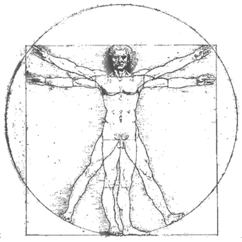
leonardo's vitruvian man

"We know very little about Leonardo’s apprenticeship in Verroccio’s workshop, but the short account provided by Vasari confirms that it included architectural and technological design, according to a concept that was being revived on the model of Vitruvius, as reproposed by Alberti" (Pedretti 14). Having had access to Alberti’s and Vitruvius’ treatises, it is no surprise that Leonardo produced his own version of the Vitruvian man in his notebooks.
This rendering of the Vitruvian Man, completed in 1490, is fundamentally different than others in two ways: The circle and square image overlaid on top of each other to form one image. A key adjustment was made that others had not done and thus were forced to make disproportionate appendages:
“Leonardo’s famous drawings of the Vitruvian proportions of a man’s body first standing inscribed in a square and then with feet and arms outspread inscribed in a circle provides an excellent early example of the way in which his studies of proportion fuse artistic and scientific objectives. It is Leonardo, not Vitruvius, who points out that ‘If you open the legs so as to reduce the stature by one-fourteenth and open and raise your arms so that your middle fingers touch the line through the top of the head, know that the centre of the extremities of the outspread limbs will be the umbilicus, and the space between the legs will make and equilateral triangle’ (Accademia, Venice). Here he provides one of his simplest illustrations of a shifting ‘centre of magnitude’ without a corresponding change of ‘centre of normal gravity’. This remains passing through the central line from the pit of the throat through the umbilicus and pubis between the legs. Leonardo repeatedly distinguishes these two different ‘centres’ of a body, i.e., the centers of ‘magnitude’ and ‘gravity (Keele 252).”
This image provides the perfect example of Leonardo's keen interest in proportion. In addition, this picture represents a cornerstone of Leonardo's attempts to relate man to nature. Encyclopaedia Britannica online states, "Leonardo envisaged the great picture chart of the human body he had produced through his anatomical drawings and Vitruvian Man as a cosmografia del minor mondo (cosmography of the microcosm). He believed the workings of the human body to be an analogy for the workings of the universe."

Golden Ratio in Art

Upon its discovery, people put the Golden Ratio to the test in everything. Nature, music, architecture, art and even the human form were discovered to repeat this mathematical proportion of infinite perfection. People began to apply the symmetry of the Golden Ratio to create buildings, sculpture and other forms of art. Leonardo Da Vinci understood the Golden Ratio's importance and used it in practical applications to create beauty with his art.
You can see one of the best examples of the Golden Ratio application in Da Vinci's famous drawing, the Virtruvian Man. Upon close examination, you'll discover that he used the Golden Ratio of 1.62 to create the physical drawing of the male body. By following the Golden Proportion math, Da Vinci was able to create a drawing of the perfect human male.

How Golden Ratio Beauty Is Determined

As you can see, by understanding the math behind it, you can measure any object or person to determine if it's symmetry correlates to that dictated by the Golden Ratio. Depending on the results, you can mathematically evaluate just how beautiful the object or human being truly is. The closer the physical ratio is to the Golden Ratio, the more beautiful it becomes.The human face is one of the most commonly evaluated by using the Golden Ratio. If the eyes, nose, mouth, facial shape and even the teeth match-up to the proper ratio, then the person is determined to be beautiful. Test subjects have proven that the human subconscious mind recognizes this rule for judging beauty. Da Vinci's Mona Lisa is a prime example of practical application of the Divine Ratio to create beauty.


Beauty Is Symmetry

Symmetry is the art of harmony and balance between the proportions of an object and the space it occupies. The object itself can be judged beautiful by applying the ratio principles.

Example: Creating Golden Ratio Symmetry

To create a Golden Ratio symmetry design for your fireplace mantle using candles, you'll need to place the same configuration of number, order of height, color of candles and spacing of the arrangement on both sides of the mantle.
You'll need to visualize the mantle as two rectangular shapes. The mantel's horizontal line serves as the bottom line. Draw a vertical line from each end, another vertical line from the center and a top line parallel to the mantle line. Place a candle inside the left rectangle. This forms a new triangle within the rectangle. Measure the height of the candle and the width to the rectangle's vertical line. Adjust candle placement until it's within the Golden Ratio. This ratio will need to be 1.62. You'll repeat this process with each candle placed within the rectangle to form a triangle with a Golden Ratio. You'll end up with a perfectly balanced mantel that mirrors its opposite side.

Beauty in the Eye of the Beholder

When it comes to the Golden Ratio and the human face, a person is subconsciously recognized as beautiful based on a comparison of facial features, placement and distance between features. When a person's face is close to the Golden Ratio, human beings recognize the person as being beautiful. The perfect human smile is created when the two front teeth recreate the Golden Rectangle of which you can create a Golden Triangle that in turn creates a Golden Ratio. In this sense of usage, the Golden Ratio becomes the deciding factor of beauty. You can apply it to all things. The closer the mathematical equation of an object is to the Golden Ratio, the more beautiful it is.

Mona Lisa's Story


This portrait was doubtless painted in Florence, Italy, between 1503 and 1506.* It is thought to be of Lisa Gherardini, wife of a Florentine cloth merchant named Francesco del Giocondo - hence the alternative title, La Gioconda. However, Leonardo seems to have taken the completed portrait to France rather than giving it to the person who commissioned it. It was eventually returned to Italy by Leonardo's student and heir Salai. It is not known how the painting came to be in François I's collection.
Mona Lisa, considered Leonardo da Vinci's masterpiece, is the most recognizable painting in the world. It is shown everyday but Tuesday at the Louvre in Paris. Crowds gather to see and photograph this surprisingly small painting. On many faces, a look of rapt wonder shows.
It was completed in the early 16th century. The mysterious, otherworldly beauty quite unlike any portrait that came before it, brought fame to the artist da Vinci. He once famously wrote that he wished "to work miracles." He developed a new artistic technique he called sfumato, or smoke. 
Over a period of several years da Vinci applied translucent glazes in delicate films, some no thicker than a red blood cell, to the painting. He probably used the tip of his finger to apply the subtle veils of color. He gradually stacked 30 of them one on top of another. Leonardo subtly softened lines and color gradations until it seemed as if the entire composition lay behind a veil of smoke. (excerpted from Scientific American magazine's March, 2013 issue-BBL)
Da Vinci's birthdate was April 15, 1452. His most famous painting, was done about 1503-1507.*

The following is from the website of the Musee du Louvre:

Lisa Gherardini, wife of Francesco Giocondo

 Among the aspects which remain unclear are the exact identity of the sitter, who commissioned the portrait, how long Leonardo worked on the painting, how long he kept it, and how it came to be in the French royal collection.
The portrait may have been painted to mark one of two events - either when Francesco del Giocondo and his wife bought their own house in 1503, or when their second son, Andrea, was born in December 1502 after the death of a daughter in 1499. The delicate dark veil that covers Mona Lisa's hair is sometimes considered a mourning veil. In fact, such veils were commonly worn as a mark of virtue. Her clothing is unremarkable. Neither the yellow sleeves of her gown, nor her pleated gown, nor the scarf delicately draped round her shoulders are signs of aristocratic status.

A new artistic formula

The Mona Lisa is the earliest Italian portrait to focus so closely on the sitter in a half-length portrait. The painting is generous enough in its dimensions to include the arms and hands without them touching the frame. The portrait is painted to a realistic scale in the highly structured space where it has the fullness of volume of a sculpture in the round. The figure is shown in half-length, from the head to the waist, sitting in a chair whose arm is resting on balusters. She is resting her left arm on the arm of the chair, which is placed in front of a loggia, suggested by the parapet behind her and the two fragmentary columns framing the figure and forming a "window" looking out over the landscape. The perfection of this new artistic formula explains its immediate influence on Florentine and Lombard art of the early 16th century. Such aspects of the work as the three-quarter view of a figure against a landscape, the architectural setting, and the hands joined in the foreground were already extant in Flemish portraiture of the second half of the 15th century, particularly in the works of Hans Memling. However, the spacial coherence, the atmospheric illusionism, the monumentality, and the sheer equilibrium of the work were all new. In fact, these aspects were also new to Leonardo's work, as none of his earlier portraits display such controlled majesty.

Wednesday, April 17, 2013

Organized byTone

This is a novel way to organize photos, by tone. It may require some forethought. I might review some of my photos to see if they can be categorized by color, especially floral shots. It could be revealing for you to find out what colors inspire you.


The Paris Color Collection

Today I'm dreaming over these beautiful photos, by Nichole Robertson. She portraits Paris in the most beautiful way by collecting ordinary moments and organizing them in an original way - by tone.
 
You can find more on her Etsy shop - The Paris Print Shop


(This green is my favorite tint bbl)

all images via The Paris Print Shop
 
If you haven't seen the old movie, April in Paris, now would be a good time to check it out. Van Johnson and Liz Taylor star. I dare you to watch the ending sans Kleenex!

Wednesday, April 10, 2013

Purple Inspiration


Purple can be used to help create a desirable mood in the garden — from peaceful to romantic to inspiring. In color theory purple traditionally indicates knowledge, self-respect, spirituality, dignity and wealth. In the landscape it promotes feelings of inner calm and self-worth, providing a sense of refuge. It also is considered useful for creative inspiration and insight. If you feel drawn to violet, lavender, plums and deep purples, here are five tips for adding this hue to your yard.
1. Adopt a Color Strategy

As with all colors, too much purple can backfire. Still, a single color scheme can work if you use enough variation. Here, for instance, light lilac catmint 'Walker's Low' and dark purple salvia leucantha 'Midnight' create sufficient contrast to keep this peaceful planting from growing dull.
Private Comment
For a broader palette, choose an analogous color scheme that combines neighboring hues on the color wheel, as in this front garden with its soothing blend of blue, violet and purple. The plant selections include dwarf catmint Nepeta mussinii, alliums and purple salvia.
Private Comment
Complementary colors (hues from the opposite side of the color wheel) can bring out the best in each other. Here, fiery yellow adds a colorful punch and energizing contrast to cool purple salvia.
Private Comment
2. Go Formal or Casual

Associated with both royalty and serenity, purple is at home in any style of garden. Planted en masse, spiked purple flowers like salvia or Veronica make an elegant choice for a formal bed.
Private Comment
Likewise, purple is at home in casual settings, as evident in this lupine meadow.
Private Comment
3. Think Beyond Plants

Add purple to the landscape by painting trimwork, front doors, arbors, gates or containers. A mix of energetic red and peaceful blue, purple has the unique ability to work well with both cool and warm color schemes.
Private Comment
A trio of purple — plants, a pot and a painted front door — greets visitors to this charming residence.

When to Paint Your Door Purple
Private Comment
The color of old-time favorites like lilacs, violets, irises and hydrangeas, purple is sometimes pegged as an old-fashioned hue. Designer Margie Grace threw that nostalgic notion a curve with these mod purple arbors.
Private Comment
4. Set a Mood

Lavender is thought to enhance feelings of inspiration and insight, making it an ideal choice for a contemplative garden.
Private Comment
According to color theory, purples and soft mauves are gentle hues that help ease strong emotions. Make your yard a haven with this color combo's soothing hues. (Plants shown include astilbe chinensis 'Visions' and hydrangea 'Endless Summer'. )
Private Comment
Purple makes a romantic gesture in this lovely dining spot, where clematis climbs the trellis to create a privacy screen.
Private Comment
5. Don't Forget Foliage

Dark purple foliage makes an excellent accent. Consider ground covers, such as setcreasea purpurea, for a swath of purple in a garden bed.
Private Comment
The deep purple-black of bugbane (cimicifuga ramosa) 'Hillside Black Beauty' creates a striking foil against silvery eryngium and pink astilbe. The plant produces pale white spires in the fall.
Private Comment
Drought-tolerant gardens can get in on the purple act with a broad choice of succulents steeped or tinged with the eye-catching hue.
Private Comment
Even shrubs like American beautyberry can add a touch of purple to delight the eye.
 
What is Purple?
Time is purple just before night
when most people turn on the light.
But if you don't it's a beautiful sight.
 
Asters are purple, there's purple ink.
Purple's more popular than you think.
It's sort of a great grandmother to pink.
 
There are purple shadows and purple veils,
and some ladies purple their fingernails.
 
There's purple jam and purple jell
and a purple bruise next day will tell
when you fell.
 
The purple feeling is rather put out,
the purple look is a definite pout.
But the purple sound is the loveliest thing.
It's a violet opening in the spring.
 
I love this poem from Hailstones and Halibut Bones by Mary O'Neill who dedicated her lovely poems:  "To my children and grandchildren and to all those who see and feel the wonders of color either with sight or through their imagination." 1961