Tuesday, December 31, 2013

A Pioneer of Color


"Squares with Concentric Rings" 1913


Wassily Kandinsky was born December 16, 1866 in Russia. He was from a well to do family and began studying art seriously at age 30. He had strong feelings about the language color speaks. Yellow, he stated, was "like an intense trumpet blast, blue suggests a celestial sound that touches the depths and black is like the silence of the body after death, an absence of life."

The vibrant colors of peasants' houses near his home and Moscow's colorful churches especially awoke his color sensitivities. He felt color "sets all one's soul vibrating."

His painting pictured above was composed with water color, gouache and crayon. It has a large presence, yet is only 10 x 13 inches in size. In this piece, Kandinsky juxtaposed cool colors (blue, green and purple) that seem to recede against warm colors (red, orange and yellow) that appear to advance. That makes the colors seem to move and dance. To the artist, lines and shapes carried meaning. He saw squares as calm and triangles as aggressive. In this piece, he enclosed soft, curvy lines within hard, straight squares. Also, he used colors that "pop" beside those that ebb. The effect the artist captured is full of dynamic tension in this resonating work.

Kandinsky led an interesting life; he taught at the Bauhaus in Germany, influenced many other artists and was ahead of his time in many aspects. Much of his work was destroyed when Hitler labeled it unacceptable or "degenerate."

Kandinsky took his studies of color seriously; he looked into the technical aspects of it as well as its retinal effects. He was one of the first to write about the emotional aspects of color. His link of color and music was very innovative.

I hope my introduction of this influential painter will encourage you to dig deeper into his art and life.


Sunday, December 29, 2013

Emotions Analyzed in Logo Designs

Advertisers study color psychology, why shouldn't we? See the chart below with logos well known to see what "emotional family" they connotate.

Here's to more savvy in 2014 about our being manipulated by ads' colors:

Color Emotion Guide22 Psychology Of Color In Logo Design

Scientists have been studying the way we react to colors for many years.  Certain colors make us feel a certain way about something. As long as the designer knows what these colors and emotions are, the designer can use that information to help present the business in the right way. These are not hard and fast rules but smart designers use the information to their clients advantage.
This fun infographic lays out the emotions and qualities that well known brands like to be known for. The color psychology is only one part of the puzzle but I think you will agree it is a very important part of it.

Thursday, December 26, 2013

Changing Eye Colors Found in Reindeer

Rudolph the fictional reindeer was famous for his oddly colored nose, but his true-life cousins have eyes that change color depending on the season.
In the summer, an interior part of the eyes of Arctic reindeer appears gold, and around Christmas it turns a deep blue, biologists have discovered. It’s not holiday magic, but rather a unique adaptation that helps these animals deal with the strange light conditions at the top of the world.
The reindeer’s world is one of extremes. Above the Arctic Circle, Christmas falls in the midst of a 10-week period of perpetual twilight in which the sun never rises and the landscape is cast in bluish hues. But from mid-May to late July, the sun never sets, creating a long, endless day.
    Biologists at the Norway's University of Tromso, in one of the largest cities situated north of the Arctic Circle, wondered how the reindeer managed the transition from a world of near-total darkness to one of blinding light, when springtime sunlight reflects off still-unmelted snow.

    To find out, they collected reindeer eyes from the Sami, indigenous herders who often slaughter the animals around the solstices. The Norwegian researchers collected eyes during both the winter and summer months, then mailed them off to Glen Jeffery, a neuroscientist who studies vision at University College London.
    Upon examining the eyes' interiors, Jeffery was stunned by what he found. “That first time, they sent me 10 eyes from summer and 10 eyes from winter,” he said. “When I opened them, I had the biggest shock I’ve ever had in science — the winter ones were clearly blue and the summer ones were clearly gold. I wished I had someone sitting next to me to exclaim to.”
    The color change occurs not on the iris, but on a reflective surface behind the central retina that’s known as the tapetum lucidum, Karl-Arne Stokkan and his colleagues in Norway discovered. (You'll find an image of the tapetum lucidum in the photo gallery above).
    Humans don’t have this structure, but lots of other animals do. It helps nocturnal animals see at night by bouncing light back inside the eye, giving the light receptors in the retina a second chance to be stimulated. The tapetum lucidum is responsible for the flash of “eye shine” you see when a cat looks into a car’s headlights.
    Scientists had always assumed that this piece of ocular anatomy's color was fixed.
    “This is the first time that a change in color in the tapetum has been shown in a mammal,” Jeffery said.
    In a study published in the Proceedings of the Royal Society B, Jeffery and his colleagues in Norway explained that when a reindeer’s tapetum is blue, 50% less light is reflected out of the eye than when the tapetum is gold. A reindeer with a blue tapetum sees less clearly than one with a gold tapetum, but its eyes are 1,000 times more sensitive to light.
    “Clinically, the reindeer become glaucomic,” Jeffery said.
    Perhaps Santa should find animals of another species to pull his sled on one of the darkest nights of winter.
    But the scientists argue that losing acuity and gaining light sensitivity is probably a worthwhile trade-off for reindeer on the ground because it allows them to detect a moving predator in the darkness — even if they can’t see it clearly.
    “Reindeer are very plastic, so it is not surprising the eye would change,” said Perry Barboza, who studies Arctic animals at the University of Alaska at Fairbanks and was not involved with the study. “Many of their external characteristics change as winter approaches — their coats fill out and go from brown to white, they put on a lot of body fat. The eye color change is just another part of that story.”
    The scientists determined that the color of light reflected by a reindeer’s tapetum likely depends on how much fluid pressure there is in the eye itself. It took Jeffery and his colleagues in Norway nearly 10 years to figure this out.
    In the dark winter months, the reindeer's pupils dilate completely to let in as much light as possible. That action also causes a flap to descend over the back of the eye where fluid normally drains out. Since the fluid has no way to escape, the pressure inside the eye increases. That, in turn, causes collagen fibers in the tapetum to squish together, which changes its color from gold to blue.

    But blue and gold are not the only colors in the reindeer tapetum spectrum. The researchers also checked the eyes of a small herd of reindeer that lived on the campus of the University of Tromso, and who were exposed to permanent distant urban lighting. Instead of turning blue in the winter, they became green.

    [Updated at 11:05 p.m. PST Dec. 20: This post has been updated from an earlier version to clarify that only a part of the interior of the reindeer eyes changes colors, not the eyes themselves. It also clarifies that Jeffery discovered the different colors when he examined the eyes' interiors, not when he opened the package containing the eyes.]

    It is possible that Rudolph's eyes need to be blue in the wintertime even in cartoons after the recent findings by researchers.

    Tuesday, December 24, 2013

    What A Difference Color Makes

    Snowfall near Milford, Michigan


    MERRY CHRISTMAS
    AND
    MAY 2014
    BE A
    COLORFUL
    YEAR
    FOR
    YOU!

    Red Nose of Rudolph May Not Be Too Far-Fetched.

    Reindeer in Lapland


    The story of Rudolph the red-nosed reindeer may be based on scientific fact, according to the findings from a new study.
    Researchers in Sweden have used thermal imaging cameras to capture the heat coming from reindeer as they graze.
    They found that while most of the animals are well insulated by their fur, their noses glow bright orange in the images due to the large amounts of heat they release.
    This is because reindeer have a high concentration of blood vessels in their nose and lips to help keep them warm and sensitive when rummaging through snow as they search for food.
    Professor Ronald Kröger, a zoologist at Lund University in Sweden, said that in some cases these even led to the animals'  mule, or snout, taking on a reddish color in cold weather.
    He said: “When reindeer are feeding, their mules are exposed to very low temperatures as they look for food under the snow. They need to maintain sensitivity in order to know what they’re actually eating.
    "They pump warm blood into the mule which means it can be a bit reddish because of this strong blood flow.
    "The thermographic cameras show the heat coming from their body. The eyes and the mule are lighter and warmer than the rest of the body."
    The story of Rudolph and his red nose dates back to a book written in 1939 by Robert L May and has subsequently featured in hundreds of stories, songs and films about the folklore of Father Christmas and his sleigh.
    They found that the reindeer's noses glow bright orange when viewed with infrared light. This is because they have 25 per cent more blood vessels there compared to human noses.
    Professor Kröger has been using thermal cameras to study the body heat given off by animals in an attempt to understand their physiology in ways not visible to the human eye.
    He said: “Dogs are the exact opposite to reindeer. Nobody knows why their noses are cold and why they have evolved that way. That is what we want to find out.”


    Monday, December 23, 2013

    Bits & Pieces of Art Techniques

    Merry Christmas. The following tidbits from art history are offered as presents to use in your painting or art history knowledge. 
    Chiaroscuro is an art technique used by artists such as Baglione, Caravaggio and Vermeer in the 16th and 17th centuries.
    The Italian word for "light and shade," "chiaroscuro" is identified by contrasts affecting an overall composition. Using opposite ends of the light-dark spectrum results in drama, depth and visual interest, as seen here in "Girl with a Pearl Earring,"by Johannes Vermeer.

    Vermeer lived and worked in Delft and completed only 35-40 paintings in his lifetime. The poetic quality of his work ranks has as one of the greatest 17th century Dutch masters, second only to Rembrandt.


    The Impressionists perfected new techniques in painting. They discovered, and showed through their works, that objects take on color from surroundings. They used clear, clean colors straight from paint tubes. Shadows were made from various colored combinations of tones with light permeating all. 

    Impressionists' darks were created from blue or green plus Alizarin Crimson. They colored their paintings' shadows with violet made up of cobalt blue or ultramarine blue with red or cobalt and manganese violet.

    "Primary colors look brightest when brought into contrast with their complementaries." Claude Oscar Monet

    Monet's Limited Palette included eight colors; Titanium White (opaque), Cadmium Yellow light and Cadmium Yellow, Viridian Green, French Ultramarine, Cobalt Blue, Alizarin Crimson and Vermilion. He used Ivory Black up to 1886. After that, he used no tube black.

    Cast shadows show a blocked light source in paintings. Darker, sharp definite edges become lighter the farthest from the object casting shadows. Also, the side of an object not facing the light source should show a softer edge than the cast shadows. This creates more subtlety and makes objects appear three-dimensional.

    Radishes Sculpted

    Tonight, December 23rd, in Oaxaca, Mexicofolks will be celebrating the Noche de Rábanos, the Night of the Radishes, and the zócalo (public square) will become the scene of a huge exhibition of figures carved from radishes. These are not the familiar little round vegetables that are eaten in salads — these are heavy, long, contorted roots that grow up to two feet in length and can weigh as much as 10 pounds. For three days, artists will have been transforming their freshly dug radishes into religious tableaux and village scenes, historical events and mythical tales. There will be animals and saints and conquistadors, the Virgin Mary and infant Jesus, and even the revolutionary hero Emiliano Zapata.

    The origin of this festival is unknown, although historians have noted that vendors in the Christmas Eve markets in Oaxaca would decorate their stands with radish figures embellished with other vegetables and that housewives would seek out the most interesting to buy for their Christmas tables. In 1897, the mayor of Oaxaca inaugurated the first official Night of the Radishes, and it has since become a unique and important part of Christmas in that city. (from Writers Almanac 12/23/2013)


    My hat is off to the artistic creations prepared for Noche de Rabanos in Oaxaca, Mexico. What skill is practiced in carving large radishes.


    It looks like the artisans start young to perfect their crafts. Note the lush hedge of Poinsettia in background, they are profuse in Mexico.


    Perhaps the piece de resistance, The Virgin Mary lovingly made from radishes, 2013. 

    Feliz navidad!

    Friday, December 20, 2013

    Color Forecasting Through 2015

    Color forecasting is compared to "catnip for the creative mind," which sums up how colors are chosen for textiles, clothes, and even dishes. The statement about colors looking different in Minnesota, for example, versus Buenos Aires is correct. Henri Matisse woke up to color when he convalesced in southern France after being sick in cold, northern France. Reportedly he called Mrs. Matisse to urge her to pack up and move to Nice, France, because he never wanted to live in the dark again! Bravo, Matisse, just think what a void the art world would be without his light-filled works. BBL

    Now, for the forecasters' inner world of choosing colors:

    At Home: Violet is the hot color for 2014

    By Marni Jameson
    Correspondent
    • Picasa - Courtesy of Lush Décor
      Any room can feel more up-to-date by just adding a simple accessory in the latest trend color. Like thisRoyal Empire quilt set from Lush Décor.
    While many people dream of being in the winner’s circle at the Kentucky Derby, I want to be in the inner circle of the group that calls the color shots.
    Think of the power! Two years ago, the Color Marketing Group, which forecasts color trends, predicted that Boyz-N-Berry – a jam-like violet – would be THE color coming in to 2014.
    Sure enough, last month two influential color icons –Pantone Color Institute and Sherwin-Williams, the paint company – named shades of purple, Radiant Orchid and Exclusive Plum, respectively, their colors of the year.
    “We love it when we’re right,” said Mark Woodman, president of the Color Marketing Group, who insists his group offers direction not dictation. For more than 50 years, CMG has been forecasting what colors will be in so manufacturers of everything from fabrics to futons, carpet to cars, and dresses to dishes, can gear up.
    Then he does his best to make me feel what it’s like to be in that room calling color.
    “It’s really odd,” he said. “You sit with a group of people having a chat. We’re all looking at what’s going on around the world that could influence color: rock groups, politics, films, traveling art collections, economic conditions, technology, sports events. Then somebody says health care is a big deal, and that prompts someone to say people need to eat better so health care won’t be so expensive, and that leads to dark berries and their health properties, which prompts someone to mention that berries grow wild in the forest, then we think of forests, and forest colors, and the fairy tales that happen in forests, and the fairies that live there, and what color they are, and ...”
    The process is like “catnip for creative minds,” Woodman said.
    “But why purple, why now?”
    “When we pulled Boyz-N-Berry out of the line up in 2011,” he said, “many said it was violet’s time. We thought by the end of 2013, beginning of 2014, we would be moving past the economic crisis, and it would be time to have this marvelous color that many consumers had stayed away from. Historically, purple has been linked to wealth, royalty, and high religious orders. Lately, it has also surfaced as a color of health, with the uptick in dark berries.”
    “We anticipated it would hit now, and we’re seeing affirmation.”
    This year the group fingered two colors to dominate in 2015: Smokey Cashmere, a warm grey with a brown influence; and Tribal Red, a slightly weathered red with a touch of orange that says heritage.
    “So what’s a consumer to do with this information?” I ask.
    “It’s important to know what people are doing and where color is going for a lot of reasons,” Woodman said. “For instance, you don’t want to be the one guy in the room with a purple shirt.”
    Here’s what else color experts say you can do with the new purple.
    Pair with care: This year’s violet has range, and changes completely depending on the combination. “With grey it would be regal,” Woodman said, “with an acid green or yellow it would be completely energized, with an earthy brown and deeper green it would feel organic.”
    Jackie Jordan, Sherwin-Williams director of color marketing, likes combining Exclusive Plum with copper and well-worn leather for a more masculine feel, or layering it with gold, gray and white for an elegant, dreamy bedroom.
    Pantone executive director Leatrice Eiseman suggests using Radiant Orchid to complement olive and deep hunter greens. “It’s gorgeous when paired with turquoise and teal,” she said.
    Adapt it to where you live: Before you slather the new color on the walls of your home, consider where you live, Woodman said. Certain colors that play well in Latin America, for instance, look garish in Minnesota. When the Southwest palette of terracotta and turquoise was big, the strong colors made sense in Phoenix, but had to be paler, washed out and weathered, to work in Schenectady, N.Y.
    Mix it in: The slightest touch of a top-trend color can quickly update a room. “This year’s purple is a phenomenal accent color,” said Woodman, who suggests putting it on kitchen chair cushions, either as a solid or mixed in a print. Jordan suggests painting a tired piece of furniture in the trend color. Or add the color with a throw blanket, pillows, candles or even fresh flowers in the new color.
    Play with high and low: The “in” color isn’t fixed as one intensity, but rather works along the continuum. Amp it up or pull it back. Think softer in a nursery, and darker to bring drama to a den. A pale violet is now out in transparent glassware. Consumers can also find mid-tone and deep values in a throw pillow. “We want people to play,” Woodman said.
    marnijameson.com

    Read more here: http://www.charlotteobserver.com/2013/12/17/4551264/at-home-violet-is-the-hot-color.html#.UrHnPfRDuu8#storylink=cpy
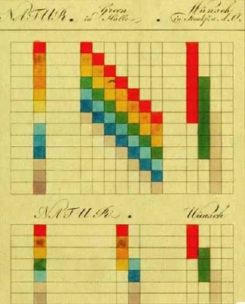
    Wednesday, December 18, 2013

    Another Color Forecast

    On the heels of the Pantone forecast, here's the latest from Brentano.

    More Color Talk

    02.12.2013 § Leave a Comment
    Brentano_ColorForecast_2014_Header
    We are forecasting interior color trends again this season. There are always nuances of differences in the colors used in different sectors of interior design (homes, hotels, restaurants, hospitals, offices, etc). However, if you look at them over time, the overall color cast does show a consistency across the sectors. Colors were warm with a yellow cast during the 1990s; the 2000s were a transitional time; and now they have definitely cooled and have a red cast. During the 1980s, mauve and plum were big in the contract market, so we can see the pendulum has swung back to red again except now we are seeing different hues with a red cast. 
    I’ve noticed that neutral colors are selected a lot, but when using color as an accent, the accent color is brighter compared to those from the 1980s and 1990s when mauve and plum were in vogue. The overall colors are getting clearer and lighter now, which is closer to the Mediterranean color sense.
    This is true for the colors we’re forecasting for 2014, even the coral color which, although a yellowish red, still looks relatively cooler than orange. Charcoal and linen, being neutrals, are very much used nowadays. The color of clear gold is starting to get noticed again too, especially the metallic gold I consider a color/neutral. So is deep blue sapphire, another color/neutral. Seafern is the name we chose to describe the “clean” color that’s bluer than celadon but greener than the soft turquoise color that’s already very established and has been very popular for Brentano. It’s a color intended to bring a soft, refreshing atmosphere to an interior without being cold.
    Brentano_ColorForecast_2014

    Friday, December 13, 2013

    Pantone's Color of Spring 2014


    I am on the side of those who believe the Pantone Color for Spring 2014 is like a breath of fresh air. Many folks feel insecure about using lilac, lavender, and other tints of purple, but some positives are connoted by derivatives of purple. Note the chart below:

     According to Lilian Verner-Bonds, in her book Colour Healing, purple foods promote leadership and heal erratic emotions. She also reveals the characteristics attributed to colors in the purple family:

    Deep purple = arrogance, corrupt power, delusion, ruthlessness.
    Violet= a rebuilder of hope, intuition, sense of destiny
    Amethyst=mystical connections, idealism, protects the vulnerable
    Mauve=makes the right choices, aristocratic, dynastic
    Plum=old fashioned, pompous, full of false pride, boring
    Lavender=perceptive and fragile, elusive, aesthetic
    Lilac=a bright personality, vanity, glamor, romance, adolescence

    She goes on to say that "purple flowers placed near you when you are working relieves eyestrain. Also, she advises us to use purple sparingly for it is a "heavy" color which, when used in excess, may be depressing. On its positive aspects, she says purple is useful for any kind of internal inflammation and for subduing palpitations of the heart. It is a good color for head problems; it is the chakra color for the brain. The immune system and jangled nerves can benefit from this color. Should you suffer from an overload of purple, the antidote is exposure to gold in the form of gold lighting, decor or clothes."

    In Maria Killam's blog, Color Me Happy, wonderful examples are shown of how to use purple tints well.

    Maria Killam, Interior Designer

    Used sparingly, lilac perks up metallics.

    Maria Killam, Interior Design


    This is how I would love for my office to turn out. White accents lavender beautifully. Blue is analagous.

    Wednesday, December 11, 2013

    Is White Really A Color?


    Some would argue that white represents the absence of color; others insist that white contains all colors. Sir Isaac Newton showed that sunlight contains colors when viewed through a prism. The artist profiled below has his own reasons for using white.

    White is more than a color at Delaware art exhibition

    The question is simple: is white really a color? There are differing opinions among color theory purists whether white should be considered a color at all, since it represents the absence of hue, and it cannot be made from the three primary colors.
    It's not usually represented on an artist’s color wheel, but white is normally an essential ingredient of any palette. Artists know it as the strong, brilliant white pigment available for oil paintings.
    “Into White,” a solo exhibition of watercolor and oil paintings by Greg Mort is on display at the Somerville Manning Gallery in Greenville, N.C. and runs through Jan. 4. Recognized today as one of America's leading contemporary artists, his watercolor, oil and pastel images are in notable collections around the world.  Mort’s works have been exhibited for 27 years at the gallery.
    “This show is about the many shades of white and the variation in those shades,” Mort explained. “In watercolor paintings you paint the objects, but leave part of the paper untouched. It’s like a pencil drawing with trees and the sky, but for the moon you leave that space white. The lighter the object the more it moves toward you when you’re viewing the painting.”
    The 19 paintings in “Into White” were developed from Mort’s exploration of the tension resulting from the presence of white or the absence of color in an image. Painting with a limited palette allows Mort to draw the viewer’s attention to specific details in each composition, like the petals of a blooming peony or the intricate striations of a conch shell. His use of white in the recent watercolors and oils evoke an ethereal beauty, enticing the viewer to appreciate his take on the objects depicted.
    The inspiration for the exhibition came about a year ago when Mort was listening to and then interpreting the lyrics to the Cat Stevens’ song “Into White.”
    ‘I built my house from barley rice
    Green pepper walls and water ice
    And everything emptying into white’
    “It’s a mixing of all these everyday things and all these colors come back to white,” observes Mort, who lives on 130 acres in Ashton, Md. “I’ve always been fascinated by the notion of white. It’s such a clean thing, like symbolizing purity in a wedding. To me it’s also an abstract notion, like a Robert Frost poem. He captures so much with so few words.”
    Image in reverse
    Mort approached the construction of each of these watercolor paintings by developing the image in reverse. Much like graphite drawing, he started on a blank white sheet of paper and developed the darker section, leaving the areas of light untouched. Since transparent watercolor affects the paper in a similar fashion, one becomes acutely aware of the underlying importance of negative space.

    As Mort was building his collection of paintings for the exhibition, serendipity played a part, such as in “Apple White.” Don’t seek, find, as Picasso once said.
    “It starts with a theme and then it feeds off itself,” Mort described. “I was visiting a neighbor up in Maine and was walking through a grove of apple trees. The usual red and green ones, then I discovered these blonde apples. I wasn’t expecting to see them and may have walked right past except for the theme of my paintings, so I was receptive. Once you’re leaning one way it’s easier to fall into other aspects of it.”
    Last year near his summer home in Port Clyde, Maine, Mort came across a portion of a beach made up of tiny conch shells, no bigger than the size of the end of a thumb. White on white became “Latitude.”

    “They were incredibly white, almost blindingly bleached white by the sun,” Mort described. “I grabbed a bag of them. A perfect fit for the nautical life in Maine. Latitude comes from the blue ribbon that I stretched across the shells. It was a suggestion of infinity. The ribbon leads you beyond the painting.”
    Drawing and painting since childhood, Mort earned his first museum show at eighteen. His creations have the classic feel of the Dutch Masters but are juxtaposed with startlingly modern designs. They are on display at the Smithsonian, Corcoran Gallery of Art, Delaware Art Museum, Academy Art Museum, Portland Museum of Art and Brandywine River Museum as well as in scores of private collections.
    Art and astronomy
    Mort regularly hikes the rugged coast of Maine and navigates the rural trails of Maryland with his brushes, paints and canvases. He sees a strong connection between both art and science.
    “There's an amazing parallel between science and art, and if you look at art history, you can see any number of people, like Leonardo da Vinci, who was a scientist and an artist, and for me, both are almost one and the same,” Mort maintained.
    “Both art and science seek a kind of beauty. We try to get at the essence of things. Take the bark of a tree, why does it look that way? Take a mundane object that can be instilled with new life. A large part of my artistic journey as a painter seems to find its roots in scientific inquiry.”
     Mort also was honored when his 2008 oil painting “One World” was recently moved from the U.S. Embassy at the United Nations building in New York City to the White House. The large-scale oil features a globe of the earth in an ancient doorway and was first shown at Somerville Manning Gallery’s “American Green” environmentally themed exhibit.
    “One World” was part of President and Mrs. Bill Clinton’s collection during their early days in the White House. The Mort family foundation Art of Stewardship encourages environmental awareness by offering resources and opportunities to artists through grass roots efforts.
    “It is a huge honor to have my ‘One World’ painting at the White House,” Mort said. “There is so much power in art and imagery. Artists can accomplish so much by using their voices to raise awareness.”
    Somerville Manning Gallery is located at 101 Stone Block Rd, Greenville. For exhibition hours, visit www.somervillemanning.com
     ---
    Terry Conway is a Delaware Arts and Culture writer.  You can view more of his work: www.terryconway.net.

    Sunday, December 8, 2013

    Mood Clothes?

    Color-Changing Mood Sweater Lets People Know What Its Wearer Is Feeling
    By Rhonda J. Miller on December 7, 2013 6:11 PM EST
    Mood Sweater Reveals Emotions
    The technology of Galvanic Skin Response similar to a lie detector has been developed into wearable interactive garments that respond to emotion with changing colors of light. (Photo: Sensoree / Rhonda J. Miller)
    Feelings are on display for all to see. A new mood sweater with lights, which change color according to its wearer's feelings — from aqua to convey tranquility, to green for calm, to yellow for blissful nirvana, and even red for feelings of nervousness or love.
    The GER mood sweater by the design lab Sensoree is wearable technology that uses Galvanic Skin Response similar to a lie detector. That's the conductive quality of human skin in response to stimulii, according to The Guardian. Galvanic Skin Response is lower when a person is calm and at rest and higher when anxious.
    Like Us on Facebook 
    Sensoree named it the GER for Galvanic Extimacy Responder, which it describes it as "externalized intimacy" on its website.
    The Galvanic Extimacy Responder sensors read excitement levels and translate the data into a palette of colors, according to Sensoree. The high collar bowl has LEDs that reflect onto the self for instant biofeedback.
    "Located around the larynx, the visual interface replaces speaking, as the wearer's truths are instantly expressed with color," according to Sensoree.
    The technology works by attaching sensors to the wearer's hands and then hooking the sensors up to a funnel-shaped LED collar, according toThe Guardian.
    Sensoree was founded by San Francisco-based designer Kristin Neidlinger, who has a background in kinetic costume design and physical therapy. She began developing the responsive garments for people with sensory processing disorder. Sensoree describes its products as therpeutic biomedia that communicate emotions to promote body awareness, insight, and fun.
    The mood sweater has been shown in exhibitions including the Digital Fall 2013 Fashion Show in San Francisco in October and the Futurotextiles exhibition in Romania in November, according to The Guardian.
    "If mood rings weren't enough, Sensoree designed a sweater that interprets and displays the wearer's mood as an interactive light show," according topsfk.com"While this idea might be a too excessive for casual wear, it is still an interesting project in the realm of wearable technology."
    Sensoree announced it is planning to produce 100 of the mood sweaters that will be available in March 2014.

    What do you think of this? Too revealing, or fun? 

    Wednesday, December 4, 2013

    Why Red & Green for Christmas?

    This post is from the international interior design expert Maria Killam, first published in 2008. 


    WHY ARE RED & GREEN THE COLOURS (she's Canadian) OF CHRISTMAS?

    There are a few answers to this question but basically it comes down to this one by Glenn Baylock: Red symbolizes the blood that Jesus spilt to redeem us from our sins.
    Green is the color of life. Therefore, green symbolizes the potential for eternal life that Jesus' sacrifice made possible for all of us. The evergreen tree is green all year round. So, it also symbolizes eternal life.
    The flame of a candle, the lights on the tree and the star on top are all meant to remind us of the new star that appeared to proclaim the birth of the promised Messiah.
    The bell is a reminder of the bells worn by sheep. They provide a means for the shepherd to find the sheep that has wandered from the flock and become lost. They symbolize our pleas to the Good Shepherd for guidance back to His flock.
    The candy cane is shaped like a shepherd's staff. It symbolizes the responsibility that we all have to be shepherds, to help each other and guide each other back to God.
    Finally, the bows on the top of the presents are symbolic of brotherhood. It should be a reminder that, just as the ribbons are tied together, we should all be tied together by the knowledge that we are all God's children and, therefore, brothers and sisters.

    Sunday, December 1, 2013

    Goethe's Color Theory Rediscovered

    Goethe’s Theory of Colors: The 1810 Treatise That Inspired Kandinsky & Early Abstract Painting

    zur_Farbenlehre__4a9b929b1348e
    I doubt I need to list for you the many titles of the 18th century German savant and polymath Johann Wolfgang von Goethe, but allow me to add one or two that were new to me, at least: color theorist (or phenomenologist of color) and progenitor of abstract expressionism. As a fascinating Booktryst post informs us, Goethe’s book on color, Zur Farbenlehre (Theory of Colors), written in 1810, disputed the Newtonian view of the subject and formulated a psychological and philosophical account of the way we actually experience color as a phenomenon. In his account, Goethe describes how he came by his views:
    Along with the rest of the world I was convinced that all the colors are contained in the light; no one had ever told me anything different, and I had never found the least cause to doubt it, because I had no further interest in the subject.
    But how I was astonished, as I looked at a white wall through the prism, that it stayed white! That only where it came upon some darkened area, it showed some color, then at last, around the window sill all the colors shone… It didn’t take long before I knew here was something significant about color to be brought forth, and I spoke as through an instinct out loud, that the Newtonian teachings were false.
    goethe5
    Schopenhauer would later write that “[Goethe] delivered in full measure what was promised by the title of his excellent work: data toward a theory of colour. They are important, complete, and significant data, rich material for a future theory of colour.” It was a theory, Schopenhauer admits, that does not “[furnish] us with a real explanation of the essential nature of colour, but really postulates it as a phenomenon, and merely tells us how it originates, not what it is.”
    goethe-color [first plate of Zur Farbenlehre]
    Another later philosophical interpreter of Goethe, Ludwig Wittgenstein—a thinker greatly interested in visual perception—also saw Goethe’s work as operating very differently than Newton’s optics—not as a scientific theory but rather as an intuitive schema. Wittgenstein remarked that Goethe’s work “is really not a theory at all. Nothing can be predicted by means of it. It is, rather, a vague schematic outline, of the sort we find in [William] James’s psychology. There is no experimentum crucis for Goethe’s theory of colour.”
    goethe6
    Yet a third later German genius, Werner Heisenberg, commented on the influence of Zur Farbenlehre, writing that “Goethe’s colour theory has in many ways borne fruit in art, physiology and aesthetics. But victory, and hence influence on the research of the following century, has been Newton’s.”
    goethefarbkreis1810
    I’m not fit to evaluate the relative merits of Goethe’s theory, or lack thereof, versus Newton’s rigorous work on opticsWhole books have been written on the subject. But whatever his intentions, Goethe’s work has been well-received as a psychologically accurate account that has also, through his text and many illustrations you see here, had significant influence on twentieth century painters also greatly concerned with the psychology of color, most notably Wassily Kandinsky, who produced his own “schematic outline” of the psychological effects of color titled Concerning the Spiritual in Art, a classic of modernist aesthetic theory. As is usually the case with Goethe, the influence of this single work is wider and deeper than he probably ever foresaw.
    You can find Goethe’s Theory of Colors in our collection of 450 Free Ebooks.
    goethe1
    Related Content:
    Josh Jones is a writer and musician based in Durham, NC. Follow him at @jdmagness