Wednesday, August 28, 2013

Color in the Garden

Conjure up color to create yard magic

Color can make spaces feel larger or smaller, warmer or cooler. Paint your back door, and it goes from dull and worn to something fresh and new. Spread that hue around the window trim to give it more interest. Be bold, be inventive, but above all, make sure that color works.
Scripps Howard News Service
Color is a great equalizer. It’s a disguise for things not quite beautiful. For some creative souls, color is a sacrament. For those unwilling to think outside the box, it is a necessary evil.
When it comes to your backyard, you can make magic with color. Adding accent color to doors, trim, walls, sheds and fences can turn drab to dynamic in a single weekend.
Color can make spaces feel larger or smaller, warmer or cooler. Paint your back door, and it goes from dull and worn to something fresh and new. Spread that hue around the window trim to give it more interest. Be bold, be inventive, but above all, make sure that color works.
Here’s a tip from pro designers: Light colors make a structure seem larger by advancing in space. To play down that element so it’s less oppressive, use darker colors that make the structure visually retreat farther into the background. This is how color can solve spatial problems if you think things out ahead of time.
Light is vital to how the human eye perceives color, so evaluate color in natural light before you make the final choice.
Architects favor testing paint color on a sunny wall to determine how much natural light influences its ultimate appearance.
The pros select a few very similar candidates, then paint a square of each one on the wall to study how subtle differences are affected by variable light during the course of a day. In the late afternoon, warm hues will literally glow, while neutrals will remain flat. Blues that might otherwise be bleached in direct sun prove their most iridescent under high overcast.
Try to play off your interior color palette. Because the backyard landscape is often viewed from indoors through windows and glass doors, the exterior becomes part of the interior and vice versa. You don’t want a sudden change as you pass through a door to the patio. Instead, aim for similar colors to transition easily, so muted interior colors match stronger hues reserved for outdoors. Remember, it’s not essential that the interior and exterior colors be identical; they simply must be harmonious.
Many well-known architectural styles favor a well-established color palette. These hues are the result of centuries of architecture and building materials in the regions where the style originated. To obtain the same look and feel, it’s essential to thoroughly understand the color palette. For example, if you have a Spanish-style home and want those coveted hot Mexi-colors, you must have a good feel for this palette. Mediterranean architecture likes sunset hues. Likewise, the cool palette of saltbox homes along the New England coast is quite uniform. Failing to choose the right palette for your style will leave you with a vague sense of unease.
Beware colors used in the shade. Whether it’s natural forest or old shade trees, your color will not appear as bright in shade as it will on a fully exposed site. The good news is it won’t fade as quickly, either.
Color also can save energy dollars. When painted with lighter colors, a wall or structure will reflect heat. Dark colors absorb heat and hold it.
Color is so powerful that a single paint job in your yard can substantially change the way spaces feel there. Be creative, experiment and take risks, because paint is forgiving. If you’re not happy with the result, just paint it another color next weekend.

Seasonal Changes

I am always excited when Autumn returns. As the following article points out, we need to consider color tones in our eyes to make our hair color and make-up compliment us---in other words, so we will be visually enhanced! We are less than a month away from The First Day of Fall, September 23rd.


Fall is quickly approaching and the September issues of the top style magazines are out, displaying all the new hair trend colors – are you ready to make the change?

Working at the Sapphire Salon & Destination Spa, I see a lot of hair color clients come in every six-to-eight weeks for their color retouch. I also see the same people come in for their new spring/summer or fall/winter trend color looks every season.

This fall/winter, hair color collections are featuring soft cool brown tones, very bright whites, neutral wheat blondes and, of course, natural golden redheads. Whichever color you decide to transform yourself with, it is very vital to update your makeup to go with it, as well as fit in with the latest seasonal trends.

If you are making that drastic change, be sure to set aside extra time  for a makeup lesson to help sort out and pick up new shades of eye colors, lip colors, and cheek colors to compliment your new look.

I know from experience that whenever I change my hair color, I am quite weary about the initial transformation and second guess the whole thing until I change up my blush or bronzer.
When going with a new hair color, always take into consideration your eye color (the one thing that never changes-BBL). Pick out different tones within your iris and go with them for your new color; that way you’re staying true to your natural chemistry and, no matter the level of drastic change, this new hue will still compliment you.

Take that same theory and apply it to your new makeup, taking the colors that are in your iris and using matching tones on the eyes, lips, and cheeks. If you have blue eyes or green eyes with no other golden tones in them, it’s obvious you can’t wear blue or green blush or lipstick. In cases like this, it’s best to look at a color wheel (always a good idea-BBL) and use something opposite these colors that will be complimentary to them.

For example, blue eyes look amazing with bronze, golden, or copper tones. Green goes great with red, purple, or gold tones. Keeping your look cohesive and monochromatic is the best way to go; it’s very natural, and no matter who you are or what you look like, it’s the most flattering. Besides, no one really ever compliments how amazing your red and black Mohawk haircut makes your eyes look and, if they do, do they mean it?

Tip: Dark Coca-Cola-colored lips are a must this fall, but to maintain a sense of beauty, keep the rest of your look light and airy.(Not a look everyone can wear-BBL)

Trick: Change up your existing natural hair color with vibrant-colored shampoos that will add or impart specific tones to liven up your hair. Aveda is one brand that carries such shampoos and conditioners for redheads, brunettes, black hair, golden blondes, and platinum blondes at aveda.com.

I am hoping cooler temperatures arrive with fall, how about you? Later on, we should all enjoy Leaf Peeping.

News flash: At Sephora, you can have your skin color-matched just like at Home Depot. By using a similar gadget, your color will be matched to the "perfect" make-up shade. It is so difficult to color match yourself that this new technology will be very helpful. In the past I have taken a mirror with me to the make-up counters and asked if they would pick my shade. The talented make-up artist would come up with the one she thought was perfect. My next step was to walk outside to look in my mirror to see if it looked right in daylight. It is almost impossible to match anything correctly while under artificial lights. I will see what Sephora's little gadget comes up with and let you know what I think in another post. 

Wednesday, August 21, 2013

Color Logic-Josef Albers

The Magic and Logic of Color: How Josef Albers Revolutionized Visual Culture and the Art of Seeing

by 
“A thing is never seen as it really is.”
“Hundreds of people can talk, for one who can think,” John Ruskin wrote“but thousands of people can think, for one who can see.” “We see, but we do not see: we use our eyes, but our gaze is glancing, frivolously considering its object,”Alexandra Horowitz lamented in her sublime meditation on looking. Hardly anyone has accomplished more in revolutionizing the art of seeing than German-born American artist, poet, printmaker, and educator Josef Albers, as celebrated for his iconic abstract paintings as he was for his vibrant wit and spellbinding presence as a classroom performer. In 1963, he launched into the world what would become the most influential exploration of the art, science, psychology, practical application, and magic of color — an experiment, radical and brave at the time, seeking to cultivate a new way of studying and understanding color through experience and trial-and-error rather than through didactic, theoretical dogma. Half a century later, Interaction of Color (public library), with its illuminating visual exercises and mind-bending optical illusions, remains an indispensable blueprint to the art of seeing.
Albers, who headed the legendary Black Mountain College that shaped such luminaries as Zen composer John Cage and reconstructionist Ruth Asawa, lays out the book’s beautifully fulfilled and timeless promise in the original introduction:
In visual perception a color is almost never seen as it really is — as it physically is. This fact makes color the most relative medium in art.
In order to use color effectively it is necessary to recognize that color deceives continually. To this end, the beginning is not a study of color systems.
First, it should be learned that one and the same color evokes innumerable readings. Instead of mechanically applying or merely implying laws and rules of color harmony, distinct color effects are produced-through recognition of the interaction of color-by making, for instance, two very different colors look alike, or nearly alike.
THE RELATIVITY OF COLOR
A color has many faces, and one color can be made to appear as two different colors. Here it is almost unbelievable that the left small and the right small squares are part of the same paper strip and therefore are the same color. And no normal human eye is able to see both squares -- alike.
Albers defied the standard academic approach of “theory and practice,” focusing instead on “development of observation and articulation,” with an emphasis not only on seeing color, but also feeling the relationships between colors. He writes:
[Interaction of Color] reverses this order and places practice before theory, which after all, is the conclusion of practice. … Just as the knowledge of acoustics does not make one musical — neither on the productive nor on the appreciative side — so no color system by itself can develop one’s sensitivity for color. This is parallel to the recognition that no theory of composition by itself leads to the production of music, or of art.
Practical exercises demonstrate through color deception (illusion) the relativity and instability of color. And experience teaches that in visual perception there is a discrepancy between physical fact and psychic effect. What counts here — first and last — is not so-called knowledge of so-called facts, but vision — seeing. Seeing here implies Schauen (as inWeltanschauung) and is coupled with fantasy, with imagination.
AFTERIMAGE EFFECT
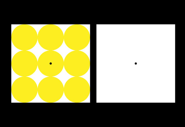
The 'afterimage effect' demonstrates the interaction of color caused by interdependence of color: On the left are yellow circles of equal diameter which touch each other and fill out a white square. There is a black dot in its center. On the right is an empty white square, also with a centered black dot. Each is on a black background. After staring for half a minute at the left square, shift the focus suddenly to the right square. Instead of the usual color-based afterimage that would complement the yellow circles with blue, their opposite, a shape-based afterimage is manifest as diamond shapes -- the 'leftover' of the circles -- are seen in yellow. This illusion double, reversed afterimage is sometimes called contrast reversal.
To mark the book’s fiftieth anniversary, Debbie Millman, who is herself amaster of color, sits down to discuss Albers’s far-reaching legacy and his fundamental contributions to our everyday understanding of color with Brenda Danilowitz, Chief Curator at the Josef and Anni Albers Foundation, and Philip Tiongson, who designed the magnificent iPad app accompanying the new edition of the book (an app so exceptional, in fact, that Millman rightly calls it “the example the world has been waiting for in order to begin to understand how it’s possible that books will never, ever go away”). Here are some of the highlights from an altogether fascinating conversation.
On how the brain’s conditioning to notice only what it expects cheats us of the richness of seeing:
Albers believed that in normal seeing, we use our eyes so much because the world is controlled by our vision, but we become so accustomed to it that we take things for granted. And when he talked about visual perception, he meant something much more profound than just the way we look at the world — he would stop and look at the world, look at the smallest object, smallest event, and see through it in a deep kind of way. … He would see magic, he would see something deeper. And he believed that the majority of people just missed the true reality — it was available for everyone to see, but nobody was looking. And that was where his notion of “to open eyes” really comes from.
On Albers’s unconventional approach as an art educator and the mesmerism he had over his students:
The one word that to Josef Albers was absolute anathema was “self-expression.” He said you do not express yourself — you have to learn, you have to have these skills, and then you create something.
Fittingly, one of Albers’s most memorable quotes:
Easy to know that diamonds are precious. Good to learn that rubies have depth. But more to see that pebbles are miraculous.
On how Albers embodied the aphorism that “the art of teaching is the art of assisting discovery” and challenged his Black Mountain College students to experiment with materials in a way that counters the assumptions of perceptual reality:


Saturday, August 17, 2013

Elvis

Commemorating Elvis' death 16 August 1977. Today, had he lived, he would be 78 years old. RIP Elvis.

 
August 16, 1977.- Elvis Aaron Presley (January 8, 1935 – August 16, 1977) was one of the most popular
 American singers of the 20th century. A cultural icon, he is commonly known by the single name Elvis. He
 is often referred to as the "King of Rock and Roll" or simply "the King". In this image: Elvis Presley fan
 Angelika Springauf poses in front of a photo from 1959, showing her with Elvis, in the US-Ray Barracks
 where US rock-star Elvis Presley was stationed as soldier from 1958 to 1960, during a preview of the
 exhibition "Friedberg-Army Home of Elvis Presley" in the Ray Barracks Friedberg, Germany, Wednesday,
 Aug. 8, 2007. Around 200 objects of the US "King of Rock'n Roll" were on display. Presley died
 Aug. 16, 2007. He was 42.

Wednesday, August 14, 2013

Clouds of Color, Part I

Weaving clouds of color

By Li Yao ( China Daily
Highly skilled workers employ traditional techniques to create brocades once worn by emperors.
Nanjing was the ancient capital of six dynasties in China, and in August, it will come under the limelight again as the host city of the 2nd Asian Youth Games. Its rich history and cultural heritage are sure to impress first-time visitors.
There are many traditional crafts still preserved in this historic destination.
Weaving clouds of color
The age-old craftsmanship of brocade weaving still thrives, thanks to the dedicated artisans with the Nanjing Brocade Research Institute. Traditional brocade takes on a modern look at a Nanjing fashion show.Photos provided to China Daily
Weavers in the city today are still making Nanjing cloud-patterned brocade, considered the most extravagant silk fabric that was produced exclusively for emperors and imperial court officials.
It was called yunjin or cloud-patterned brocade because its woven motifs were as beautiful and diverse as clouds in the sky.
The techniques of weaving this brocade have a history of more than 1,500 years. They were, however, almost on the brink of extinction until 1979 when the Nanjing Brocade Research Institute tried to replicate a dragon robe that had been unearthed from one of the Ming Tombs in Beijing.
The robe was in tatters and its brilliant colors were fading from exposure to air. Researchers concluded that it had been made in 1619 during the Ming Dynasty (1368-1644). This was the period when the cloud-patterned brocade production was at its peak and private workshops were allowed to develop because of rising demands from the imperial court.
It took specialists five years to resuscitate the ancient skills and recreate the brilliant luster and colors of this historic robe.
The design features dragons and symbols of longevity such as cranes, and it was embroidered with gold thread and peacock feathers.

To be continued...

Wednesday, August 7, 2013

A Century of Formica-Color came to the kitchen, and everywhere else

A century ago, two material scientists quit the manufacturing giant Westinghouse to develop a product their superiors didn’t quite appreciate, a new form of plastic laminate that could be used to insulate electronic components. The called it Formica, because they envisioned it as a substitute “for mica,” the mineral that was then typically used as an electrical insulator.
As a new history of the company, Formica Forever, explains the timing was perfect: the new wonder material came along just as a host of new industries were developing, all requiring sophisticated new electrical parts. Formica was used in airplanes, automobiles, ocean liners, and trains. It entered the home environment with the radio—all those transistors and wires and knobs required grounding, and Formica fit the bill.
Formica’s domestic revolution came about in the 1930s, first with the introduction of metal foil into the laminate, and later with the move to stronger melamine resins, which made for a tougher product that could be brightly colored or given faux wood patterning. Now you could find Formica everywhere, from the Queen Mary to Radio City Music Hall to the counter of the local diner to just about every suburban kitchen. It was the perfect material for the postwar building boom: inexpensive, durable, easy to clean, adaptable to just about any aesthetic. This was modernism for the masses, at its best.
In the intervening years, Formica has remained popular, though it has not always been quite so fashionable. Perhaps unfairly, there has been a stigma to Formica, it being a form of plastic, that throwaway substance that conjures poorly made objects of minimal value.
As we’ve come to celebrate the modern heritage of the mid-century, Formica once again seems like a respectable option, and not just for nostalgists. It still retains the virtues that made it appealing a half century ago, and in years before that. Granite counters are nice,  but they don’t come in tangerine, and they don’t come cheap.