Thursday, December 15, 2011

Ultramarine Blue

Author Eve Ashcraft, in her informative book I recommended a few weeks ago, gives more information about early painters' steps necessary to obtain precious and expensive colors.

"For centuries, color---and the pigments to create it---was as precious as gold. Imagine if I, as a color expert, held the secret formula to the perfect sky blue paint and, to my colleagues' chagrin, only my clients could have access to that hue for their walls.

This kind of scarcity and level of secrecy was once common in the world of color. Artists would go to great lengths to protect and keep secret their color formulations. Costly pigments were held under lock and key. Even the most prominent artists relied on wealthy patrons to front them the money to procure expensive pigments. For example, if Vermeer had a client who commissioned a painting containing a certain amount of costly ultramarine blue (lapis lazuli, ground as pigment) that patron would have to advance the money so the artist could buy the precise amount of the pigment needed. And, Vermeer would have to accept visits from financial auditors who would make sure that the pigment was being used as contracted and that none was being squirreled away by the artist or his helpers."

Vermeer's 'Girl with the Pearl Earring,' also called 'The Mona Lisa of the North' pictured above included the vibrant ultamarine blue in her face-framing turban or scarf. The color sets off her skin tones very beautifully.

Today we artists are privileged to have at our fingertips almost any color at a relatively affordable cost. I will never gripe about the cost of paint or art supplies again.

On another note, just wanted you to know the difference in angels depicted in old paintings.

Cherubs are those portrayed as  winged infants with  chubby, rosy faces. They are depicted in western art from the 15th century onwards.  Putto, "little boy" in Italian, is the chubby, naked child represented in art since classical times, often as a decorative feature. Often, putti are adorable, cherubic heads with wings and no bodies.

 by Raphael

 Originally derived from ancient representations of Eros, the Greek god of love, since the Renaissance putti have often been associated with his Roman counterpart, Cupid. Cupid is normally represented as a naked, winged boy with bow and arrows.


From: The Concise Oxford Dictionary of Art Terms.

Tuesday, December 13, 2011

Luxurious Lapis Lazuli

Taken as a whole, lapis lazuli means "stone of Lāzhward/Afghanistan".
The name of the place came to be associated with the stone mined there and, eventually, with its color. The English word azure, the French azur, the Italian azzurro, the Polish lazur and the Spanish and Portuguese azul are cognates.  From Wikipedia

I recently heard a wonderful lecture given by Brian Baade, "Secrets of the Old Masters," at the Philbrook Museum of Art. He is a painting conservator and artist. He not only analyzes, but actually reconstructs paintings using historically accurate techniques.  I found the history of lapis lazuli especially intriguing.

Freshly mined and polished Lapis Lazuli, an opaque amalgam of minerals, is a magnificent blue, prized for millenia. Ground up and mixed with linseed oil, early painters used this magnificent hue to designate the Virgin Mary by painting her cloak this signature color. Christ is also depicted during his earthly ministry wearing a blue cloak.

This pendant was made in Mesopatamia 3900 BC. Highly prized and enormously expensive,  lapis jewelry became status symbols worn by the wealthy.

Mined in Afghanistan for centuries, it has always been rare and expensive. Pre-Renaissance painters' cities had to buy the mineral and keep it safely stored. If a painter received a commission to depict the Virgin Mary and infant Christ, for instance, the contract between the artist and his patron was shown to the magistrates who apportioned the lapis to the artist. Because it was so precious, perhaps costing $10,000 per pound, the artist put an undercoat of cheaper color under the lapis. Through time, some brilliant blues have oxidized into darker blue shades.

Egg tempera painted on wooden panels seemed to preserve the brilliance of the color. Southern European artists usually used poplar wood for panels, northern ones used oak panels. Lapis varies from azure-blue to deep-blue gemstone of lazurite.

Today, this magnificent color has been produced synthetically, like all earlier, costly colors, making it accessible to painters everywhere.

Thursday, December 8, 2011

Do Animals See Colors?

Can our fellow creatures see colors the way we can? I have pondered that question awhile. The following article and pictures supply the information thoroughly.

By Dr Ivan R. Schwab


 Dogs see colors, but their span of color vision closely resembles the array of colors seen by “color blind” males.
About 8%, or 1 out of 12 males (humans) and about 1 out of 200 females are “color blind.” We use that term to describe individuals who are color deficient, but they are not truly color blind. The eye has cells that perceive color and these are called cone photoreceptors or “cones.” We use another set of photoreceptors called “rods” for the black and white vision of dim light or nighttime. Our cones contain three visual pigments each of which responds to a different spectrum of wavelengths of light. It is these three visual pigments that combine their signals to permit us to have color vision by blending the signals, depending on the wavelengths received. Although it is an over-simplification, and misleading to some extent, we can describe our visual pigments as blue, green, and red. The brain receives the input from these three channels and then interprets the color we see. At least two different color channels are needed for color vision because the brain needs to “compare” these two different channels to determine color.
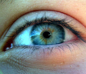
Color blindness in humans is caused by the genetic deficiency or loss of either the green or the red photopigment hence that input into the brain. So, the brain learns to see only those colors that can be interpreted or constructed by combining the input from the other two remaining visual pigments. The result is a less robust spectrum of colors, but colors are still seen. True color blindness in humans does exist when two of the three visual pigments are genetically unavailable, but it is exceedingly rare. If only one visual pigment channel is coming to the brain, say the blue cone input, it isn’t seen as blue but rather as on or off—hence that is “real” color blindness and would be a black and white world.
So, almost all color blindness in humans is not true color blindness but would be better described as color deficiency.
Now, let’s go back to your dog. Normal dogs have two different visual pigments in their cones, and much like humans afflicted with so-called “color blindness.” But they would see color. The color input would be weaker to some extent because dogs have fewer cones than we do because they are evolutionarily closer to their nocturnal ancestors. Cones are needed less, if at all, at night.
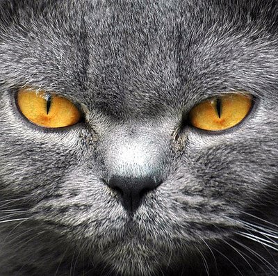
So, what about the other pets in the household? Your cat will have a similar color distribution as your dog although there are some subtle differences.
Birds, on the other hand, possess rich color vision, in many cases better than our own. Most birds have four cone visual pigments, although this varies. In general, birds have an additional ultraviolet pigment in their cones and many more cones than we have. Furthermore the visual pigments that would be similar to ours span different wavelengths. Their visual experience is richer than our own in ways impossible to describe or understand. Not only do they see more colors, but the interpretation of colors would be different. Think of combining different colors of paint—if you combine more colors radiating from the same object, like a flower, you will see different colors. A hummingbird, then, would see a red flower as a different color because of the ultraviolet channel input.
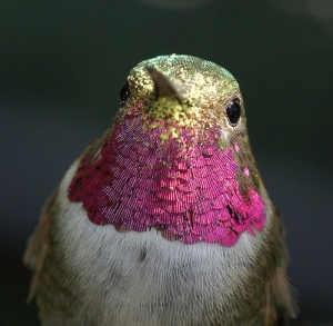
You may ask what good are these extra color channels in birds? Of course, it’s hard to know completely since we can’t even understand the perception of the color “ultraviolet,” but here is an example. When a mouse is being hunted by a hawk, it will often urinate out of fear and to make itself as light as possible for escape. Mouse urine radiates ultraviolet and that actually helps the hawk follow the mouse trail. Fresher urine radiates more ultraviolet light. The ultraviolet arrow will point to lunch for the hawk.
For those of you who have aquaria, the story gets even more interesting. There are at least 28,000 species of fish on earth, not to mention the staggering number of invertebrates. Although no one will have that large of an aquarium, commercially available animals for aquaria are quite numerous and it is harder to generalize about them. Many fish have four visual pigments or channels and, like birds, even the three that would resemble our own, span different wavelengths and provide more robust color vision. That is a very different story.
Hence, the answer to the question of “Does my dog see in color?” is “yes” although not as well as you probably do.
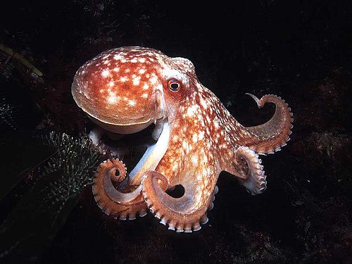
The next question you might ask is “Does my octopus sees in color since it can change into so many different colors?” Surprisingly, the answer is no, because octopuses have but one visual pigment. But that is a story for another day.
Dr. Ivan R. Schwab, a professor at the University of California, Davis, is the author of Evolution’s Witness: How Eyes Evolved. He also has a blog which you can find here.

Saturday, November 5, 2011

Picasso and Braque 1910-1912

Picasso%20ManwithaPipe%207inch
The close and competitive working-relationship between Pablo Picasso and Georges Braque in the radical, game-changing development of Cubist painting is a standard story in the history of Modern art. Braque, conjuring a bit of mountaineer melodrama, said, "We were like climbing partners roped together." Picasso, employing more than a hint of sexist condescension, said that during the most intense period of give-and-take growth, Braque worked as if he were Picasso's "wife." (Picasso was hard to get along with, many reported. BL)

The last time the story was told in a museum exhibition was more than 20 years ago. New York's Museum of Modern Art pulled out all the stops for "Picasso and Braque: Pioneering Cubism," brilliantly untangling a knotty artistic revolution that opened the door wide for everything from total abstraction to anti-art Dada. Nearly 400 paintings, drawings, collages, sculptures and prints began with the run-up to 1907's "Les Demoiselles d'Avignon," the Spaniard's manifesto in reaction to Matisse, which blew away Braque when he saw it. The show then went on to survey in exhaustive detail the dialog between them until 1914, when the French painter went off to war and suffered grievous wounds that nearly killed him.

We're unlikely to see anything like that definitive MOMA presentation again anytime soon. But now the Santa Barbara Museum of Art and the Kimbell Art Museum in Fort Worth, Texas, have joined forces to offer a centennial look centered on the year 1911 -- the most intensive in the two artists' working relationship. "Picasso and Braque: The Cubist Experiment, 1910-1912," (already on exhibit in Texas) now in California, shines light on the movement's analytical phase. Call it Cubism 101, a primer on the start of something big.

The show is very small -- just nine canvases by Picasso and five by Braque. The inevitable gaps are partly filled by almost all the etchings and dry-point prints they made at the time. Ten prints are by Picasso, exceptionally prolific throughout his long lifetime, while eight are by the more deliberate Braque.

Among this modest selection, however, are some of the finest Cubist paintings either artist made. They  start with Picasso's fresh -- and decidedly strange -- "Man With a Clarinet," loaned from Madrid's Thyssen-Bornemisza Museum and prominently installed on the center wall.
Picasso%20StillLifewithBottleofMarc%207iinchTall and narrow, like the enigmatic figure and his musical instrument, it translates rhythm and doleful sound into fleeting pictorial terms. The picture is constructed on a scaffolding of mostly diagonal lines interrupted by curves and arcs that allude to everything from the musician's rounded, air-filled cheeks to the curved flare at the end of his reed-instrument. On this gangly scaffolding Picasso hung a flickering array of mostly short, horizontal brushstrokes of muted color, like laundry hanging out to dry in the Mediterranean sun.

"Man With a Clarinet" was painted in Paris after the two artists spent a productive summer in Céret, a rural French town in the foothills of the Pyrénées near the Spanish border. The painterly technique derives from Post-Impressionism. With a limited palette dominated by OCHRES  and GRAYS, the prismatic image appears shot through with rays of silvery light. The musician exudes all the tactile solidity of drifting smoke.

A sliver of context for the show comes in several African sculptures, whose powerfully abstracted forms captivated the artists, plus three late-19th Century works. An enigmatic fantasy landscape of a moonlit castle by Henri Rousseau, Picasso's buddy, dramatically restricts the range of color that would likewise characterize Analytical Cubism. A surprisingly mediocre little landscape painting by Paul Cézanne, whose posthumous 1907 Paris retrospective kick-started the Cubist revolution, represents focused scrutiny on the problem of reconciling the two-dimensional canvas with the three-dimensional world and the fourth dimension of time. (In Cubism, look for objects such as playing cards, real things as flat as the painting's surface; women's folded fans, their accordion pleats shifting in dimensional space through time; and written words, inherently two-dimensional abstractions.) Finally, a Cézanne lithograph of ungainly bathers -- denizens of a lost paradise struggling to gain their footing in a rapidly changing new world -- anticipates the Cubist  project of building a new art for a new century. The lithograph also introduces reproduction into the mix, setting up Picasso's and Braque's prints.

COLOR is the exhibition's real surprise. Usually, Analytical Cubism is synonymous with brown -- one reason it can be tough going for viewers. To be sure, brown is prominent here, along with black and white. (The prints are also in black ink on white paper, sometimes unhinging hatch marks from their traditional printmaking function of creating volume and shadow and here just floating freely as lines on a page.) A surprisingly wide range of tonal effects is possible from mixing this very LIMITED PALETTE.

But French painting had just been through 40 years of art that put color in the forefront -- wave after wave of Impressionism, varieties of Post-Impressionism, Fauvism and especially Matisse. Since Picasso and Braque were focused on conceiving  new structural properties for painting, color didn't become a major concern until later -- during the so-called Synthetic Cubist period. Then, what had metaphorically gotten taken apart was put back together in unexpected ways. But Analytical Cubism circa 1910 to 1912 had set all that aside for another day.

Except, not entirely. I didn't expect it, but virtually every painting in this show also incorporates a rich range of greens.

Braque%20BottlesandGlasses%2010inch(1)Why green? That's hard to say. Despite all the cafe tables evoked in these often circular and oval pictures, it's probably not a hangover from all that green absinthe, the anise-flavored herbal alcohol favored in the artists' Montmartre haunts. The French called absinthe la fée verte -- the green fairy. Even Picasso's great figure study, "Man With a Pipe," arguably the exhibition's best-known picture, shows the mustachioed gentleman with his newspaper seated at a table inside a smoke-filled drinking emporium in Céret. Bottoms up.

Perhaps it's a direct legacy of Cézanne, hero of Picasso's and Braque's epochal adventure. Maybe, since all the show's works are figure studies and still-lifes, it's a more general bequest from landscape painting. Without all the blazing color of Monet, Van Gogh and Picasso's rival, Matisse, landscape injects the authority of nature into this radical project.

Whatever the case, green is a common undercurrent of color in these Analytical Cubist canvases, with all their dour, structurally obstinate brown. Maybe because the show is a modest affair, unlike MOMA's 1989 everything-including-the-kitchen-sink extravaganza, the pigment's use lingers in the mind as a prominent if often forgotten aspect of the work.

In Braque's marvelous tabletop array of "Bottles and Glasses," on loan from a local Santa Barbara collection, green even tees up a secondary contrast for a shock of wholly unexpected purple at the upper right, adjacent to the artist's cleverly inserted initials. What the purple patch describes I couldn't say. But the painting dates from 1912, and in no time flat Analytical Cubism would be a thing of the past. The adventure would move on to its swaggering Synthetic phase, with color flooding back in.


Written by Christopher Knight, from Santa Barbara
@twitter.com/KnightLAT
Photos: Pablo Picasso, "Man With a Pipe," 1911, oil on canvas; Pablo Picasso, "Still Life With Bottle of Marc," 1911-12, drypoint; Georges Braque, "Bottle and Glasses," 1912, oil on canvas. Credit: Santa Barbara Museum of Art

My comment: CEZANNE is the only artist Picasso admired! He made disparaging remarks about most others, especially Matisse.  Barbara Loyd

Friday, November 4, 2011

Color Wizard

Color genius is how I describe Eve Ashcraft. The article is from Remodelista Daily, a site I recommend.


"Anyone who has admired Martha Stewart's Araucana line of paints, based on the subtle shades of farm-laid eggs, should know about Eve Ashcraft, the NYC-based color expert who developed the nuanced palette. Ashcraft has been working out of a loft located on the edge of Soho since 1991, long before the area became gentrified. "The building used to be a sweatshop with a manual elevator," she says. Ashcraft spends her days pondering the complexities of color, so it's fitting that her studio is a well-organized, light-filled, bright space, serving as a backdrop for visual experimentation. Ashcraft works as a private consultant in New York, but her wisdom is available to all via her new book, The Right Color, and her new line of 28 custom colors for Fine Paints of Europe."
Photography courtesy of Eve Ashcraft and Artisan Books.
The Right Color, by Eve Ashcraft
Above: "The walls in my studio are painted Benjamin Moore Super White, which is a very pure white; I needed the space to be as bright and functional as possible," Ashcraft says. "The floor is painted Durango 33-24 from Pratt & Lambert; it's a warm gray the color of a Weimaraner that grounds the room. All my work surfaces are covered in linen or canvas that I source from Blick Art Supplies on Bond Street."
The Right Color, by Eve Ashcraft
Above: Color chips from Ashcraft's new line for Fine Paints of Europe.
The Right Color, by Eve Ashcraft
Above: A collection of natural objects (sticks, shells, stones) turned into miniature works of art.
The Right Color, by Eve Ashcraft
Above: Two wire-frame boxes, found on the street, function as a sculpture.
The Right Color, by Eve Ashcraft
Above: Carefully stored brushes, an essential tool for the color expert.
The Right Color, by Eve Ashcraft
Above: A utilitarian sink for washing up after color sessions.
The Right Color, by Eve Ashcraft
Above: The Right Color, by Eve Ashcraft (Artisan Books), is $18.59 at Amazon. The painting is by Ashcraft.

I must admit it, I have studio envy. Her recommendation for wall color to brighten up in a non-color-competing way is important. I've already ordered her book from Amazon. This is one lady who is not afraid of color, evidenced in her painting shown above the stack of books.

Wednesday, October 26, 2011

Color and Emotions

O'Keeffe


Color is a powerful influence in our everyday lives whether we are aware of its power or not. When we enter a room or see an object for the first time, our minds register its color before any other detail. The 7,000,000 colors our eyes can see are like words that form a patois of mood, energy and insight. Color can exert a gentle effect on the mind and body, influencing our dispositions and our physical health. It has the ability to trigger our emotions, affect the way we think and act, and influence our attitudes. Advertisers and color psychologists know the power of colors well, we would all do well to become as savvy.
We unconsciously respond to the color of the walls in our homes, cars, clothing, and the food we eat based on our bodies' natural reactions to certain colors and the psychological associations we have formed around them.

The consequences of the decisions to paint a room or wear a specific article of clothing goes beyond aesthetics!

Egyptian and Green physicians, including the father of Western medicine, Hippocrates, used different colored ointments and salves as remedies. They also practiced their medicinal craft in treatment rooms painted in healing shades. The Arab physician Avincenna systematized the teachings of Hippocrates in the 9th century. He wrote about color both as a symptom of disease and as treatment. He suggested, for example, that red acts as a stimulant on blood flow while yellow reduces pain and inflammation as well as depression.

We are drawn to the color we need, such as a lively red when exhausted. Blues, greens and violets soothe us when we need rest and healing.

Notice the colors of fast food restaurants when you next visit them. Red, orange, and yellow are somewhere in the color scheme. These warm colors speed up our production of digestive juices, urging us to eat fast. In a tony restaurant when quick turnover of diners is not desired, the colors will be soothing and relaxing. Candlelight adds to the ambiance of the location.

NOVEMBER BIRTHDAYS OF NOTE

O'Keeffe
Georgia O’Keeffe
November 15, 1887
1 William Merritt Chase, 1849
2 James Lesesne Wells, 1902
2 Jean-Baptiste Siméon Chardin, 1699
3 Benvenuto Cellini, 1500
3 Walker Evans, 1903
3 Loïs Mailou Jones, 1905

6 Alois Senefelder, 1771
7 Francisco de Zurbarán, 1598
8 Charles Demuth, 1883
10 William Hogarth, 1697
11 Paul Signac, 1863
11 Édouard Vuillard, 1868
11 Claude Clark, 1915
12 Auguste Rodin, 1840
13 Wilmer Angier Jennings, 1910
14 Claude Monet, 1840
15 Georgia O’Keeffe, 1887
15 Wayne Thiebaud, 1920
15 Miriam Schapiro, 1923
17 Isamu Noguchi, 1904
18 Louis Jacques Daguerre, 1787
19 Nicholas Poussin, 1594
21 René Magritte, 1898
23 José Clemente Orozco, 1883
24 Henri de Toulouse-Lautrec, 1864
26 George Segal, 1924
28 William Blake, 1757
28 Morris Louis, 1912
30 Gordon Parks, 1912
30 Sam Gilliam, 1938
 Remember to click on the name to find out more about these artists. If your birthday coincides with one of these artists, you may find you have more than a birthdate in common with him or her.

Other dates  to enjoy: Roy Rogers' birthday Nov. 5th,  Daylight Saving Time Ends Nov. 6th, The Frost Moon is full on Nov. 10, Veterans' Day is Nov. 11, Abigail Adams's birthday was Nov. 22, wnjoy Thanksgiving on the 24th, and last, but by no means least, Mark Twain's birthday is the 30th.