Wednesday, February 25, 2015

Basing Colors On A Favorite Palette

By Vicki Payne, 
The Charlotte Observer
One of the most frequent questions I’m asked is, “What color paint should I use?” I have never understood why so many people are intimidated by color. Maybe it’s because we all see color differently. Over the years I’ve tried to take some of the mystery out of color for my clients and viewers. Once you get it, using color is fun and not scary at all.
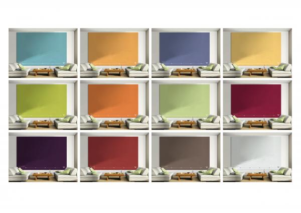
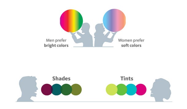
Start with a color palette. Each room in your home should flow from space to space. That doesn’t mean you can’t use color; it just means you need to think about where that color is going to be used and, most importantly, in which tone. That’s what color selecting is all about. A shade is just a lighter or darker version of a color. That isn’t the same as tone.
We’ve all tried to match one shade of beige to another shade of beige without success. Some beiges look pink, others more tan. That’s because every color has undertones. Whites can be tinted with grays, browns, black. It’s that undertone that gives a color warm or cool tones. Start by picking your base color. It has to have a tone that matches the furniture, rugs and accessories that you will be using in that space. No one can afford to start from scratch, so we have to work with what we have.
I’ve been using the same tone base color for my house for over 30 years; a warm soft gold for the walls and creamy white for the woodwork. I’ve changed the shade of gold and white but never the tone. Before I paint a room blue (or any color), I make sure it works with my base color. That allows me to move my furniture and accessories from room to room because I know they will all match. (excellent advice-BL) The gold armchair in my living room is the same tone of gold as the sisal rug that I have in my bedroom, just 2 shades darker. So if I decide to move the chair from the living room to the bedroom, it still matches because they both match my base color.
In my new house, I painted the walls and ceilings in my common spaces with Sherwin Williams Creamy. The woodwork is Pure White. But I used lots of color throughout the rest of the house: The master bedroom in Tidewater blue, another in Repose Gray, an office in Tricorn black, and the laundry room in Crystal Clear aqua with a Lily (pale yellow) ceiling — all Sherwin Williams colors. It all works beautifully together and flows from room to room, because the undertones are right on. These seven colors are my color palette. Nothing comes into my house if it doesn’t match this palette. (Blog viewers, you can go to the Sherwin Williams blogsite to see these colors for yourself-BL)
To determine your color palette, start with what it is that you love in your house. It could be the living room walls, the sofa, a rug in the hallway or your favorite dress or tie. Now start matching up the other items in your house with this “base color.” Do they look dirty, dingy perhaps too green or too blue when held next to your favorite color? If so, they’re the wrong tone for your palette and need to be replaced. Your goal is to eventually get all the colors within your home to work with the base color. Once you do, you’ll have your color palette.
Having a color palette allows you to introduce new popular colors into your existing home without the fear of making a mistake. Don’t be afraid of color. If it matches your base color, you can move from one shade of that color to another with great decorating success.

Wednesday, February 18, 2015

Color Choice in Clothing


Using your color knowledge in selecting clothes:

 Select a core color for the principle clothing items across the family.
 Use accent (second or third colors) colored clothing items from the complementary, triad, analogous or neutral families. Substituting colors from within these same families is fine.
 Determine a neutral color preference that will balance your color scheme.
Some Examples:
 Monochromatic – All one color. Pairing dark blue jeans with different shades of lighter blue tops. If going for monochromatic coordination it is beneficial to add visual interest by varying clothing textures and patterns. As such, the tops may be cable knit, or feature stripes for different color family members to add variety.
 Complementary – Using opposite colors on the color wheel. Sticking with our blue example, we could add orange accessories (jewelry, scarves, tie) to the outfits. The balance between complimentary colors needs to be carefully considered – too much of both will likely be an eyesore. If is possible to reduce this risk by using a complementary color with a paler tint, such as blue with pale gold. The "Rule of Three" might help here. Use shoe, scarf and earrings in the complementary hues.
 Analogous – Using accents in the blue green and green colors. For dad, pair a forest green jacket with blue jeans. Mom might add a blue-green scarf while the kids don an aqua cardigan and a green hat. This could work wonders in a group photo!
 Triad – Triad colors can often appear very bold, so subduing them with less intense versions is often a good idea. To our blue outfit, add pink (from the red family) or cream (from the yellow) accessories for a lovely subdued triad color theme.
 Neutral – Neutrals work well with all colors and may be worn together. Add white accent items or accessories to our blue theme for a classic nautical color theme. Consider adding beige as a neutral if your hair is a light color; black works well if your hair is dark and light grey looks super on those with white or grey hair.

I advocate hanging a color wheel in or near your closet. This is useful information to teach your spouse and/or children.

The Effect of Color on Taste

The color surrounding us as we imbibe is important, as the following article expounds.


I’ve seen several different studies examining the effect of the color of food or a beverage on how it tastes. But this is the first one I’ve seen where they’ve looked at the color of the room in which the tasting is held. This study used wine, but it would undoubtedly be the same for beer, or any other drink. It certainly makes sense that your environment would effect the experience of tasting. Or as this short article in Drinks Business puts it, the “environment in which you experience a wine has a ‘profound’ effect on how you will perceive it to taste.” The study, conducted by Charles Spence, a professor of experimental psychology at Oxford University, concluded that “Lighting and music can act as digital seasoning for food and wine.” I”m not quite sure about sound, but perhaps. Anyway, it brings up all sorts of possibilities about how we taste, and where. I’d certainly like to see more of this kind of research.
colored-rooms
Be careful what room you drink in, especially what color it is.
Guess we will have more information on which are the favorable colors for enhancing our tasting experience. BBL

Wednesday, February 11, 2015

Color Preference by Gender

Color Preferences by Gender

Perceived appropriateness may explain why the most popular car colors are white, black, silver and gray ... but is there something else at work that explains why there aren't very many purple power tools?
One of the better studies on this topic is Joe Hallock's Colour Assignments. His data showcases some clear preferences in certain colors across gender.
It's important to note that one's environment--and especially cultural perceptions--plays a strong role in dictating color appropriateness for gender, which in turn can influence individual choices. Consider, for instance, this coverage by Smithsonian magazine detailing how blue became the color for boys and pink was eventually deemed the color for girls (and how it used to be the reverse!).
Here were Hallock's findings for the most and least favorite colors of men and women:
The Psychology of Color in Marketing and Branding
The most notable points in these images is the supremacy of blue across both genders (it was the favorite color for both groups) and the disparity between groups on purple. Women list purple as a top-tier color, but no men list purple as a favorite color. (Perhaps this is why we have no purple power tools, a product largely associated with men?)
Additional research in studies on color perception and color preferences show that when it comes to shades, tints and hues men seem to prefer bold colors while women prefer softer colors. Also, men were more likely to select shades of colors as their favorites (colors with black added), whereas women were more receptive to tints of colors (colors with white added):
The Psychology of Color in Marketing and Branding
Image credit: KISSmetrics
The above infographic from KISSmetrics showcases the disparity in men and women's color preferences.
Keep this information in mind when choosing your brand's primary color palette. Given the starkly different taste preferences shown, it pays to appeal more to men or women if they make up a larger percentage of your ideal buyers.

Wednesday, February 4, 2015

Art History 101: Palettes of the Past

Before mankind could write, cave paintings depicted concerns of the period.


Ancient world Simple earths
A long long time ago an early human made a deliberate mark with either a burnt stick from the fire or red or yellow clay. The earliest archaeological evidence is about 100,000 years old, but the practice could have started any time in the previous 100,000 years, no one will ever know for certain what the beginnings were or why, but we can be certain for almost all of that time these were the only colors used:
  • Red Earth
  • Yellow Earth
  • Carbon Black from the fire
  • White Clay or Chalk (depending on locality)


Ancient Egyptian Beginnings of technology
Ancient Egypt was not the first civilization, but it appears to have been the earliest with an economic base and organized artistic class that was coupled to an industrial culture of mining and manufacturing on a large scale. The royal court and the temple hierarchy both demanded sophisticated artworks for both decorative and symbolic reasons. Most colors were natural in origin, but Egyptian Blue Frit has the honor of being the first truly synthetic color produced by humankind. Indigo and Madder were both textile dyes which may have had a minor usage in artist's palettes. As dyes both would have behaved more like inks than as the pigment colors we are familiar with today.
  • Red Earth
  • Yellow Earth
  • Carbon Black both from fires (wood) and lamps
  • Gypsum and/or Chalk
  • Malachite
  • Azurite
  • Cinnabar
  • Orpiment
  • Egyptian Blue (Frit)
  • Indigo
  • Madder


Greco-Roman Broadening the color range
The Greeks and Romans extended the industrial approach to colors with new artificial colors such as the Lead based red, yellow and White lead the most important pigment produced until the introduction of Titanium White in 1919. Vermilion was produced from about 1500 BC, although it was inferior to the Chinese Vermilion (developed in the 8th century) we are familiar with. Textile dyes such as Indigo, Madder and Tyrrian Purple were used sometimes especially as glazing colors. With minor possible exceptions this is the full range of colors available.
  • Red Earth
  • Yellow Earth
  • Raw and Burnt Sienna
  • Raw and Burnt Umber
  • Lamp Black and Carbon Black (from wood fires)
  • Ivory Black
  • Chalk
  • White Lead
  • Malachite
  • Green Earth
  • Azurite
  • Egyptian Blue
  • Egyptian Green
  • Verdigris
  • Cinnabar
  • Vermilion
  • Red Lead
  • Dragon's Blood
  • Massicot
  • Orpiment
  • Naples Yellow
  • Indigo
  • Madder
  • Tyrrian Purple


Asia / America Mineral and organic beauty 
Although modern color ranges are mostly descended from industrial revolution products and research there have been important pigments that have originated in Asia and to a lesser extent in the Americas. As it covers many cultures and varying art practices this list puts together pigments and colors that may not have been found alongside each other in daily usage. Many of these colors are still in use in traditional arts from China to the Andes. There seems to have been a greater acceptance of impermanent vegetable based colors in many parts of Asia and the Americas although their localized nature means that few are on this list. It should be noted that some Oriental pigments are used for their textural or other qualities other than as just pure coloring agents.
  • Red Earth
  • Yellow Earth
  • Carbon Black
  • Chinese Vermilion
  • Carmine (Cochineal lakes)
  • Azurite
  • Malachite
  • Indigo
  • Quartz White
  • Mica White
  • Calcite
  • Shell White
  • Saffron
  • Genuine Ultramarine


Renaissance Better binders and ideas for new colors
The development of oil paint changed everything. Previously painting had tended to be mural oriented and water based although the Greeks had developed wax based painting (encaustic) for easel pictures. Oils and then the adoption of canvas meant paintings were used for a wider variety of situations and subject matter gradually broadened. The final understanding of perspective encouraged a greater desire for more realistic effects and illusions. Artist skill levels increased and while only a few new colors were available all colors were used in increasingly sophisticated ways. By the 17th century all the major traditional paint forms (oil, tempera, watercolor, gouache) were being used. This list is complete with the exception of the many plant based colors available but rarely used by the important studios due to their known imperfections.
  • Red Earth (wide variety of versions from dark purplish to light)
  • Yellow Earth
  • Green Earth
  • Ivory Black
  • Lamp Black
  • Vine Black
  • White lead
  • Chalk
  • Malachite
  • Verdigris
  • Azurite
  • Indigo
  • Egyptian Blue
  • Genuine Ultramarine
  • Ultramarine Ashes
  • Cinnabar
  • Chinese Vermilion
  • Red Lead (Saturn Red)
  • Red Lake 
  • Dragon's Blood
  • Orpiment
  • Massicot
  • Naples Yellow
  • Lead-Tin Yellow
  • Gamboge
  • Raw and Burnt Sienna
  • Raw and Burnt Umber


17th, 18th and 19th centuries Discovery rush starts
The industrial revolution lead to many changes in artist's ranges. The good news was that development of new and more permanent colors came, first as a trickle then as a flood as chemists became involved in the search. prussian Blue was the first of these industrially produced revolutionary new colors. The bad news was that as the Renaissance studio system broke down, artists understanding of the permanency and other issues surrounding color suffered. A perusal of Robert Ackermann's offerings at his artists supply shop in 1801 is insightful. Along side the new Prussian Blue is the traditional Azurite (now called Bremen Blue) and various extracts from flowers and berries. Bizarre colors like Mummy existed which was literally ground up Egyptian mummies, or the disastrous Ashphaltum used in the belief it imparted an 'old master' look to pictures.

The 19th century saw the synthesization of Ultramarine and the development of most of the metal based colors with which we are familiar today and the beginnings of the organic color revolution that would sweep the 20th century. 

This list only includes the major new color introductions and most of the colors available during the Renaissance were still available until quite late in this period, in addition to numerous impermanent plant extracts.
  • Prussian Blue
  • Cobalt Blue
  • French Ultramarine
  • Cerulean Blue
  • Mauve
  • Emerald Green
  • Viridian
  • Chromium Green Oxide
  • Cobalt Green
  • Zinc White (Chinese White)
  • Rose madder
  • Alizarin Crimson
  • Cadmium Yellow
  • Chrome Yellow
  • Aureolin
  • Zinc Yellow
  • Strontium Yellow
  • Lemon Yellow (Barium Chromate)
  • Indian Yellow
  • Egyptian Brown (Mummy)
  • Ashphaltum


20th century A permanent rainbow of color at last
The century started with the introduction of the Hansa Yellows and the introduction of Cadmium Red and Titanium White. As the automotive revolution gathered pace vast resources were poured into the color industry in the search for new colors able to withstand permanent outdoor use on cars. Artist's benefited as these high performance pigments became widely available and older more poisonous and impermanent colors started to decline in use. Universal standards such as ASTM accelerated the process.

Hundreds, if not thousands of new colors have become available, especially since 1930. Only the most important new ones to be adopted by artists are listed here.
  • Titanium White
  • Cadmium Red and Orange
  • Quinacridone Reds, Violets, Rose, and Magenta
  • Pyrrole Reds
  • Dioxazine Violet
  • Mars Black
  • Pthalo Blue
  • Manganese Blue
  • Indanthrone Blue
  • Arylide, Azo and Hansa Yellows
  • Pthalo Green


References
Alberti, L B,    On Painting    1435 (Penguin Classics)
Cellini, B,    The Life Of Benvenuto Cellini,    finished 1562 but not published until 1730 (Heron)
Cennini, C d'A,    The Craftsman's Handbook.    1437 (Dover)
Doerner, M,    The Materials Of The Artist And Their Use In Painting,    1921 (Harcourt Brace)
Eastlake, Sir C L,    Materials For A History Of Oil Painting,    1847 (Dover)
Feller, R L,    Artists Pigments    1986 (National Gallery Of Art / Cambridge University)
Gottsegen, M D,    A Manual Of Painting Materials And Techniques,    1987 (Harper & Row)
Maire, F,    Colors: What They Are And What To Expect Of Them,    1910 (Drake)
Mayer, R,   The Artists Handbook Of Materials And Techniques,    fifth edition 1991  (Faber & Faber)
Merrifield, Mrs M P,    Medieval And Renaissance Treatises On The Arts Of Painting    1849 (Dover)
Muther, R,    The History Of Painting From The Fourth Century To The Early Nineteenth Century,    1907 (Putnam)
Parkhurst, D B,    The Painter In Oil   1898 (Lothrop, Lee & Shepard)
Patton, T C,    Pigment Handbook,    1973 (Wiley)
Pliny, The Elder (Gaius Plinius),    Natural History,    77AD (Penguin Classics)
Taubs, F,    A Guide To Traditional And Modern Painting Methods,    1963 (Thames & Hudson)
Theophilus,   On Divers Arts,    1125 (Dover) 
Various,    Encyclopedia Britannica,    fifteenth edition 1981  (Encyclopeadia Britannica, Inc)
Various,    Paint And Painting,   1982,  (Winsor & Newton / The Tate Gallery)
Various,    The Artist's Colourmen's Story,    1984 (Winsor & Newton)
Vasari, G,   The Lives Of The Most Excellent Painters, Sculptors And Architects,    1568 (Penguin Classics)