Wednesday, September 13, 2017

Research on Bees' Eyes Should Enhance Photo Lenses


A team of Australian scientists has unlocked the mystery of how bees can successfully identify colors across varying light conditions, and it involves three extra eyes on the top of their heads called ocelli. The function of these extra eyes has never been fully understood, but new research discovered each ocelli contains two upwards pointing color receptors that can accurately measure the color of ambient light. This allows bees to better identify the true color of an object and target their flower of choice across a variety of light conditions.
One of the researchers mapped the neural tracings from the ocelli and discovered that these receptors are connected to the parts of a bee's brain responsible for color perception. The only question remaining was how these two particular color receptors could allow the bees to interpret the entire color spectrum from red to ultraviolet?
The team built a mathematical model showing that if the ocelli focused on two specific wavelengths, ultraviolet and blue, they could cover most typical light levels a bee would encounter in their natural environment. This model accurately explains why bees cannot successfully interpret flower colors under yellow artificial light and also why bees with blocked ocelli generally forage only in the middle of the day when light conditions are constant.
This research offers a clever, and simple, solution to achieving color constancy across our camera, robotic and drone systems. By incorporating two small, skyward pointing sensors in a camera to register the color of the ambient light, the researchers suggest that an object's true color could be identified across most light conditions.
As well as having benefits for general photography, the technique could prove extremely useful in industrial applications, bringing improvements in machine vision that would sort colored objects, such as ripe fruits or mineral-rich sands, to be identified easily across a variety of complex illumination conditions.
"The strength of this study lies in the combination of modeling, behavioral analysis, and neuro-anatomy," says Professor Marcello Rosa, one of the authors of the study. "It shows how modern, interdisciplinary neuroscience can point to an elegant solution to classical problems in vision."
The team's study was published in the journal Proceedings of the National Academy of Sciences (PNAS).

Wednesday, September 6, 2017

Colorful Foods Contribute to Prettier, Smoother Skin


If you want a smoother, clearer complexion, Jessica Wu, M.D., assistant clinical professor of dermatology at USC Medical School and a dermatologist in Los Angeles, encourages you to toss all these fortifying Feed Your Face foods into your grocery cart.

Tomatoes
Definitely one of your skin’s best defenses, tomatoes contain a powerful antioxidant called lycopene. While studies have not yet been entirely conclusive, many suggest that lycopene may be responsible for helping to protect the skin against sun damage.
Lycopene is best absorbed by the body when it has been cooked or processed, so eating tomato sauce, tomato paste, and ketchup is likely to be more effective than just eating raw tomatoes when trying to safeguard your skin against harmful UV rays. Lycopene is also fat soluble, which means that it is absorbed more easily when consumed with fat, such as eggs, avocado, and olive oil.

Red Meat
Sometimes it gets a bad rap, and even though red meat does contain saturated fat and cholesterol, lean red meat is one of Dr. Wu’s favorite Feed Your Face foods because it’s so high in protein and zinc. In fact, recent studies suggest that red meat may be even better at treating acne than antibiotics.
To produce collagen, your skin needs the amino acids glycine and proline, and the protein in red meat has the highest concentration of these two amino acids. The mineral zinc is also crucial for collagen production. “It’s an essential cofactor,” says Dr. Wu. “Without enough zinc, it’s difficult for the skin to make collagen. Plus, zinc is a natural anti-inflammatory.” And vegetarians don’t need to miss out. Dr. Wu adds that high concentrations of glycine can also be found in seafood, proline in cottage cheese and cabbage, and zinc in lentils, kidney beans, and raw oysters.

Green Tea
It’s no secret that green tea is an antioxidant powerhouse. Its strong anti-inflammatory and anti-aging effects are attributed to its high concentration of catechin compounds. Studies have shown that green tea can be used both orally and topically to help protect the skin from sunburns and UV-associated skin cancers. Research also suggests that drinking one cup of green tea twice a day over the course of six months may actually reverse sun damage and significantly improve any problems you have with redness and broken capillary veins.

Green Beans
As long as we’re going green, let’s talk about how these low-calorie beans can help you grow thicker hair and healthier nails. Green beans are a star Feed Your Face food because they’re one of the richest sources of silicon — not to be confused with silicone, which is found in bad lip jobs and breast implants! The USDA has not yet established recommended daily intakes (RDIs) of silicon, but 10 mg per day seems to be adequate for strengthening hair and nails, according to recent studies. Dr. Wu recommends choosing organic green beans, since they retain more silicon from the soil. Don’t like green beans? You can also get your silicon fix from volcanic mineral waters such as Volvic, which contains 14.5 mg per liter.

Wednesday, August 30, 2017

The Statue of Liberty's Many Color Changes Through Time

The color changes of Lady Liberty


Here's the story of how the Statue of Liberty became that iconic green color—and how it was almost reversed.

As the name of the material would suggest, the statue was originally a 
bright copper color. However, once she was assembled in New York 
harbor, a reaction called oxidation—which is also responsible for rust—
began. Her copper exterior began to react with the oxygen in the air.
That reaction created tenorite, a dark brown-black material. So her 
copper color got darker before it got lighter.
 Completing the chemical makeover, sulfuric acid in 
the air (much of which comes from New York air 
pollution) reacted with the tenorite and the 
oxidized copper, turning the exterior green. By 1906, 
all traces of copper were gone and the statue was 
the color we know today. However, in the early 1900s,
Congress collected money for repairs, suggesting 
that the statue be painted its original copper color—
but people protested, and the “repairs” never 
happened. Thankfully, because we certainly can’t 
imagine this iconic statue being any other color. 
But with all of these reactions, will the Statue of Liberty be changing her
color again anytime soon? Will we see a purple Statue of Liberty? Luckily,
no. The statue’s exterior is finally “stable,” meaning it’s not reacting 
anymore. Green will continue to stand for liberty for generations to come. 

Wednesday, August 23, 2017

Smart Tips for Updating Paint in Your Home

 10 Tips, Tricks, and Fascinating Facts About Paint

 
Paint is all around us, but how much do you really think about it? OK, thinking or talking about paint sounds, well, just about as exciting as watching it dry. But there are actually some cool things to know about what you can paint and how to paint it.
So whether you're just freshening up your white walls or trying something new with an accent color, you should check out these bright tips. We guarantee that after you read this, you won’t think about paint (or painting) the same way again.

1. Smart paint

A lot of institutions, like high schools and prisons, use colors such as taupe for their hallways because it’s known to be soothing (as is a certain shade of pink)—but did you know that some colors are thought to make you smarter? It has been hotly debated whether red and blue can actually affect your ability to take tests. A study from the Journal of Experimental Psychology showed that red has an adverse effect on, say, SAT performance because it tends to make people anxious and more likely to second-guess themselves. Blue, on the other hand, inspires creative thought, because it’s relaxing and cooling and makes you more attentive to details.

2. How to paint without removing the hardware

If you're spray-painting a piece of furniture, it's kind of tricky to avoid the hinges and locks. Here's a great hack: Simply cover anything you don't want to be painted with a generous layer of petroleum jelly, and spray-paint away. When you’re done, simply rub the coated areas with a paper towel and the paint will come right off.

3. Chair lift

Did you know you can paint upholstered chairs? All you need is acrylic or latex paint, fabric medium, and a few more supplies to transform you latest thrift store find into a one-of-a-kind, statement-making piece of furniture. The miracle material is fabric medium, which keeps the paint from drying stiff. For a thorough breakdown of this project, we love this tutorial from DIY Network. Now nothing is stopping you from having that canary-yellow armchair you’ve always wanted!

4. Mind the sun

When deciding on a paint type, consider how much natural light the room you’re painting is going to experience. The more light a wall gets, the quicker the paint color is going to fade. If you can’t find a UV-resistant paint (these are mostly for exteriors), it’s best to go with the generally more durable oil-based paint.

5. How to reduce drying time

As previously mentioned, few things are more boring than watching paint dry—but what if you could speed up the process? Paint dries quickest at 70 degrees Fahrenheit, so if you have to paint when temperatures are less than ideal, it’s a good idea to set your thermostat. Be warned that while higher temps can help paint dry, humidity can undo all that work and actually slow down the process, so check the weather report and plan accordingly.

6. Don't believe the label

Even if you bought them at the same time in the same store from the same guy, no two cans of paint are precisely the same color. The best way to level out the minor differences in shades is to simply mix your cans into one container. If you have two gallons of paint, combine them into one 5-gallon bucket. Once mixed, the subtle differences blend away.

7. Beware! New paint smell = bad for your health

That distinctive scent of a newly painted house is—and we’re sorry to break it to you—really, really toxic. On a typical day, volatile organic compound levels in a home are about two to five times higher than they are outside. But when you paint, those indoor pollution levels could reach up to 1,000 times higher. The good news is that you don't have to vacate your house for a week after painting. Consumer Reports announced a few years back that the federal government was regulating VOC content in paint. There are also brands such as Mythic that boast zero VOCs and an "ultra low odor."

8. Adhere to the 60-30-10 rule

A key rule of thumb for maintaining a balanced color scheme in a room is the trusted interior design equation: 60-30-10. Roughly 60% of your room should be the dominant color (this is generally the wall color). The next 30% should represent a secondary color—accent walls, a painted bookcase, wainscoting, or furniture such as a large-scale sofa. The remaining 10% of the color scheme should be accented with art and accessories.

9. Smart storage

For those times when you need to touch up your walls or furniture, keep an extra can of the original paint on hand. To extend the lifespan of your paint, make sure to store at the optimum temperature range of 55 to 90 degrees. Before you store your leftover paint, close the lid really well (use a hammer to make sure it’s firmly sealed), and then flip the can upside down. This will prevent air from getting into the can.
You can also ditch the metal cans and store paint in separate containers. Just use a funnel to empty the can into an airtight jar.

10. Chill out

Whether you hear a knock at the door or experience arm fatigue, chances are you're going to have to put down your paint roller before you can finish painting the whole room. To keep it from getting all crusty, just wrap the roller in plastic wrap and place it in the refrigerator. The roller will be ready to go when you're ready to keep chugging along.
Eric Alt has been a writer and editor for outlets as diverse as Maxim, Fast Company, Men's Journal, Cosmopolitan, Mental Floss, Inked, "Attack of the Show," and Spike TV, among others. He lives in New Jersey, where he tries desperately to keep his two children from tearing the state to pieces.
 

Wednesday, August 16, 2017

Coloring Post Cards

 Humboldt postcards offer creative fun

Color Me Humboldt postcards were created by local artists Jenna Catsos and Tibora Bea.
Color Me Humboldt postcards were created by artists Jenna Catsos and Tibora Bea. Tibora Bea — Contributed
The Color Me Humboldt postcards feature various local scenes, including the Trinidad Lighthouse.
The Color Me Humboldt postcards feature various local scenes, including the Trinidad Lighthouse.Tibora Bea — Contributed
Sharpen those colored pencils, because Humboldt’s first color-in postcards are making their debut just in time for the summer travel season. The idea was born out of a desire to celebrate Humboldt County, while encouraging creativity. Color Me Humboldt products feature illustrations of the county’s landscapes, attractions, flora, and fauna, created specifically to color and decorate.
Each postcard pack features six illustrated cards printed on thick, high-quality card stock, designed for coloring with a variety of media (pencil, marker, watercolor, crayon). Each pack also includes a set of colored pencils. All materials and packaging are carefully selected with sustainability in mind: compostable packaging; recycled paper with soy based inks; and reused colored pencils from SCRAP Humboldt
Color Me Humboldt is collaboration between Humboldt-based artists Jenna Catsos and Tibora Bea.
You can find Color Me Humboldt postcards through Pen&Pine’s online shop: penandpineshop.etsy.com.

If you've run out of time to order these postcards, use pages from a fun coloring book and print them out on cardstock, cut to standard post card size, buy cute postcard stamps, pack colored pencils and a small sharpener and be on your happy way. This could be a project for youngsters to enjoy as they travel. It could cut down on questions such as "Are we there yet?" BBL

Wednesday, August 9, 2017

Pops of Color Enliven An Overabundance of Concrete Gray

Seattle architecture now

crushes on color


A new building along Madison Credit: Nick Turner for Crosscut
Not too long ago, you could look around the metropolitan region and
lament the absence of color in new buildings. It seemed as if everything
 being built was some version of grayness. Tan and beige tones were the standard go-to hues as the 1990s came to an end. (In dreary climates,
depression increases)
Large expanses of glass often reflected (sometimes literally) the
sky — looking like a uniform, fluorescently lighted ceiling. Each new
 building appeared to extend this limited palette with more walls of pale boredom.
That was before the 2000 completion of the Museum of Pop Culture
 — or MoPOP — the former Experience Music Project. Whether or not one considers it a top-drawer example of architect Frank Gehry’s prolific
body of international work, the structure created a definite splash
on the local scene.
Perhaps it broke the unwritten rule of architectural discretion through
the application of vivid colors, as well as sinuous shapes. It just took a
while for the regime change to fully occur.


As we emerged from the long stretch of depressing weather that broke
records from November onward, we saw that something quite interesting
had happened almost without anyone in Seattle expecting it. With
scaffolding and protective tarps taken down around construction, we
found ourselves seeing colors. Lots of them.

A trend settter? The Museum of Pop Culture, formerly called EMP.
The Museum of Pop Culture, formerly called EMP. Credit: jc_nyc

Along Dexter Avenue, Stone Way, Madison, Seneca and other streets
throughout the city, many new buildings have been enlivened by intense
colors. And not just token swatches or trim but broad brush strokes that
 cover large portions of the exteriors.


In previous years, a handful of designers played with colors. But the
attempts were tentative and subtle. Perhaps a series of projecting bays
 were finished in mustard yellow. But not much more.
Likely, the reticence was the result of development clients being fearful
 of making a “wrong” choice in the marketplace — safer to stay with
muted color scheme.
Moreover, the specification of colors can be fraught with hazards. What
might look good on a small sample or in a simulated rendering could turn
out quite different in the full-scale presentation. And, by then, of course,
the work has been bought and paid for.


Some of the past reluctance to add color to architecture might have
 come from the region’s roots in Scandinavia, where politeness and
deference is often the cultural norm. But for decades, buildings in
Scandinavian countries have used intense colors to create a unique
ambience in spite of their more adverse climates. For whatever reason,
Seattle has come late to the game.
But now, color is on us almost with a vengeance. Even temporary
construction enclosures on high rises are showing up with bright yellows
and blues. The increasing verticality of the city is being celebrated by
these rising collars of color.


New townhomes tend to make bolder use of colors. Credit: Nick Turner

And color has come not just in flat-painted surfaces. It has been infused
in glass. The clutch of towers for Amazon around Seventh Avenue and
Lenora Street fairly bristle with blades of colorful glass. Light passing
through them produces different effects depending on sun angle and sky atmospheric conditions, as well as with ambient light in the evening.
We are seeing a wholesale playfulness in infusing the skyline with
combinations of color.

Wednesday, August 2, 2017

Red, the Feel Good Color


Is your outfit falling flat today? Perhaps not giving you the confidence you want? Well, it’s time to mix things up and add this color to your wardrobe.
What color? Red.
A new study has found that both women and men who wear red feel more physically attractive. Apparently, the bold color gives us all a nice little confidence boost.
The study, published in the European Journal of Social Psychology, saw researchers from Germany ask 180 university students to wear either a red or a blue shirt. (Side note: the students had no idea what they were being asked.)
Then, the students checked out their reflections in mirrored cubicles, as well as completing a survey that included questions about how hot they thought they looked.
The end result: those who wore red rated themselves higher in attractiveness compared those in blue. They also rated themselves higher in sex appeal.
Researchers did note that introverts who shy away from attention could view themselves differently wearing red. And that attractiveness might not last forever.
Modal Trigger
Olivia Wilde[/caption]
AFP/Getty Images
“We need to investigate if and how different personality characteristics interact with the effect,” study author Anne Berthold, a researcher from the University of Zurich, told PsyPost. “Also, it might be possible that the effect disappears when someone wears red every day.”
The other kicker: it might not be the color that makes us feel more attractive, but the fact that it’s an attention-grabbing shade.
Despite the if’s and but’s, we reckon you should test the theory out for yourself.

Wednesday, July 26, 2017

Learn Which Colors Affect Your Moods

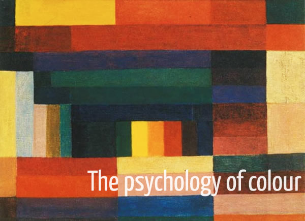
Psychology of color: how it can help bring you in the right mood!

by SYLVIA
psychology of colour
“The deepest and truest secrets of colour effect are invisible even to the eye and are beheld by the heart alone”
Johannes Itten
Isn’t colour just the most wonderful thing?  Doesn’t a place look that much nicer when you add a bit of colour?
Colour can also really influence your mood. And as such you can use it as a tool to influence it. We tend to pick our clothes each morning for the mood that we are in. If I am feeling particularly happy I will normally choose something colourful to wear. And if I”m feeling a bit down, I will probably want to hide a bit from the world and would go for something black.
But what if you did the complete opposite?
Instead of choosing the color matching the mood that you are in, go for a colour that will enforce the mood that you want to be in.
Now I know that this can be very hard to do, because if you are feeling depressed the last thing you want do is to appear happy. But if you are determined to not let that depresssive mood get the best of you and rule your day, try to do it anyway.
 Go for something with yellow instead of the all-black outfit. It is very hard to keep feeling depressed or sad when you are wearing yellow. Just like it is very hard to feel depressed if you stand up straight and hold your head up high.
So let’s have a look at what effect certain colors have on you, so you can pick the right color for the kind of mood you want to be in.

Black

Black is the color of authority and power, stability and strength. It is also the color associated with intelligence (think of the black robe you wear at graduation). It’s a somber color sometimes associated with evil. In the western hemisphere black is associated with grieving. Black is a serious color that evokes strong emotions; it is easy to overwhelm people with too much black.
Wear it to feel powerful or mysterious

White

For most of the world this is the color associated with purity (wedding dresses); cleanliness (doctors in white coats) and neutrality. In some eastern parts of the world, white is associated with mourning. White is associated with creativity (white boards, blank slates).
Wear it for more mental clarity.

Gray

Gray is mostly associated with the practical, timeless, middle-of-the-road, solid things in life. Too much gray leads to feeling mostly nothing; but a bit of gray will add that rock solid feeling. Some shades of gray are associated with old age, death, taxes, depression or a lost sense of direction. Silver is an off-shoot of gray and often associated with giving a helping hand and strong character.
Wear it to feel more solid.

Red

Red is the color of energy. It’s associated with movement and excitement. People surrounded by red find their heart beating a little faster. Red is the symbol of life and, for this reason, it’s the color worn by brides in China. Red is used at holidays that are about love and giving (red roses, Valentines hearts, Christmas, etc.)
Wear red when you want to have lots of energy and confidence.

Pink

Pink is the true color of love . Pink is the most calming of all colors. Think of pink as the color of romance, love, and gentle feelings, to be in the pink is to be soothed.
Wear pink to feel more loving.

Blue

Blue is a a calm and restful color.  Seeing the color blue actually causes the body to produce chemicals that are calming. However, some shades (or too much blue) can send a cold and uncaring message. Over the ages blue has become associated with steadfastness, dependability, wisdom and loyalty (think of the many blue uniforms). People tend to be more productive in a blue room because they are calm and focused on the task at hand.
Blue is good to use when you want to calm yourself or be more intuitive.

Green

The color of growth, nature, and money. A calming color also that’s very pleasing to the senses. Dark forest green is associated with terms like conservative, masculine and wealth. Hospitals use light green rooms because they too are found to be calming to patients. It is also the color associated with envy, good luck, generosity and fertility. It is the traditional color of peace, harmony, comfortable nurturing, support and well paced energy.
Use green to feel more relaxed and ease your anxiety.  If offers a sense of renewal and harmony.

Yellow

Cheerful yellow is the color of the sun, associated with laughter, happiness and good times. A person surrounded by yellow feels optimistic because the brain actually releases more seratonin (feel good chemical in the brain) when around this color. It is the color associated with optimism. It has the power to speed up our metabolism and bring out some creative thoughts. Some shades of yellow are associated with cowardice; but the more golden shades with the promise of better times.
Wear yellow to feel more optimistic, mentally stimulated and creative.

Orange

The most flamboyant color on the planet! It’s the color most associated with fun times, happy and energetic days, warmth and organic products. It is also associated with ambition. There is nothing even remotely calm associated with this color. Orange is associated with a new dawn in attitude.
Use orange to stimulate activity and socialization.

Purple

Purple is royalty. A mysterious color, purple is associated with both nobility and spirituality.  It stimulates the brain activity used in problem solving. However, when overused it is associated with putting on airs and being artificial. Use purple most carefully to lend an air of mystery, wisdom, and respect.
Wear it to feel spiritual, calm and creative

Brown

This color is most associated with reliability, stability, and friendship.  It’s the color of the earth itself. It is also associated with things being natural or organic. In India, however,  it is the color of mourning.
Use it when you want to feel wholesome and stable.
Think of colour as another tool you can use to influence how you feel. When used effectively it can really brighten up your day.
“Colour is a means of exerting a direct influence on the soul. Colour is a keyboard, the eyes, the hammers and the soul is the piano with many strings. The artist is the hand which plays, touching one key or another purposively to cause vibrations in the soul.”
Wassily Kandinsky

Wednesday, July 19, 2017

Color-changing Tattoos Monitor Health

Another use for colors!


Color-changing tattoos aim to monitor blood sugar, other health stats


MIT researchers are in the early stages of developing biosensing tattoo inks with the hope that one day they might help monitor blood sugar levels and other health data.
 MIT MEDIA LAB
For many people with diabetes, keeping tabs on blood sugar every day is expensive, time-consuming and invasive, but researchers at MIT and Harvard are exploring a creative new approach that could one day help make things easier: biosensing tattoos.
The scientists have developed special tattoo ink that contains chemicals that can sense blood sugar levels, pH, and sodium. When blood sugar goes up, for example, the glucose sensing ink changes from blue to brown. When a person's salt levels increase, the sodium sensing ink becomes a more vibrant green under UV light. When alkaline levels shifts, a pH sensor changes from purple to pink.
The DermalAbyss ink – still in what scientists call the "proof-of-concept" stage – alters its hues in response to changes in the fluids inside a person's body, MIT Media Lab researcher Xin Liu told CBS News. It literally becomes an interactive display.
"People with diabetes email us and say, 'I want to try it out,'" Liu said. 

But the technology is still in the very early research stage, Liu points out, and has only been tested on pig skin samples, not living, breathing animals – let alone humans. Liu said there are a lot of unknowns in testing it on living skin, including questions about allergies, accuracy, and durability.For someone with diabetes who has to prick their finger multiple times a day to test their blood sugar level, or who wears pricey blood glucose monitoring equipment that can be cumbersome during activities like swimming, glancing down at a tattoo to check if blood sugar has dropped or spiked could be a lower-maintenance approach to health monitoring.
"It will take a long time for anything practical to go to market, but it [the technology] evokes imaginations and opens up possibilities," said Liu.
For some, the idea of a decorative new tattoo that reflects your body chemistry may be appealing. But mostly, the scientists say the goal is to make monitoring of health data easier, safer and as accurate as possible. 
"People want to understand what's happening in their bodies," Liu said.