Wednesday, January 29, 2014

Researchers have developed "smart" holograms that can be used to detect health conditions and monitor diseases.
Researchers at University of Cambridge have developed holographic sensors that
 can be used to detect and monitor health conditions and diseases.
The “smart” holograms change color when they come in contact with certain 
compounds and they are being developed into cheap and portable medical devices
 and tests that can prove useful especially in developing countries where 
diagnostic tests can be costly.
The holographic sensors can be used to test a person’s breath, saliva, urine,
 blood, or tears for a wide range of substances like glucose, hormones, alcohol,
  drugs, or bacteria. The color-changing holograms can be checked against a color
 chart or possibly a smartphone camera — allowing people to monitor their medical
 progress on their own and without the need for expensive equipment.
smartholograms-2
Department of Chemical Engineering  Biotechnology Phd student Ali Yetisen, who 
led the research, said,
Currently, a lot of medical testing is performed on large, expensive equipment. 

While these sorts of inexpensive, portable tests aren’t meant to replace a doctor,

holograms could enable people to easily monitor their own health, and could be useful

for early diagnosis, which is critical for so many conditions.
The holograms are made of a highly absorbent material called a hydrogel, 
impregnated with silver nanoparticles. The silver nanoparticles are formed into 
3D-holograms using a single laser pulse. When they come in contact with 
certain compounds, the holograms shrink or swell, causing them to change color.
The holograms are currently being tested to monitor glucose levels and urinary 
tract infections in diabetic patients at Addenbrooke’s Hospital. The research team 
is also developing a smartphone-based test.
A paper on the research was published on the Advanced Optical Materials journal 
earlier this year.
smartholograms smartholograms-3
Source, Images: Gizmag

Colors on the Wild Side


Photo by Matt Pelikan
A most clever adaptation: the coloration of hover-flies has evolved to mimic that of wasps, to deter would-be predators.
Color has been much on my mind lately. I've noticed the first hints of color in foliage, brought on by shortening days and the first strong cold fronts of the season. I just bungled a bird ID, mistaking iridescent black feathers for truly blue ones. And the other evening, a passing rain shower with breaking clouds behind it produced that most beautiful and useless of all natural phenomena, a rainbow.  Sometimes it helps us, sometimes it fools us, and sometimes it just makes the world a prettier place. Let's give it some thought.
First, it's a little bit amazing that we can see colors in the first place. In biological terms, it's much more complicated for an eye to distinguish among colors than simply among different intensities of light. The fact that so many organisms take the trouble to develop organs that can see color shows how useful this type of perception can be.
To be sure, there are colors that derive from basic physical laws, enriching the world for humans perhaps but not actually not meaning anything. That rainbow is a fine example: it isn't even really there, existing just as a sort of optical hiccup. Light waves of different lengths bend different amounts when they pass through water droplets; our eyes and brains perceive different wavelengths as different colors. So, inevitably, when sunlight hits raindrops in the right way, a spectrum of colors unfurls in the human eye. It's a classy touch, but there isn't any pot of gold at the end. There isn't even an end.
You might add the subtle coloration of stars to this class. Basic physical factors such as mass, age, and chemical composition determine what kind of nuclear reactions are taking place in a star. That in turn determines the star's temperature and the wavelengths of the radiation it emits (including visible light). And it follows that we see stars ranging from, say, the red of Betelguese to the intense blue-white of Rigel (winter stars, both of them, but already visible in the eastern sky if you're up late enough, or early enough).
But most of the colors we see are in some way related to function. Take the onset of colorful foliage in the fall, for example. The effect, from our perspective, may be purely ornamental. But deciduous trees are all business. The short days and low sun angle of winter don't add up to enough solar energy to make effective photosynthesis possible. And with the onset of cold weather, leaf tissues, easily damaged by freezing, become a liability. So trees shut down their photosynthetic machinery. Levels of chlorophyll, the green pigment that captures the energy of light, begin to drop, and other pigments present in the leaves begin to show. Voila: swamp maple and yellow aspens for us to enjoy. The plants, however, gain little or nothing from the show — they're mainly being practical and cutting their losses.
But color often has meaning, serving as a cue of some kind. In animals, the message is often a social one, broadcasting your identity as a particular species or advertising your suitability as a mate. In many birds, for example, the intensity of plumage coloration in males seems to be relate to how desirable females find a particular male. And in general, markings that help members of the same species recognize each other is an enormous time-saver, preventing wasted efforts to mate with or chase away a member of a different species. Birders, of course, rely heavily on color — though, as a field mark, color is often more variable and hence less reliable than other factors, like structure and vocalizations.
The target of color cues may, though, be a different species altogether. Many flowering plants, for example, take the trouble of producing colorful blossoms not for their own direct benefit (plants don't have eyes!), but rather to signal the availability of resources — pollen and nectar — to insects. Visiting one colorful flower and then the next, these insects "pollinators" transfer genetic material from one flower to another and assist the plants' reproduction.
Even among animals, the intended recipient of a color signal may be an unrelated species. Many species of wasps and bees, for example, sport a snappy black-and-yellow pattern that serves as a warning sign to any potential predator that has been stung once before (or has evolved an instinctive aversion to black-and-yellow). And in a singularly elegant evolutionary touch, many other insects that lack the ability to sting have nevertheless evolved wasp-like color schemes. The resemblance of some harmless flies to yellow-jackets, for instance, can be utterly convincing to a casual observer, letting the flies putter about with impunity while sailing under false colors.
Sometimes important, sometimes useless; sometimes an important signal, sometimes a bit of deception or mis-perception. We take colors for granted and interpret them constantly, usually without thinking. But there is a lot more going here than meets the eye.

Wednesday, January 22, 2014

Niki de Saint Phalle

Queen, by Niki de Saint Phalle located in Kit Carson Park, Escondido, California


I have always admired the work of Niki de Saint Phalle, especially her large, colorful sculptures of fanciful women which she called Nanas.


Niki de Saint Phalle (1930-2002)
Niki de Saint Phalle was born in Neuilly-sur-Seine, Hauts-de-Seine, near Paris, to Count AndrĂ©-Marie Fal de Saint Phalle, a French banker, and his American wife, the former Jeanne Jacqueline Harper.  After being wiped out financially during the Great Depression, the family moved from France to the United States in 1933, where her father worked as manager of the American branch of the Saint Phalle family's bank.

Saint Phalle enrolled at the prestigious Brearley School in New York City, but she was dismissed for painting fig leaves red on the school's statuary. She went on to attend Oldfields School in Glencoe, Maryland where she graduated in 1947. During her teenaged years, Saint Phalle was a fashion model; at the age of eighteen, she appeared on the cover of Life (September 26, 1949), and, three years later, on the November 1952 cover of French Vogue. 


At eighteen, she eloped with author Harry Mathews, whom she had known since the age of twelve, and moved to Cambridge, Massachusetts. While her husband studied music at Harvard University, Saint Phalle began to paint, experimenting with different media and styles.

Niki with her work

Niki and her husband divorced in the 1960s. She met the American artist Tinguely while working on a joint project in Paris. The two artists married in 1971. Her only American sculpture garden is located at the Kit Carson Park in Escondito, California.

Later in life she moved to California. She was awarded Honorary Citizen of Hanover, Germany after she donated over 300 sculptures to the art museum located there.


Wednesday, January 15, 2014

Literature and Color


In the novel The Wonderful Wizard of Oz the colors emerald and yellow are mentioned a countless number of times. Considering the book centers around taking the Yellow Brick Road to Emerald City, that makes a lot of sense. But L. Frank Baum’s novel is full of references to color that are not quite so obvious (Tin Man, ruby slippers, the “great gray prairie”). Jaz Parkinson, an art student from England, was curious about how the written imagery in the work would translate into color, so she decided to chart the color signatures of some of her favorite books.
Using the color-related data pulled from novels, Parkinson visualized how famous books would look if you could only read them through a visual signature. “I think the charts are beautiful and informative, which is a very special mix of the subjective and the objective,” she says. “They reveal a new dataset which hasn’t been associated with the book before.”
Parkinson’s images are a fascinating look at an author’s use of description and color and how that relates to the themes in a novel. For books like Antoine de Saint-ExupĂ©ry’s The Little Prince, Parkinson used the accompanying watercolor illustrations as data, which made for a gorgeous array of colored bands. And while the ominous mood of Cormac McCarthy’s The Road is reflected in the predominantly dark visual signature, there are still mentions of color like “glistening peaches” and “iridescent orange fire.” Interestingly, the title often had little impact on the book’s signatures, with novels like The Color Purple barely registering purple on the spectrum, and A Clockwork Orange being mostly red.
When I first saw Parkinson’s visualizations, I just assumed she used an algorithm to gather all of the color data in a book. Surely, she didn’t go through each novel line by line, marking down every time the author referenced or evoked the idea of a color. I was wrong. “I just read through the book, a physical copy or an ebook, and just note in MS Excel in a table whenever a color is evoked in the mind,” she says.
Parkinson says The Little Prince is the most romantically colored of the books she’s visualized, likely because of its watercolor illustrations. Though Parkinson’s image is an accurate reflection of the book’s charming nature. Image: Jaz Parkinson
Parkinson explains that for a book like The Color Purple, any direct mentioned of a color, like yellow, blue or brown, will get a tally. More obscure references like “hair the color of silver and dry grass” and even imagery that evokes a color like “sunshine,” “smoke” and “blood” get tallies in Parkinson’s Excel form, too. “I am interested in the precise moment when reading a word or phrase converts from shapes on a page to a definite, almost tangible color in the mind,” she says. “This human connection to the colors is much more effective than using an algorithm or a program.”
Once Parkinson has all of the color data from a book, she organizes the colors into a spectrum of horizontal bars. “I find it absolutely irresistible to order them into a spectrum. It is kind of like when you have coloring pencils when you’re little, and they come in color order — they just look right,” she says. Charting them by color allows the visualizations to hint at the dominating mood and overarching themes in a book. She toyed with the idea of organizing the colors into a grid, and she often hears that she should consider organizing the colors chronologically, sort of like a book version of movie barcodes. “However, I’m interested in color, and I want this to be the only factor in the charts, making them as minimal and color-based as possible,” she says.

Tongue-in-Cheek Decorating Advice

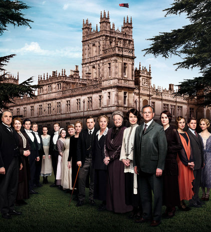
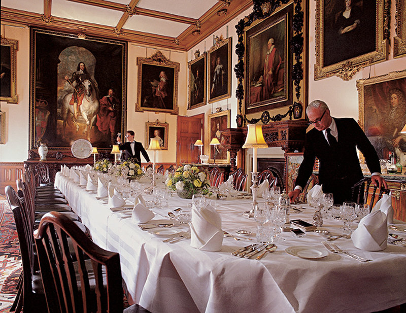
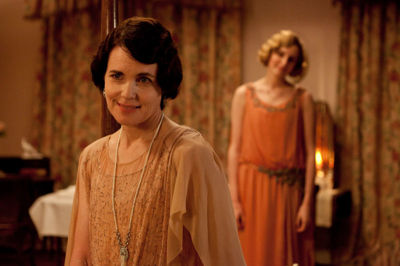
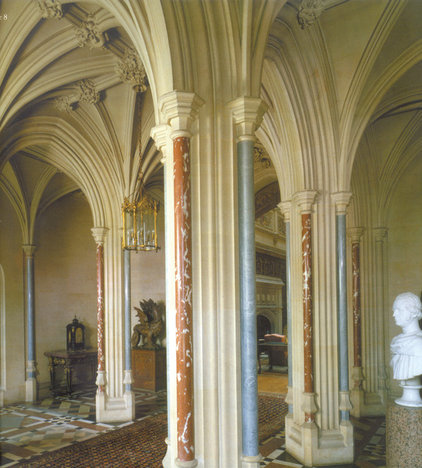
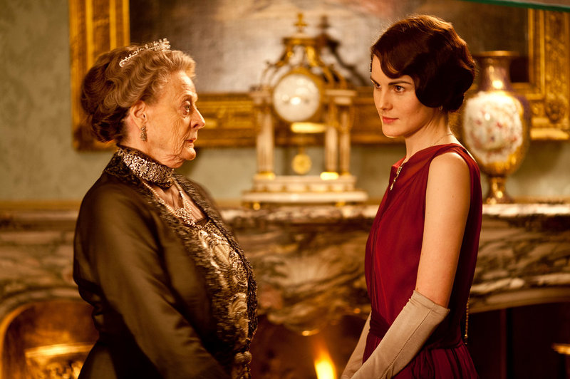
Just for fun, imagine that you had the Crawleys money to use for decor and entertaining!


Wednesday, January 8, 2014

Tobi Fairley on Color

I saw Tobi's blog in August and had to share. She must love color as much as I do. Her examples of rooms shown below highlight color with lots of courage. I find them delightful. I hope you enjoy them as much as I did. She asks what is a favorite, and my answer has to be "All of them!"


Just about any pop of color can take a room to a different level. I can hardly decide which color is my favorite to pop in. Luckily over the last few years Pantone, the respected color institute, has been helping to guide us with their Color of the Year including this year’s color, Emerald.
And though I love their expert opinion,  I’d like to hear from you…which color is your favorite to pop into a space and why?
IMG_1303
Is it Orange like I used in my Living Room? This citrus-y hue looks great any time of year. And if it’s good enough for Sinatra and Hermes, well…
0397b6542ee96aa53cbad21eb947dadd
Or maybe Green, like this year’s Emerald craze? Green is definitely on the top of my list. Particularly this space from the pages of House Beautiful. Is it on yours?
56adfba79d2ae51ade86a189d8b22d5d
Or how about Yellow? This gorgeous design by Nick Olsen makes me want to make my home sunny all year long.
37d6c4d39a7640bb85515465d112804c
Everyone’s mad about blue. Is it your favorite hue? I love this chic Marrakech space recently featured in Elle Decor by Caitlin Dowe Sandes.
6149165cc2c09ca5aaa8b8f1ef9ef329
Red is making a come back. Or did it ever go out? Do you want to infuse this hot color in your space? It’s hard to go wrong with a classic Scarlet shade as evidenced by this spread from Traditional Home Magazine.
d7da56d305842f7e64a9edd45535478d
Or a softer version might be your cup of tea. I’ve always been a pink girl myself. Can you cozy up to this Feminine tone?
1af0667f1a57fa77ea5d32a501c1e639
And finally purple. Never my favorite color in the past, purple has been making strides with me, particularly shades of Lavender and Orchid. This Atlanta Homes and Lifestyles spread certainly makes purple pop!
So tell me, which color is your favorite to infuse into a space? I can’t wait to hear what you think.
xo,
Tobi Signature
- See more at: http://tobifairley.com/blog/2013/color-cues-which-do-you-love/#sthash.YUphEpet.dpuf

The Meaning of Color in Early Christian Art

Crusaders


Early Christian Art Symbols - The Meaning of Colors
The The Symbolism of Colors represent many different items of sacred significance. The 
meaning of the different are highly significant and are detailed as follows:

White symbolizes Purity, virginity, innocence and virtue. It also symbolises holiness and is 
the Christian color for all high Holy Days of the Church Year, especially the seasons of 
Christmas and Easter

Yellow colors symbolize renewal, hope, light and purity. Yellow is the Christian color for the
 season of Easter when used with white. When taken as an off-white color symbolizes 
degradation or cowardice

Orange colors symbolize courage, endurance and strength representing fire and flame

Green colors symbolize nature, fertility, hope and bountifulness. Green symbolizes freedom 
from bondage. Green is the Christian color for the season of Epiphany

Red colors symbolize the Holy Spirit and is the color of Pentecost. Red also represents fire and 
is associated with power and importance. Crimson red also symbolizes the presence of God 
and the blood of martyrs. It is the Christian liturgical color for Pentecost and 
represents atonement and humility

Black colors symbolize death, fear and ignorance and was also used to indicate authority
and power. The color black is associated with Good Friday.

Brown colors symbolize the earth, poverty and humility and closely associated with monastic life

Blue colors symbolize heavenly grace. The Virgin Mary is often depicted wearing blue 
clothing. Blue also represents hope, good health and the state of servitude

Purple colors are always associated with Royalty, Purple togas were worn by the powerful 
Roman Emperors. The symbolic meaning of the color purple was for penitence and mourning 
and is the liturgical color for the seasons of Lent and Advent