Wednesday, June 24, 2015

The Color Brown

Brown can make a bold statement or be a low-key sidekick to brighter hues in decor or in clothing. Brown is a blend of Red, Yellow, and Blue, the primaries.
:That's why every color goes with brown" says Interior Designer Elaine Griffin. She is a huge fan of this hard working neutral.
"If you use dark brown paint, walls become the star and the other objects play second fiddle; with light brown walls, the reverse is true."
One of the psychological aspects of brown is that it makes people feel safe, comfortable, grounded and at ease---all good things for cocooning.

Another take on naming colors, discusses brown:


Why We Love "Mocha" but Hate "Brown"

Although different colors can be perceived in different ways, the names of those colors matters as well!
According to this study, when subjects were asked to evaluate products with different color names (such as makeup), "fancy" names were preferred far more often. For example, mocha was found to be significantly more likable than brown--despite the fact that the researchers showed subjects the same color!
Additional research finds that the same effect applies to a wide variety of products; consumers rated elaborately named paint colors as more pleasing to the eye than their simply named counterparts.
It has also been shown that more unusual and unique color names can increase the intent to purchase. For instance, jelly beans with names such as razzmatazz were more likely to be chosen than jelly beans names such as lemon yellow. This effect was also found in non-food items such as sweatshirts.
As strange as it may seem, choosing creative, descriptive and memorable names to describe certain colors (such as "sky blue" over "light blue") can be an important part of making sure the color of the product achieves its biggest impact.
version of this article first appeared at HelpScout.net.

Wilmington, Del.,-based Gregory Ciotti is the marketing strategist at Help Scout, the invisible email support software for small businesses. He also writes about behavioral psychology at his blog Sparring Mind.

Wednesday, June 17, 2015

Store Color Affects Your Shopping

How many of us notice the wall colors in the stores where we shop? I was guilty of ignoring it until I read the following article. I feel the more insight we have about retailers' use of color to influence our purchases, the better equipped we are to resist impulse purchases. It keeps money in our pocketbooks when we are aware!


Shoppers most often choose what they buy based on color. In fact, it can account for up to 85 percent of the reason people buy one product over another, according to the Color Marketing Group, a professional organization for color designers in Alexandria, Va.
Color's influence on consumer behavior isn't confined to just merchandise. The colors surrounding customers while they're shopping also can influence whether they make a purchase. "Colors in a store format can create different emotions and store retailers can use that," says Rich Kizer, a St. Charles, Ill.-based retail design consultant.
Here are five ways store colors can affect the shopping experience and help turn browsers into buyers:
Five Ways Store Colors Can Influence Shoppers
Quiltique in Henderson, Nev., is decorated in an antique garden theme, with found objects like chairs and window frames providing accent colors.
Photo by Quiltique
1. Tell a story with color. Rather than simply select colors you like, it can be more effective to start with a theme and choose colors that represent that concept. For example, you could capture the essence of the beach with colors reminiscent of sand, water and sunshine. That would transport customers to an environment they associate with relaxation and enjoyment and make them want to stick around your shop longer.
"There are hardwires we have about colors," says Jill Morton, a Honolulu-based color psychologist and brand identity expert. "Blue is associated with water, green with grass, red is fire."
When Jennifer Albaugh chose a color scheme for Quiltique, her Henderson, Nev., sewing and quilting supply shop, she first decided on the theme of antique gardens. This prompted her to find colors that suggested garden spaces, rather than pick random paint swatches at the hardware store. She painted her walls celery green and used a brick red accent to call to mind foliage and garden pots.
Five Ways Store Colors Can Influence Shoppers
Accessories from the Heart in Oswego, Ore., uses a burnt orange color for the walls and floor to create a warm, welcoming environment.
Photo by Sarah Fenwick
2. Comfort and calm customers.Warm colors like oranges and browns are inviting and reassuring to shoppers, while cooling colors like green and blue can have a calming effect, says Georganne Bender, a partner and retail consultant with Rich Kizer.
"Orange makes you happy," she says. And happy customers are more likely to linger longer in your store. When Carol Winston moved her Lake Oswego, Ore., women's shop, Accessories From The Heart, to a new location, she decided to change the white walls to burnt orange. At night, under the store's halogen lighting, the interior gives off a warm calming glow.
"When it gets dark, the store looks like a jewelry box," Winston says. "It's really inviting." 
3. Alert your shoppers to certain products. Bright colors like yellow and red grab customers' attention, stopping them in their tracks before they breeze by a product display. That's because yellow is the color first perceived by the retina, according to Linda Cahan, a West Linn, Ore., retail design consultant. Red, of course, has long been associated with stopping, whether it's on a traffic signal, emergency vehicle or store design.
"People buy more when there is red," Cahan says.
But use these bold colors sparingly. Too much red will agitate shoppers, Bender warns. She recommends making bright accent colors no more than 20 percent of your store's overall color scheme.
Five Ways Store Colors Can Influence Shoppers
Wet Nose's periwinkle logo color is brought out in the store design, from the color of the ceiling to decorative ribbons around products.
Photo by Wet Nose
4. Build brand recognition. Colors can increase brand recognition by 80 percent, according to a 2007 study by psychology and management researchers at the University of Loyola, Maryland. Finding a way to work your logo colors into your retail design will help customers associate those colors with your company. But think beyond just the paint on your walls.
At Wet Nose, a pet shop with two locations in the Chicago area, owner Sheila Spitza draws inspiration from the shop's periwinkle logo. The ceiling is painted a rich purple, while merchandise tags, business cards and tissue paper match the lighter purple of the logo. A customer once told Spitza she spotted a little girl at a party wearing the shop's decorative periwinkle ribbons around her pigtails.
"I wanted to use a color that was unique and could be identified with Wet Nose," Spitza says.
5. Highlight rather than overpower your product. Be careful not to drown out what you're selling by immersing it in too much color. "In retail, you want the merchandise to pop and not the surroundings," Bender says.
If you are selling lingerie, for example, bold colors could work against the delicate quality of the product. Similarly, if you are selling electronics, too many bright, flashy colors can detract from your product's clean sleek look. Because Quiltique sells particularly busy and bright patterns, Albaugh limited the store's main color scheme to celery green and brick red to avoid overpowering the quilts on her walls. She worked other colors in more subtly by using found objects like a distressed turquoise bookcase and yellow antique gate as display pieces—all in keeping with her antique garden theme.
"You don't want to have explosive color [that] is irritating to the customer," she says. "We incorporate bright cheerful colors…It brings so much life to the store."


Jane Porter is a freelance writer and editor based in Brooklyn, NY. You can find more of her work at Janeroseporter.com

Wednesday, June 10, 2015

Scale Affects Our Emotions

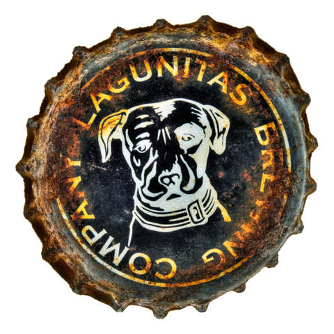
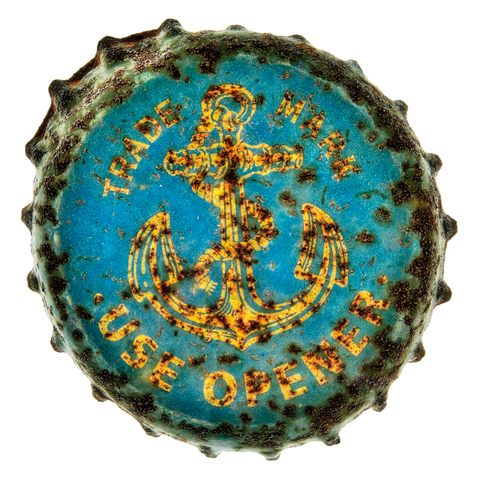
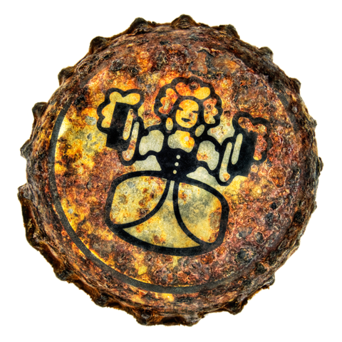
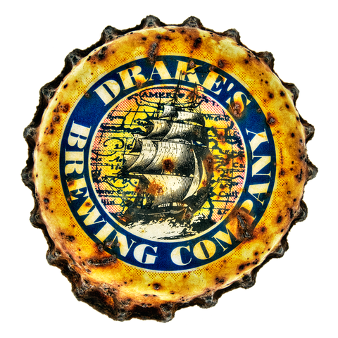
An ingenious photographer had a brainstorm about enlarging the art on beer bottle caps, rust and all. There is something about large, familiar items that draws us in emotionally and many artists have capitalized on this phenomenon. Andy Warhol was one of the first to catch on to this trick.

Imagine these prints hanging above your bar. Many have excellent icon art, they are easy to recognize, and certainly deserve more than a quick glance.

I have known several collage artists who collect bottle caps and use them in their mixed-media art works. My kudos to the clever photographer who thought to blow up the miniature works of art. Now, I will study tiny throw aways to appreciate their artistic merit.


Rusty Crowns As Art


anchor-rusty-cap
I meant to write about these before, but they got away from me. British photographer — and current Bay Area resident — Charly Franklin is making some amazing art … with rusty beer caps. And not just rusty, but “rusted, bent, discolored and generally distressed.” He’s taking very detailed photos of these crowns and blowing them up large, over three feet in some cases, which gives them almost an otherworldly appearance. Or in Charly’s own words, an “extraordinary quality and graphic dynamic that looks amazing.” And I have to agree. The patina of the rust, along with the colors and texture of the bottle caps looks really cool. Check out some samples.
Here’s a black crown from Lagunitas:
rusty-crown-lagunitas-black
And one from Anchor:
rusty-crown-anchor
Check out the catalog of over 200 different available crowns from breweries around the world, but with quite a few from California and many craft breweries.
Here’s one from Trumer:
rusty-crown-trumer
And other of Sierra Nevada’s Hoptimum:
rusty-crown-hoptimum
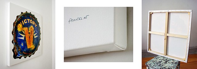
Prints are available on framed canvases, in five sizes, including 18×18, 24×24, 30×30, 36×36 and 40×40 inches. Shipping is free within the U.S.
rusty-crown-framed
Finally, here are two more, starting with Bear Republic:
rusty-crown-bear-republic
And here’s Drake’s:
rusty-crown-drakes

Wednesday, June 3, 2015

Art History 101: Georgia O'keefe and the Influence of Zen Buddhism

Georgia-O-Keeffe-Portrait.jpg - Photo by Fred Stein/Archive Photos/Getty Images
Portrait of Georgia O'Keeffe(1887-1986).  Photo by Fred Stein/Archive Photos/Getty Images
Georgia O'Keeffe (Nov. 15,1887-March 6, 1986) is most well-known for her large-scale paintings of flowers as well as for her paintings from New Mexico of the landscape, sunlight, and natural forms of the American southwest - rolling hills, sun-bleached animal bones, wildflowers. Although following a singular vision, she was influenced by the culture and times in which she lived, both in what she rejected and in what she absorbed and embraced. 
Influence of Zen Buddhism
O'Keeffe rejected the traditional realism that was being taught in art school at the time and turned instead to a more abstract style, which although still based on representation,enabled her to express her feelings about what she was painting.  Japanese Art and Zen Buddhism played a large role in her approach to her art.


According to the PBS website, Georgia O'Keeffe, About the Painter/American Masters/PBS,  "Teaching in South Carolina was Arthur Dow, a specialist in Oriental Art. Dow’s interest in non-European art helped O’Keeffe move away from the forms she had found so stifling in her previous studies. She said of him, “It was Arthur Dow who affected my start, who helped me to find something of my own.”  O'Keeffe had abandoned making art in her early 20's because it had no meaning for her, and it was the influence of Dow that brought her back to painting.
In her revealing, insightful, and thoroughly engaging book, How Georgia Became O'Keeffe: Lessons on the Art of Living, author Karen Karbo writes;
"Enchanted by the simplicity of Japanese art, and the voluptuous lines and shapes of Art Nouveau, Dow had tossed the dusty plaster casts aside and asked his students, on the first day of class, to draw a line on their paper, thus beginning the process of defining the space.  This was pure radicalism in 1912. It was the beginning of modernism, a declaration of independence for the artist. "I had stopped acting when I just happened to meet him and get a new idea that interested me enough to start me going again," said Georgia, in a letter to a friend." 

O'Keeffe carried the influence of Zen Buddhism throughout her life in the way she lived and in the subject matter of her paintings.  She loved to paint the objects and organic forms of nature, and lived a contemplative life, often taking long walks alone in the landscapes she loved.
Another well-researched and insightful book,The Influence of Zen Buddhism on the Art of Georgia O'Keeffe, by Sharon Fitzgerald, traces the history of the influence of Zen Buddhism on American culture during the early 20th century, and on Georgia O'Keeffe, herself, through her teacher Arthur Dow and others. One of the concepts O'Keeffe learned about and used in her paintings was Notan, the Japanese concept about the balance of light and dark.  After taking art lessons with Dow, O'Keeffe was no longer tied down to imitative realism, but rather, was freed to express her own ideas and feelings in her drawings and paintings.  When famed photographer and gallery owner Alfred Stieglitz first saw these expressive drawings of O'Keeffe, he was immediately moved by their power and energy and shortly thereafter, in 1916, exhibited them in his New York City art gallery.

An example of Arthur Dow's painting style