Thursday, April 27, 2017

Popular Colors During the Regency Period


Regency Colors

Ever picked up a Regency novel and wondered about the strange color descriptions?
The coquelicot ribbons that raise the plain white muslin gown of the debutante above
the ordinary. The dashing heroine in a very low cut pomona green silk ball dress. The
flattering primrose morning dress on the freckled redhead who's been outside without a
hat. (Good gracious!) The jonquil gown of the young widow just out of mourning. And
don't forget the puce waistcoat on the boring suitor. Here they are in all their splendor!


Coquelicot

Coquelicot is the French name for the regular corn or field poppies (Papaver rhoeas) so poppy red it is. As today in Regency times, Paris was the fashion capital of the civilized world and French fashions the epitome of chic, so French names abounded in all matters of apparel. Coquelicot was at the height of fashion in 1794-99 a. but was used continuously throughout the period. Coquelicot was such a bold color that for well brought up [young] ladies it was only permissible for trimmings or accessories. 1.
coquelicot

Jonquil

The jonquil (Narcissus jonquilla) is the small scented daffodil that grows wild in southern Europe. This plant has a more than 300 year long history of cultivation and was used in early times to hybridize our modern daffodil, thus jonquil is daffodil yellow, a true yellow color. Jonquil was The color of the 1801 b. season as jonquil was everywhere. The fashion magazines of the time mention ribbons, hats, draperies (scarfs and dress details NOT curtains!) and other trimmings in jonquil. No lady aspiring to be fashionable could do without it. 2.
jonquil

Primrose

Primrose is one of the colors that most confuse readers of Regency romances. Is it a bright yellow as some say or more of a soft yellow as some others seem to think? That depends on what primrose we are talking about. Regency fashion comes in two primrose colors, both inspired by flowers. First we have the soft, pale yellow of the common primrose, Primula vulgaris. It has a pleasing, mild yellow color suitable for daywear. 3.
primrose

Evening Primrose

The biennial Evening Primrose (Cenothera biennis) has a much deeper and brighter yellow color. When gloves and boots are described to be of primrose color it is this darker, deeper yellow the writer had in mind. Both the primrose colors were popular during the whole Regency period, and the height of fashion 1807-1817. c. So there we have the reason for the confusion: Two colors referred to with one name! 4.
evening primrose

Pomona Green

Regency style is classic, based on old Greece and its buildings, thus classic allusions were not uncommon. Pomona was the Greek goddess of the orchards and the apple her favorite fruit. So what the Regency people called pomona green is simply apple green, a green color with a good helping of yellow in it. Green was a fashionable color both in clothes and furnishings during the Regency and pomona green apparel depicted in the periodicals of the day from 1812 d. to the end of the period. Pomona green was used both for trimming and whole dresses. 5.
pomona green

Puce

One of the more obscure colors used in Regency novels is puce. It's a color nearly always treated with disdain but what color was it, really? It might help to know that the word puce comes, as so many others, from the French. Puce is the French word for flea! Yes, the color is a brownish-purple or a purplish-pink, the color of the blood-sucking flea; coagulated blood in other words. It may seem astonishing to the modern reader that one of the most popular colors in 1805 e.was just puce! 6.
puce

Emerald Green

1817 f. was the year emerald green burst upon the fashion scene in a big way. The pigment - alternately called Paris green, Sheele's green, Schweinfurth green, imperial green, Vienna green or emerald green - was already popular in interior decoration, particularly on wallpapers 7. and fabric. For the first time a green dye that did not fade or darken was available and it became all the rage. Unfortunately, the basis of this lovely bluish green was a copper arsenic compound! Yes, the pigment was poisonous, but this had yet to be discovered. g.
emerald green

Cerulean Blue

Although blue shades referred to as Cerulean have existed for centuries and were not exactly inpopular in Regency times, h. the intense sky blue of today is a product of the Victorian era. During the Regency, the cerulean pigment was usually made up of a copper and cobalt mix, which had an unfortunate tendency to shift towards green. It was also a very unstable color that washed out badly. Not that the later was unusual for the times as colorfast dyes finally came into their own in the later part of the 19th century. 8
cerulean blue

Wednesday, April 19, 2017

Fashionable Developments

Fashion, Technology & Women’s Rights – Ready To Roar? 

Fashion, technology & women’s rights are intertwined today– just like they were in the 1920s. Trends in wardrobe, hair, and makeup are a visual sign of the times that speak to women’s current roles and values plus technological advances throughout the decades.  A few historically significant trends come to mind:
Click for more flapper fashion at the Mob Museum
1920s:  Flapper dresses that embraced physical freedom through functionality and accessibility
1960s: The mini skirt (named after British designer Mary Quaint’s favorite car The Mini) debuted in 1940s pulp and science fiction and became streetwear for “Ya-Ya Girls” in the ’60s. It eventually became a symbol of female power to be feared by men who might succumb to its seductive nature.
1980sPower suits and shoulder pads told corporate powers that women can compete with men in any workplace role. While suiting was popularized by Hollywood starlets as early as the 1940s, this decade’s suits were devoid of curves– mimicking a masculine projection of competence and confidence. Think of the movie Working Girl.
Major changes in women’s roles, rights and values are reflected in fashion and are many times considered to be rebellious or associated with immoral behavior (like the mini skirt).  One example is the notion that flapper fashion was directly tied to mobsters, speakeasies, and booze. Evan Casey, who is the Public History Graduate Assistant at University of Nevada, Las Vegas says otherwise. She’s the student curator for Ready To Roar, a Prohibition Era fashion exhibit showing at the Mob Museum in Las Vegas through February 2017.
“Dispelling this myth is one of the primary themes of Ready to Roar. In retrospect, it is easy to imagine the Flapper springing from the booze poured into the gutter in January of 1920, but the historical record shows she was a long time coming. Many hallmarks of the ‘flapper’ silhouette predate the 1920s. Beginning at the turn of the Twentieth Century, American culture saw an increase in the importance of health. The sports and youth culture that developed from this shift dramatically changed society, as well as the way women dressed. The S-shape corset was discarded, and changes in hemlines and tailoring increased range of motion as the Twentieth Century matured. By the time speakeasies became the social hotspot, women’s attire had accommodated their ability, and desire, to kick up their heels.”
Compacts for a girl on the go! Click to see more at the Mob Museum
And just like today, young women didn’t want to look (or act) like their mothers. “The chaperone died at the hands of dating as interactions between the sexes changed during Prohibition. Automobiles carried young adults away from parental eyes to socials, petting parties, sporting events, and theaters, while Hollywood productions portrayed, and simultaneously manufactured, this modern courting culture,” Casey explains.
Technology enabled fashion to become more accessible to women outside the upper class. According to Casey, manufacturing finally matured (it lagged behind men’s fashion) and built the needed relationships with retailers for broad accessibility.  Shopping became a “hobby.”
Cold Cream companies were marketing gurus
How about those cosmetic compacts that fit neatly into your purse? It all came down to modern marketing. “Central to 1920s beauty culture was the idea of the ‘ritual,’ a concept that cold cream companies actively promoted. During Prohibition, the visible use of cosmetics became a point of demarcation between the old guard and the new,” says Casey.
How do technology, socio-economic and political tides influence fashion? According to Casey, the more things change the more they stay the same. “Despite the extremely varied result, the influences are pretty much the same. Clothing is a mechanism by which the social order is experienced, communicated and reproduced. The passing of the 19th Amendment did not inspire women to suddenly shorten their skirts any more than the Free Speech Movement of the 1960s made everyone grow long hair. What we wear and how we look is a lived experience that happens in real time. It is proactive, not reactive, and will always be shaped such factors.”
The objects in Ready to Roar came from a combination of nearby institutions and private lenders. Lending institutions include the Nevada State Museum, the Clark County Museum, Death Valley National Park, and Spring Mountain Ranch. Most of the private lenders are local, including several who are part of the UN LV community. The exhibit continues through the month of February, 2017.
Thea Wood
Signature Stylist
SheSpark Co-publisher

Wednesday, April 12, 2017

Top Jelly Bean Color


Is it the flavor or the color that makes "the red ones" in the jelly bean bowl the favorites?

What flavor is the red jelly bean?
The Strawberry Jam Jelly Belly has super-concentrated strawberry flavor, and it has dark purple speckles to identify it. 
Sour cherry is opaque red; 
 Very Cherry is a bit bluer than its sour cousin and is the more recognizably cherry-flavored bean.
According to the April 2017 issue of Real Simple magazine, an article written by Brandi Broxson makes the following claims:
"Very Cherry has been the top jelly bean flavor for the manufacturer Jelly Belly since way back when...Have you ever wondered why? What is it abut red candies that makes them universally alluring?
Charles Spence, a psychology professor at the University of Oxford who studies how our brains process taste, says it may be back to our foraging ancestors. 'Fruits turn from unripe, green shades to red hues when they sweeten.'
And still today we make this red-equals-sweeter connection. In fact, studies show that just coloring a food red make it "taste" about 10 percent sweeter."

Monday, April 10, 2017

The Colorful History of Peeps

I found the following article fun and hope you will too. Happy Easter 2017-BBL

The Black Peep Scandal: An Easter Candy Mystery


The Black Sheep Peep Scandal of 1912.
The Black Sheep Peep Scandal of 1912. (lee.org)
Fruitcake at Christmas, hot dogs on July Fourth, beer for St. Patrick’s, turkey on Thanksgiving. And, the quintessential American food favorite for Easter?
Hanging with their Peeps.
Surpassing the hard-boiled matter once those decorated eggs are cracked, not to mention asparagus, jellybeans, lamb or ham, and selling at an annual rate of over 5 million is the beloved, almighty and ubiquitous colored-sugar marshmallow Peep.
Peeps and Pop Art: Perfect Marriage.
Peeps have found purpose in the wide Pop Culture beyond its sweet taste and grainy-smooth mouth feel. For a few years in the late 1990s there was a kooky college kid craze of Spring Breakers popping Peeps in microwaves. Annual art contests are now conducted using Peeps.
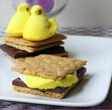
PeepS'Mores.
PeepS’Mores.
Peeps are used in Ambrosia Salad recipes. They serve as a non-sticky version of the key ingredient to S’Mores. They’re used as topping for dessert pizzas. They’ve been arranged onto long wires to substitute as bouquets of spring flowers.
Peeps Warhol Marilyn Monroe.
Peeps Warhol Marilyn.
There were experiments conducted to see how long it would take before a box of opened Peeps would completely harden into a brick – many of which failed due to weakened resistance of those who let their need for a sugar rush get the best of them.
They’re used on wedding cakes and as a medium for sarcastic, allegorical tableaux. Any lingering doubt about the Pop Power of Peeps is, in fact, laid to rest this Easter season by the release (in 2013) of an official portrait of the Lord Mayor of Lost Angeles, master of mid-century modernism himself Charles Phoenix, who posed with his visionary manifestation Astro Easter Tree, populated by a plentiful potpourri of Peeps on an aluminum-wrapped styrofoam trunk.
This year, Peeps were pronounced part of Pop Culture officialdom by Lost Angeles Lord Mayor Charles Phoenix.
 Peeps were pronounced part of Pop Culture officialdom by Lost Angeles Lord Mayor Charles Phoenix.
All this Easterly irreverence is just fine by the company that makes them.
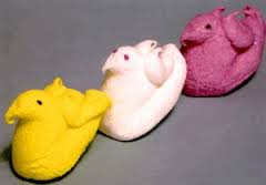
Old-school Peeps had wings.
In fact, ever since 1995, it’s been the manufacturer of Peeps itself, the Just Born Company of Bethlehem, Pennsylvania, which has been pushing the mushy old birds into the future, literally clipping off their former back wings and giving them full flight into the mouths and imaginations of Americans.
That was the year Peeps began rising to reach critical mass, the very first season when purple Peeps were introduced to the old-school line of pink, yellow and white ones.
21st Century Peeps of colors across a wide palette.
Three years later, the company conducted a deft public relations contest, asking Peep-peoples around the globe to vote on the next color they wanted to eat: in 1998, the blue Peeps joined the pack.
Nostalgic Peepers fondly recall the simpler, earlier incarnations, and often point out that for many a long decade one could engorge at even the Winter Holiday Season upon what was technically Peeps-material, the yellow chick transmorgraphied into Santa Claus form.
Still, in an age when any kid can watch a Charlie Brown Christmas on any day of the year at any hour on an Android phone, another small chink in the overall destruction of disciplines such as patience and anticipation, that same sense of wait-for-it-once-a-year is now being practically upheld in the mass culture by Easter Peeps alone. Who cares if you can get a marshmallow Santa a full four months before Easter or how it tastes exactly the same – a Santa is not a Peep. Those neon candy baby fowl can only begin lo brighten the aisles at Drug Fair once the chocolate mint shamrocks are in the half-price bin but before the striped summer umbrellas appear. Peeps come but once a year.
All types of Peep innovations continued on into the new century, including the appearance of them also in green and orange and flavored in strawberry, vanilla, chocolate, and mint. The 21st century Peep, however, is basically the same: what has changed its how pervasive the Peep image has become.  In just the last year, for example, the first of three Peeps Stores have opened in Minnesota, Pennsylvania and Maryland.
Peeps-mobile parked outside the first Peeps Store.
The Pope-mobile seems to have nothing over the new Peep-Mobile.
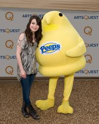
And for those inclined to dress like it was Halloween at Easter, there’s even now an official Peeps costume.
The result is that over 1 billion Peeps are freshly-born annually.
Peeper and friend in Peeps costume.
The considerable effort to make us a Peeps Nation has been brilliantly shepherded by Ross Born, grandson of the original owner of the candy company.
The pinnacle of Peeps public relations came a decade ago when the company marked its 50th Anniversary in 2003.
In reaching the half-century benchmark, Peeps became to chirp a bit louder about its longevity, and the effort began to organize and disseminate the story of just how we came to love the sweet little things for public consumption.

Wednesday, April 5, 2017

Words, Culture and Color Views

Pharmakon: Ancient Greek word meaning drug, poison, cure, remedy, medicine, charm, spell, recipe, artificial color, and paint.
Words can be strange things. They have hidden histories that, once uncovered, take us to unexpected places. The ancient Greek word for color, pharmakon, is one such word, leading us to drugs, poison, wizards, and ritual human sacrifice.
For contemporary readers, associating color with drugs, spells, magic, and medicine might not come to us as quickly as maybe it did to the ancient Greeks. It is there, however, hidden in our word for a drug dispensary, our pharmacy.


In a 2016 project called "Color the Temple," the Metropolitan Museum of Art used projection-mapping technology to simulate the vividly colored paint that covered the walls of the Temple of Dendur in ancient Egypt.
In a 2016 project called “Color the Temple,” the Metropolitan Museum of Art used projection-mapping technology to simulate the vividly colored paint that covered the walls of the Temple of Dendur in ancient Egypt.

The Greeks loved color. Their temples and statues were painted in bold and garish color, but all of it has since washed away and faded with time, leaving us with the white marble underneath. We can appreciate the Elgin Marbles in the British Museum today and endlessly debate about whether they should be returned to Greece. Less controversial is whether or not the ancient sculptures, scrubbed free of their pigment during “conservation,” should be restored to their original color, perhaps tacky by today’s aesthetic standards. The Metropolitan Museum of Art found a good compromise with digital light projections on their ancient Egyptian Temple of Dendur exhibit.

Today, when we look at a good painting, we can be intoxicated by its color and become lost in it, mesmerized, as if in a spell. Despite our attempts at color theory and chemical analysis (we can codify color relationships and understand pigment composition), the effects of color remains something of a mystery, an irrational science.
Like a drug, color can both stimulate and calm; it can be a healing tool and good medicine. In his book Chromophobia, artist David Batchelor writes that “color is a lapse into decadence and a recovery of innocence, a false addition to a surface and the truth beneath that surface. Color is disorder and liberty; it is a drug, but a drug that can intoxicate, poison or cure. Color is all of these things, and more besides, but very rarely is color just neutral.”

Derived from the same etymological root, the ancient Greek word Pharmakos (later Pharmakeus) translates as druggist, poisoner, wizard, magician, and sorcerer. Perhaps the person grinding the color pigments in ancient Greece might with the same mortar and pestle concoct a medicinal cure for an illness, or even put together a charm or spell with magical properties. It is worth noting that the ancient Greeks had no proper word for “art” and “artist,” at least as we know these terms in the contemporary, modern sense. Some scholars have suggested that the closest word to approximate the concept of “art” might be the word techne, meaning skill or the mastery of any art or craft. Techne, by the way, is where we derive English words like technique, technology, and technical. Sculptors and, more especially, painters, did not hold as high a social position as, for example,a supposedly divinely inspired poet or dramatist. 
 Greek Philosopher Plato ranked sculptors and painters in the sixth of seven ranks in his social hierarchy. Roman philosopher Seneca writes of the Greeks, “One venerates the divine images, one may pray and sacrifice to them, yet one despises the sculptors who made them.” 

Our understanding of “artist”—that is, the artist as quasi-religious figure, or a magician, or a truth teller and tricksterstands in contrast to the ancient Greek notion of the artist as craftsman or skilled decorator. 

Much of our contemporary understanding of the role of the artist comes from ideas born of 19th-century Romanticism. But perhaps the ancient Greeks had a much more contemporary understanding of “art” and “artist” than many scholars realize. With pharmakos meaning druggist, poisoner, wizard, magician, etc., could we not very easily suggest the addition of artist to this list as well? The artist as pharmakos is not so much a stretch, being the purveyor of pigments and skilled, perhaps, in the masterful use of pharmakon (artificial color and paint) in such a way as to cast an intoxicating spell on the audience — whether to heal or curse, or perhaps poison our sensibilities.

true-colors-of-greek-statues-4
The Vatican Museums have produced a brightly painted copy of the iconic statue Augustus of Prima Porta in an attempt to more accurately depict the use of polychromy in ancient statuary.


But the artist as pharmakos is a double-edged sword, and once again the meaning is found in the word. Pharmakos: someone with the ability to poison or cure, and pharmakon: either a poison or a cure. This duality mirrors our own contemporary treatment of artists, of course, where artists are often perceived as being different from the general populace, by turns celebrated and vilified. Never completely trusted (like anyone with the ability to poison and cure), artists are perennial outsiders, held in suspicious esteem. And perhaps the ancient Greeks had an understanding of this, too, because as it turns out pharmakos also refers to a sacrificial ritual, for which a city-state would purge evil by exiling (after being beaten and stoned), or by execution (either thrown from a cliff or burned) a pharmakon, a human scapegoat and community outsider (usually a slave, a cripple, or a criminal). 
The pharmakos ritual was performed annually and during times of great stress, such as a famine, invasion, or plague, in hopes that the fortunes of the city would take a turn for the better. But this should not be such an alien concept to us. In times of stress today, even simply financial stress, art and artists are often the first thing to be placed upon the sacrificial chopping block. Art is perhaps taken for granted because of its ubiquity. It is there when you step off the elevator on the way to a doctor’s appointment. It is there when you pick up a novel or when you turn on the radio. What happens when art is removed? Even a philistine, when stranded on a desert isle, would inevitably hum a crude song, draw with a stick upon the sand, or construct a shelter. Art, though hard to qualify in terms of physical necessity, is nonetheless vital to our well-being, necessary for our spiritual, emotional, and psychological well-being. Simply put, we cannot live without art."