Wednesday, February 26, 2014

Quality in Colors Pays Off


I am very impressed with Dabney Frake's discussion of Color Quality
This is an easy one to remember, but speaks to what you buy and invest in for your home. The quality of the color in your home is directly related to the quality of the material you have purchased and how that interacts with light. Whether that is paint, cotton, wool, or ceramic, choose the material of your products wisely. The depth of color and the hue and saturation will be greater and will last longer if the quality is better.
These two throw examples are made very differently from very different materials. They also have different costs so you can't compare them evenly. Everyone has to choose the best their budget will allow, but the one on the left is made of organic wool and natural dyes, while the ones on the right are made from 100% polyester. The one on the left is extremely rich in color and will look even better with time.
Color gains subtlety and depth from a number of material factors, and though I am no scientist, I can attest to my own greater attraction to those colors which are not simple, primary hues, but which are more complex mixes of pigments and hues. Additionally, I've found that higher quality materials carry a richer color quality which also lasts over time. While it can be deceiving to judge some things inside of stores under fluorescent lights, you can tell when you drag stuff out under the sun.
This lovely pic from The Rug Company shows some great color in some high quality materials. The rug is entirely handmade of lanolin rich Himalayan wool dyed with natural pigments.
My biggest lesson with this issue came from buying a number of rugs from IKEA many years ago. Much as I love the Swedish Giant, I found the color in the wool went "dead" fairly quickly, and I attributed it to the lower wool quality, which shed for months and picked up dirt and stains easily. If you've ever bought more affordable off-the-rack clothes at big box stores, you may also have noticed how the color quality, while seemingly fine at first, does not last long.
How to do it: When making a 20% color choice for your home, remember that this is the attention getting element and be aspirational with your budget. You will appreciate it as your home grows and this piece grows with you. This applies to textiles, paint, wood, ceramics AND artwork. When in doubt, read the label and go with the most "natural" ingredients and look into vintage or antique as the quality of the materials has to be pretty good if it's still around. :)


Monday, February 24, 2014

History of Color


Color in History

Colorful Textiles


Color has become such a staple in everyday life that most individuals are not aware that there’s a history there.  It all started with Isaac Newton, who started at the young age of 23 experimenting with colors and breaking down the components to discover where the colors came from.  He named them red, orange, yellow, green, blue, indigo, and violet, which are still used today. 

Ranucula fields in California


 Since then, there have been huge leaps in the discovery of color.  The color wheel was created, identifying primary, secondary, and tertiary colors.  In the 19th century, physicist James Clerk Maxwell discovered that using three basic colors (red, green, blue) can create a wide range of colors.

Colorful Canoes


The development of color isn’t just limited to the colors themselves – color television is a phenomenon that is always reinventing itself even into present day.  The first successful color television system began broadcasting in the 1950s. 

 When Ford started mass producing cars, they painted them all black because the paint dried faster and made the assembly line move quicker.  For 13 years, all cars produced by Ford were in black until more colors were introduced to the line to boost dwindling sales.


Color has had an impact all over the world, in different countries and cultures. Certain civilizations viewed colors in certain ways, with suspicions and beliefs in their meanings and symbolizations.  The Chinese have gone through periods of color, believing in the five elements of nature (water, fire, wood, metal, and earth) and focused their fashions along the corresponding pigments of black, red, blue-green, white and yellow.  During periods of a reigning emperor, like Huang Di (the Yellow Emperor), certain colors were emphasized more than others.  Red symbolized good fortune and joy, black represented Heaven’s color, and white portrayed mourning; whereas in North America, black is the color of mourning and death and white stands for purity.

Black Crows in Winter


India also has a history of rich colors, with their fabrics and architecture vibrating with bright, expressive hues.  For them, weddings are especially colorful as red represents purity and often overshadows all other colors at this event.  Egyptians used to believe that color had mystical healing powers.


Zebra Bath in Botswana-color in nature
Paint is one of the biggest distributors of color, providing the opportunity for every one to add personality to their homes and surroundings.  During the Renaissance period, blue was favored by the general population as it was intense, yet warm.  It continued its popularity into the 18th century, while also welcoming a brilliant green.

In more recent history, light and bright colors, such as yellows, greens, and light blues, were common in most households, being used on walls, fixtures, and trims.  Color trends come and go as well in respects to household products.  It used to be that avocado green and harvest gold were prominent in the appliance industry. It has slowly moved towards neutrals or vibrant colors leading up to current trends.

Color Block Trend in Kitchens


Looking back into the history of color is important, to know where we started and what we’ve gone through.  Whether we repeat the trends of the past or continue to develop new ideas, color will continue to be a significant part of the future.

(This short history of color was written by Pat Verlodt, who writes for the Color Maniacs website.

Wednesday, February 19, 2014

Mood Uplifted with Color

Mary Jo Brown from Craig, Colorado has learned the secret of using color in clothes and decor to uplift her mood. We can be proactive about incorporating color too. BBL

One thing some of us tend to take for granted is our ability to see the many colors of the world. I particularly am fond of pastel colors. However, I tend to associate different colors with different feelings. Light blue represents serenity, light green is peaceful, soft yellow is warmth and tan is a warm, homey feeling.
photo
Mary Jo Brown
Some of these colors were ones I had in my home when I lived in a house, but because I live in an apartment now and can’t paint the walls, everything is white. In order to jazz the place up a little, I add splashes of pinks, yellows, purples and sage green. Along with many other people when decorating, I use the colors associated with the season that we are in, such as oranges, browns and reds for fall or greens, reds and white for winter.
The colors I choose to wear are different. I like to wear deeper jewel colors but throw a bit of pastel in there for comfort. The only color I don’t like to wear is black. It is a color that looks fine on others but for me, no way. My thinking is that the color you are wearing will affect your mood for that day. Wearing bright colors that bring attention to you can make you feel active and energetic. Colors that bring you comfort will help you through a stressful day and make you feel at ease. You can use colors in many ways: in your home, dress, appearance and to express yourself.
Many of the expressions we use have colors in them: "Looking at life through rose-colored glasses;" “He was in a black mood;” “I was so mad, I was seeing red;” and also yellow-belly, redneck and so on. Be sure to look around and appreciate the colors of the season. It isn’t all brown, even though we are in late fall. There still is a hint of color here and there and the sunsets are beautiful. Use color to express yourself, and I hope it lightens up your day and gives you a rosy outlook on the gray days of life.

Mary Jo lives and works in Craig, Colorado.

Wednesday, February 12, 2014

Red and Tokens of Love


Today, we think of bouquets of red roses, or boxes of chocolates-- typically enclosed in red boxes, or cards with red hearts used in the illustrations. In 1526, King Henry VIII had a different way to display red to catch the eye of Anne Boyeln, his future second wife and mother of Elizabeth I.


The Shrovetide Joust of February 1526


The shrovetide joust of 1526 was the first indication of Henry VIII’s courtly pursuit of Anne Boleyn. According to the chronicler Edward Hall, it was on this day that Henry VIII rode out in cloth of gold and silver “richely embraudered, with a mannes harte in a presse, with flames about it, and in letters were written, Declare ie nos, in Englishe, Declare I dare not”. The Marquis of Exeter and his men and their horses were in green velvet and crimson satin embroidered with burning hearts. Above these hearts was a lady’s hand coming out of a cloud with a watering can, dropping silver droplets on them – I guess to cool the burning hearts!
This display – and it must have been a sumptuous display – showed clearly that the King had found a new love. He was besotted. Anne had won his heart. It was a courtly love display in the best chivalric tradition and I suspect that Henry had no idea at this point that Anne would be any more than a flirtation or possibly a mistress. Of course, Anne was to refuse to become his mistress, even his maĆ®tresse en titre, and Henry’s love for her would lead to him offering her marriage instead.
Edward Hall goes on to describe how many spears were broken at that joust and that this was the occasion when Francis Bryan lost one of his eyes – ouch!
If you’re interested in finding out more about Henry VIII and Anne Boleyn’s relationship then do read the folowing articles:-


Read more: http://www.theanneboleynfiles.com/the-shrovetide-joust-of-february-1526/#ixzz2seuyfywq


(This is one of the most addictive websites I've found thus far. I love history and especially romantic history!)


Have a happy St. Valentine's Day

Wednesday, February 5, 2014

Eat by Color

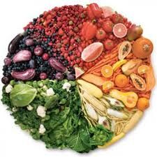
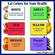
Why eat colorful food? Because it keeps us healthy and strong and it delights our eyes as well.

 Lori Okami from Hawaii has classified food by colors and makes suggestions of how much of each color to consume. Check your plate, you don't want to consume too many meals that look like the last example! 
Happy New Year.


Some sage advice came from my faithful nutrition guru....eat by color. Have vibrant, colorful meals and get a balance of nutrients. This quick tip has made meal assembly and the journey to more nutritious meals a lot easier and fun. It's a method that has been easy to implement with the children and lets us escape studying foods to death and over-analyzing our eating.

We take in various phyto-chemicals which protect us when we eat fruits and vegetables. These work to boost our immune system and the colors are a fascinating way that nature goes about highlighting these beneficial nutrients--give them bright, attractive colors.
Choose foods that represent the colors of the rainbow. The USDA suggests paying particular attention to orange and red (5 1/2 cups per week) and dark green (1 1/2 cups per week) produce, both good sources of vitamin A and other important nutrients.

I simplify it by making certain that I get at least 4 colors per meal, have a fair amount of each color (meaning that parsley or green onion sprinkles as a garnish don't count), and a mix of these 6 color groups. See a few examples below:
Red
· peppers
· tomatoes
· watermelon
· guava
· pink grapefruit
· raspberries
· strawberries
· cherries
· beets
· apple
Green
· kale
· spinach
· lettuce
· broccoli
· celery
· boy choy
· chard
· mustard greens
· green beans
· arugula
· apple
· kiwi
· lime
Orange
· orange/tangerine
· pepper
· mango
· papaya
· cantaloupe
· pumpkin
· apricot
· sweet potato
· squash
· nectarine
· persimmon
Yellow
· banana
· squash
· corn
· pepper
· lemon
· pineapple
· apple
White
· garlic
· onion
· cauliflower
· cabbage
· corn
· turnip
· mushroom
· potato
Purple/blue
· blackberry
· blueberry
· eggplant
· grapes
· plum
Eat the colors of the rainbow and be well. Do this...
Don't do this....