When it comes to picking the "right" color, research has found that predicting consumer reaction to color appropriateness in relation to the product is far more important than the individual color itself. So, if Harley owners buy the product in order to feel rugged, you could assume that the pink + glitter edition wouldn't sell all that well.
Psychologist and Stanford professor Jennifer Aaker has conducted studies on this very topic via research on Dimensions of Brand Personality, and her studies have found five core dimensions that play a role in a brand's personality:
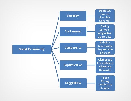
(Brands can sometimes cross between two traits, but they are mostly dominated by one. High fashion clothing feels sophisticated, camping gear feels rugged.)
Additional research has shown that there is a real connection between the use of colors and customers' perceptions of a brand's personality.
Certain colors DO broadly align with specific traits (e.g., brown with ruggedness, purple with sophistication, and red with excitement). But nearly every academic study on colors and branding will tell you that it's far more important for your brand's colors to support the personality you want to portray instead of trying to align with stereotypical color associations.
Consider the inaccuracy of making broad statements such as "green means calm." The context is missing; sometimes green is used to brand environmental issues such as Timberland'sG.R.E.E.N standard, but other times it's meant to brand financial spaces such as Mint.com.
And while brown may be useful for a rugged appeal (think Saddleback Leather), when positioned in another context brown can be used to create a warm, inviting feeling (Thanksgiving) or to stir your appetite (every chocolate commercial you've ever seen).
Bottom line: I can't offer you an easy, clear-cut set of guidelines for choosing your brand's colors, but I can assure you that the context you're working within is an absolutely essential consideration.
It's the feeling, mood, and image that your brand creates that play a role in persuasion. Be sure to recognize that colors only come into play when they can be used to match a brand's desired personality (i.e., the use of white to communicate Apple's love of clean, simple design).
Without this context, choosing one color over another doesn't make much sense, and there is very little evidence to support that 'orange' will universally make people purchase a product more often than 'silver'.
Article by Gregory Cioppini
Barbara, we will have to keep an eye out for color used in the Super Bowl commercials!
ReplyDelete