Thursday, March 29, 2012

Historical Color Wheels

Today, it is simple to buy a colorwheel at Michael's or Hobby Lobby. Years ago, the study of color was laborious. The following article explains the history of this great tool for artists and craftspersons.

How many ways can you reshuffle the rainbow? Three, as a matter of fact, if modern color theory is to be believed: Pantone numbers for print designers and brand managers; hex, RGB, and CMYK values for web designers; and CIELAB and CIECAM02 color models for the scientific community. But while the science of color models is largely settled, all that rigorous theory still doesn’t quite squeeze out the sense of fallible humanity underpinning the history of the color wheel.
All it used to take was a load of brilliant chutzpah, a dogged sense of orderliness, and just a smidgen of actual science to impose your personal order over the color universe. This post and the next salute the color giants of centuries past and their often-fanciful, sometimes inaccurate, but always wildly rollicking wheels.

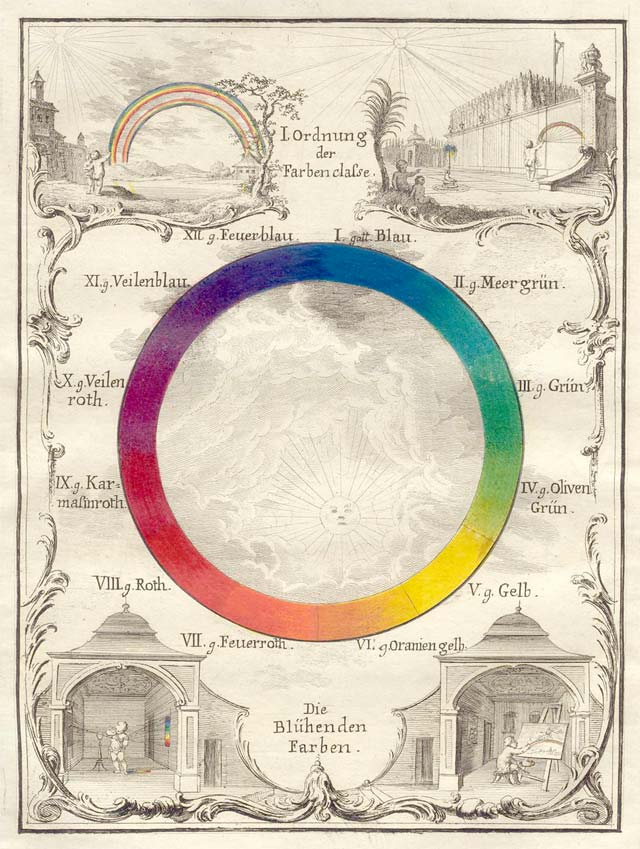
Slightly dotty in the science department but much-loved by generations of art historians and philosophers, Johann Wolfgang von Goethe's Theory of Colours coincided with this wheel (left) he designed in 1810. In the book, Goethe rebutted Newton’s color-spectrum theory by imagining darkness not just as absence of light but as its own active force. As light struck dark, in Goethe’s view, their battle threw off observable sparks of color.
During the week, Goethe devoted himself to such legend-building stuff as inventing the Italian tour, discovering the human intermaxillary bone, and giving voice to Sturm und Drang and Weltliteratur. But Goethe spent his weekends breathing on glass panes, prodding chocolate-froth bubbles, and flapping his arms in broad daylight, then jotting down how colors changed in each observation. The resulting catalog is an impressive confluence of exhaustive scientific inquiry and pointillistic word-art.
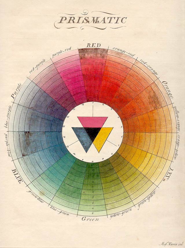
But Goethe had quite a few predecessors, some more wedded to the wheel-shape in quantifying color than others. (It’s an oddly Germanic list, too, these would-be color scientists.) In 1686, Richard Waller’s "Table of Physiological Colors Both Mixt and Simple" offered a handy table for cross-referencing colors one might find in nature samples. If a shade didn’t match exactly, Waller explained, it was a simple matter to locate where on the table’s color-continuum that shade might fall:
The table format, as is obvious to us today, had serious limits primarily because of the vast number of shades that fell between the divisions in color in any table. Even vast catalogues like the Pantone-esque Viennese Color Collection or Complete Book of Samples of all Natural, Basic, and Combined Colors, compiled by Johann Ferdinand Ritter von Schönfeld, in 1794, couldn’t catalogue every single color – and comprehensive catalogues also tended to be huge, unwieldy and expensive.
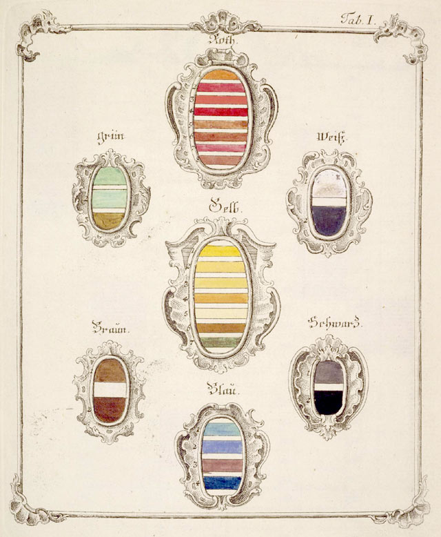
In 1769, Jacob Christian Schäffer – a naturalist, inventor and German Evangelical superintendent of Regensburg – tackled this natural limitation of the table format in his own color system. He gave blue, red, and yellow pride of place in his hierarchy, explaining how these primary colors could be combined to create a multitude of shades in between:
Photograph © 2002 Board of Trustees, National Gallery of Art, Washington, D.C. via The Creation of Color in Eighteenth Century Europe by Sarah Lowengard
No wonder color scientists hewed back towards color wheels and other means of suggesting an infinite color continuum. [Image via] Ignaz Schiffermüller was a Viennese butterfly expert whose 1775 color wheel was designed to help him accurately identify the colors he encountered in nature studies:
The color wheel above rolled hard on the heels of Moses Harris’ 1766 model from the Natural Systems of Colors. This particularly fine specimen was the British entomologist’s attempt to explain the color interplay he saw in his own favorite kind of bugs, flies:
Although it would be some time before the color wheels concept finally took over, the notion of suggesting color relationships through smarter information design had taken root.
Go here for Part 2
[Thanks to Sarah Lowengard’s impressive project The Creation of Color in Eighteenth Century Europe and COLOURLovers’ concise summary of the project for great inspiration.]


Read more: History of the Color Wheel | Part 1 — Imprint-The Online Community for Graphic Designers

Monday, March 26, 2012

Vincent's painting re-discovered

Yes, This Still Life Really Is By Vincent Van Gogh

Image courtesy of AP.
The AP reports: "A new X-ray technique helped experts re-examine what they already knew about 'Still life with meadow flowers and roses' and draw on a growing pool of scholarly Van Gogh research."
After the Kroeller-Mueller Museum in the Netherlands bought the piece in the 1970s, experts posited that the vase was "too exuberant," and the signature (in the top right corner) was very unlike Van Gogh. So in 2003, the museum decided be safe and attribute the painting to an unknown artist. But on March 20, 2012, experts were finally able to verify that it was indeed by the Dutch master.


We should all be thrilled that new techniques of seeing behind surface paint to verify artists' works. Since this discovery coincides with van Gogh's birthday month, this is special.

Vincent Van Gogh originally painted a canvas of two wrestlers and then painted Still Life With Meadows and Roses over it photo
Vincent Van Gogh originally painted a canvas of two wrestlers and then painted Still Life With Meadows and Roses over it
Using a new X-ray technique, researchers examined the two wrestlers in more detail.
The brush strokes and pigments pointed to Vincent Van Gogh.
Researchers also discovered the large canvas was a standard format for figure paintings at the Antwerp academy where Van Gogh studied at the time.
A senior researcher at Amsterdam’s Van Gogh Museum, Louis van Tilborgh, took part in the study.
Louis van Tilborgh the wrestlers posing half-naked in the original painting was characteristic of the Antwerp academy at the time.
Vincent Van Gogh also wrote to his brother saying that he was pleased with how the wrestler painting had turned out.
But Van Gogh later painted directly over it which experts say accounts for the “uncharacteristic exuberance” of the floral still life.


Like so many other "starving artists," Vincent reused a canvas with a scene of boxers which he evidently did not think worthy of keeping.


Read more: http://www.bellenews.com/2012/03/20/arts-culture/van-gogh-still-life-with-meadow-flowers-and-roses-is-deemed-genuine/#ixzz1qEUwtyxx

It's Never Too Late

It takes so much courage to open an art gallery these days. Kudos to Mr. Houston. Anyone near Galveston should go see his wonderful abstract pieces. He credits other artists for their influence on his style, a gracious thing to do.

Photo by Kevin M. Cox - See More Photos Artist David Houston has opened the West End Contemporary Art Gallery in Jamaica Beach.

Artist works with bold colors, edgy vibe

Published March 25, 2012
For artist Dan Houston, opening a gallery in Galveston was a no-brainer. He’d known about the island from his years of living and working in Houston.

But finding the right spot in Galveston was the challenge, he said.

“My work is very contemporary,” he said. “I don’t paint traditional landscapes or seascapes, the sorts of things you see a lot of in downtown. I was looking for some place different.”

Houston found it in Jamaica Beach and instantly loved the edgy, avant-garde vibe, which seemed a natural fit for his works of bold colors and dramatic themes.

Houston built out a 1,200-square-foot space in the Jamaica Village Shopping Center. He said he likes the community’s independent air just as much as he loves being on his own.

Starting the gallery was a leap of faith for the artist raised in Michigan and New York. Houston studied at New York City’s School of Visual Arts and The Cooper Union School of Art.

Houston was trained as an artist and was influenced by the innovative styles of Mark Rothko and Jackson Pollock. But he left New York in 1980 after realizing it wasn’t where he wanted to raise his family, he said.

He moved to Houston and put his art background to work finding employment as a building contractor, and spending the next 25 years working mostly on architectural interiors.

He never lost touch with his art, though, owning a gallery in southwest Houston and even doing some art publishing. In 2005, he finally sold his contracting business and decided to dedicate himself to his art full time.

“My children were out of college,” he said. “And it was time to do something for me.”

Houston originally was an illustrator, but soon realized he had a knack for the abstract.

“When I started painting, it came out as abstract,” he said. “And the more I began to understand the concepts behind that, I found it was easy for me to go with the flow and watch how my thoughts came out on the canvas.”

He still reveres Rothko and Pollock.

“Those are the people you’ll see in my work,” he said. “Those guys are imprinted on my brain.”

Houston has created a body of work that’s vivid and passionate. Working in acrylic on paper and making limited-edition pieces, he crafts paintings that offer everything from the cheerful “Avocado salsa,” with its bright swathes of green and vivid red-orange, to the pensive, such as “Life Begins in the Roots of a Woman,” which sets earthy greens and browns against a backdrop of blue.

He’s also created a collection he calls “Eros,” a series of paintings inspired by love. Because the subject matter deals with more adult themes than his other work, Houston keeps these paintings in a special partitioned-off space in the gallery.

“I so enjoy this,” he said. “Art allows me to express myself and brings me such great joy, and having my own gallery lets me express myself any way I want.”

Houston says his color sense is influenced by his love of music, especially jazz, and he often paints listening to music, allowing the canvas to capture what he’s feeling as he hears the notes.

“Traditionalists might say, you can’t put those colors together,” he says. “But I paint what I feel and I am so validated when I see the colors on the finished piece.”

Houston doesn’t paint every day. But when he does, he does so fervently, not emerging from his studio for hours on end, he said. And, after years of dipping in and out of the art scene, exhibiting his work at galleries and using his art skills in other endeavors, he’s thrilled to have a space to call his own, he said.

+++

At A Glance

Dan Houston Gallery

16708 FM 3005 Suite G

Jamaica Beach

www.architecturalwalldecor.com

Tuesday, March 20, 2012

Surrounded by Color

The following post came my way yesterday and I had to share. If you enjoy being surrounded by BRIGHT colors and patterns, this will delight you. The division between color and pattern versus plain white might satisfy right and left brain couples perfectly.

Graffiti Hotel Room
Posted: 19 Mar 2012 06:00 AM PDT
Hello everyone! Chloé from Plenty of Colour here and I'm thrilled to have this new opportunity to pop up on the fabulous COLOURlovers blog a couple of times a month. What an incredible community devoted to all things bright and colorful.
This week, I wanted to share a rather unique hotel room in Au Vieux Panier hotel in Marseille, France that caught my eye. The 'Panic Room' was created by artist Tilt and features one half of pure white and one half soaked in layers of colourful graffiti.
I also love the round mirror with just a hint of colour.
 
This hotel is located in Marseille, France. I am not sure where the following village is located, but it is definitely a COLOR FILLED place!
 

Imagine an Easter basket filled with eggs in these colors, they pop out against the green trees and grass surround.
 

Saturday, March 10, 2012

Colors in Vincent van Gogh's Chair with Pipe painting


Vincent van Gogh created this painting of a chair with his pipe on it using the following colors in his palette: CADMIUM YELLOW, COBALT VIOLET, COBALT BLUE, EMERALD GREEN, LEAD WHITE, ULTRAMARINE BLUE, VERMILION, VIRIDIAN GREEN and EARTH COLORS.  Vincent painted at a time when tube colors became available, which made outdoor painting easier.

If you have not seen the movie Lust for Life,  about van Gogh, I hope you will take time to track it down. Many public libraries have it. It was made in 1956.  Anthony Quinn won an Oscar for his performance as Paul Gaugain which lasted only a few minutes, and Kirk Douglas who gave  a masterful job portraying Vincent lost his bid for the Oscar.

 If you would like a list of movies made about artists, email me at babs.loyd@yahoo.com.  My list  ends in 1998, but I will add to it if you have more movies or books to recommend which are centered on artists.
 One book published in 2011 about Vincent:A Life, sheds new light on his death. Tragically, he was shot accidentally by two teenagers and, typical of him, he did not want them blamed or prosecuted. 

 Also, it is likely that Vincent did not cut off his ear during a mental breakdown. He and his friend Paul Gaugain got into a fight, and Gaugain, a fabulous swordsman,  lopped off a portion of Vincent's ear. The two covered up the details to prevent the arrest of Gaugain. Shortly after the incident, Gaugain left  and Vincent's dream of establishing an artists' colony in Arles, France, never happened.

Thursday, March 1, 2012

Color Decor Influenced by Economics

The Imperative Month by Barbara Boothe Loyd

March is an imperative month,
like a bossy teacher putting students
in line for a graduation ceremony.

March 1st, the Valedictorian's place,
second is the Salutatorian, on through
the ranks until the last grad, the 31st.

Perhaps a C student, the Ides is average,
those following plug along in line,
giddy that their school years are complete.

The brassy lions and humble lambs often
put the line out of order, with gale force
or balmy temperaments,and tussles between
bullies and door mats.

"March forth!" shouts the determined director,
"Keep the line moving in an orderly fashion."

If the economy stabilizes, homeowners begin investing more money into their homes, particularly the aesthetics. During difficult economic times, design influence returns to holistic, spiritual and simplistic elements that reflect the richness of life that abounds in nature, relationships, and spirituality.

Dutch Boy brand paint categorizes four different palette personalities and trends:
PURIST = Nature rules with colors of branches, grass and dark earth underneath the feet. It's a soothing relief, a retreat from the hectic, it's terra firma brought indoors. Purists are concerned about their impact on the world and care deeply about finding balance. Purist colors are natural shades of herbal teas, the stones in the stream as the water rushes over them and the yellow-green of buds pushing up through the springtime earth.
SEEKER=A seeker goes beyond the ordinary to showcase shades influenced by history and architecture. Rich, complex hues give this color palette personality. The important things to a seeker are creating meaning, spirituality and beauty in life. Colorful objects made of precise, hexagonal tiles to stylized, architectural furniture are quintessential to the seeker.
MUSE=Creating a palette that's all about feeling and experiencing turns on a muse. They prefer colors that swaddle and soothe the soul. It's a color style that reflects the need for sanctuary. Attention to design details and just the right sensory colors bring muse to life. This palette is infused with rich details, fine fabrics and soft twilight shades of blush pinks, rosy peach and lilac.
STORYTELLER=The storyteller shows off colors that reflect a life well lived through travel and varied interests. Furniture and colors from afar add a vibrant touch to the home and bring life to tales from foreign lands. Everything a storyteller sees during her travels inspires her home design and color choices. The storyteller is brave explorer.

Many people will combine and blend more than one of the four palettes into spaces that reflect distinctiveness. For instance, an airy, light-filled room might be held to earth by chunky furniture or given flight with watercolor prints. Blending personalities could have a muse kitchen, storyteller family room , and a combined purist and seeker dining room.

However you decorate, don't be afraid to express yourself. You can check out various palettes at www.DutchBoy.com. Sears and Wal-Mart carry their paints.