Wednesday, April 29, 2015

Evolution and Eye Sensitivity to Color

Advances in scientific research fascinates me. How eyes evolved to recognize color is especially interesting and pertinent to my fascination with the amazing phenomenon of color research.


(AFP)
A fish eye from a primitive time when Earth was but one single continent has yielded evidence of color vision dating back at least 300 million years, researchers said.

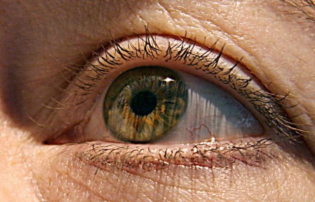
Analyzing the fossilized remains of a fish from the “spiny shark” family that lived long before the dinosaurs, scientists discovered light-sensing “rod” and “cone” eye cells-the oldest ever found.
“This is the first discovery of vertebrate retinal fossils,” said Gengo Tanaka from Japan’s Kumamoto University, who coauthored the study in the journal Nature Communications.

It is rare for paleontologists to find eye remains, as the soft tissue generally decays within 64 days, the authors of the study said.

However, the Hamilton Quarry in Kansas is a treasure trove of unusually well-preserved fossils ― an entire ecosystem having been rapidly buried under sediment.

They included the extinct fish Acanthodes bridgei ― among the oldest known vertebrates with jaws.

It had a long, streamlined body and fins with spines, is believed to have lived in shallow, brackish water, and died out at the end of the Permian period about 250 million years ago when nearly 90 percent of species disappeared in the largest extinction in Earth’s history.

An A. bridgei specimen found at the quarry retained elements of the original eye color and shape, and a light-absorbing pigment in the retina.

The remains had been preserved under a thin coating of phosphate, Tanaka told AFP.

Analysis of the tissue “provides the first record of mineralized rods and cones in a fossil,” said the study.

These, combined with light-absorbing melanin pigments, suggested the fish was “probably” able to see in low light using highly sensitive rod cells, and by day using cone cells.

In modern animals, cone cells respond individually to light at specific wavelengths, thus allowing observation of different colors. (AFP)

Rods and cones help us distinguish colors; females have more of one, males the opposite. BBL

Wednesday, April 22, 2015

Changeable Charlie Eye Colors

The actor Tom Hiddleston has what the ancients called The Eyes of Athena. According to legend, her eye color changes were governed by her emotions. If she wore white, that theory holds up. 
So Hiddleston’s eyes probably aren’t electric blue, but they might not be green either. So what color are they? Most likely Hiddleston’s changing eye color is a result of what he’s wearing. Dr. Ivan Schwab spoke about the occurrence with the Wall Street Journal and said that when you look at someone’s eyes, the color you see is influenced by the colors around it. ”If I wear a shirt that is complementary, my eyes may appear to be a different color, but the wavelength is the same,” Schwab said.
Essentially that means when Hiddleston wears blue, his eyes appear more blue and when he wears green they take on more of that color. But really, when trying to find a solution to his eye color mystery, you can’t turn to Tumblr GIFs and assume they haven’t been enhanced. You can’t even 100 percent trust his agency and the notation that they’re green. There’s one person whose opinion means more than all the others, and that’s Tom Hiddleston himself. So what color eyes does Hiddles think he has? Blue. 
Speaking to Entertainment Weekly last year, he confirmed what many had always thought (emphasis author's). ”In making [Loki] with raven black hair and blanching my face of all color, it changed my features. Suddenly my blue eyes look a lot bluer, which lends a severity to my face.” 
So there you have it. Hiddleston's eyes may change depending on what he’s wearing, but at the heart of it all he has blue eyes, and he said so himself. But even if you’re not convinced, there’s one thing no Hiddlestoner can deny: Hiddleston’s eyes are gorgeous no matter what color they are. (So true; and he is a fine Shakespearean actor as well. BBL)
Images: tomhiddles (3), becausehiddles/Tumblr; Walt Disney Studios; Getty Images

Wednesday, April 15, 2015

Green's Properties

Green’s Properties  


            “Green is the color of primeval wealth---sappy green fields, the green of a woodland glen---everyone can revel in it. It is this thin layer of green plant cells that keeps us breathing, keeps us fed, keeps us alive. No wonder we adore it and long for it when without it. The changing seasons add the melody to the green of a planting. Spring shoots are often tinged with chartreuse, turn blue-green in their fullness, and fade to biscuit yellow in the autumn before they fall. The eye translates the fresh green of spring to excitement, change and newness. Surely green is the lush, sympathetic color.
            Colors are rarely seen in isolation, so it is important to be aware of the optical effect adjacent colors have on each other. Both Goethe in his theories of color harmony and Chevreul in his 700 page monograph of 1839 about the Gobelin's dyers (formed by a family of tapestry weavers in France who became wealthy from their fabulous works for French kings)pointed out the phenomenon of successive contrast, the way in which the eye, staring first at a color and then at a piece of white paper, will see on the paper an afterimage in a complementary or opposite color. If the eye is fixed on green, the successive contrast will be red; if fixed on yellow, violet; if fixed on blue, orange and so forth.  Each shadow is in perfect contrast, and Seurat and Monet made use of this effect in creating the depths of their canvases. It results in a dazzling shimmer between pure red flowers and green leaves.

(An excerpt from Nori and Sandra Pope’s gorgeous book Color in the Garden) 

I hope you will try this experiment with Successive Contrast. My art students were amazed that after staring at a pure color, then looking at a white sheet of paper, the opposite color presented itself on the paper. It only lasts a few seconds, but it is fun to see it. This phenomenon was used by Pop artists to produce "vibrating" color contrasts. 


THE POWER OF GREEN
Chlorophyll is present in all green plants. Chlorophyll has anticancer, anti-aging, anti-inflammatory and detoxifying properties. Green fruits and vegetables are high in lutein and indols which have antioxidant and disease-preventing properties. Green leaves are abundant in carotenoids, bioflavonoids, vitamins and organic mineral complexes. Have a minimum of two or three servings of green leafy vegetables every day.
Artichokes, asparagus, green snap beans, Italian green beans, lima beans, broccoli, Brussels sprouts, cabbage, celery, cucumbers, fennel, turnip greens, collards, kale, dandelion greens, mustard greens, lettuce (the darker, the better), leeks, okra, green bell peppers, spinach, chives, zucchini, green apples, avocados, green grapes, kiwi, limes, pears, mung beans, or wheat grass.


(from the website www.bragg.com

In next week's blog, I will present more information on Goethe's Color Harmony discoveries as well as Chevreul's work with the Goebelin's tapestry dyers.

Wednesday, April 8, 2015

Simultaneous Contrast-Goethe and Chevreul

This is my second post on Simultaneous Contrast and the discovery of it, how it was used in the production of tapestries, and how "modern" artists used this information to produce canvases with "popping colors," i.e. POP Art.

Goethe and Chevreul: Simultaneous Contrast


Picture of a Girl in Reverse Colors, Goethe. Stare at this image for half a minute, then look at a blank white wall or paper. You might see the faint image of the fair maiden at whom Goethe was gazing in a pub.
By 1800, Goethe had already identified color interaction, simultaneous contrast and complementary colors, which he logically named completing colors.
Goethe also attributes other properties to colors. He talks of color both addressing itself to the eye and the feelings – or human emotions. He lists “plus” colors, such as yellow conveying “action, light, force, warmth” and other qualities, as it excites a warm and an agreeable impression on the eye. Even today, we would not quarrel with that idea. The “minus” colors, such as blue, equate with shadow, weakness, coldness, melancholy, and so forth. 
Goethe illustrates an experience that led to his scientific theories on color. He drew the drawing above after gazing at a girl in a pub. He observed that when he looked away from her and looked on a wall, he saw a black face surrounded by white. The colors were inverted. These are complementary colors (white and black, red and green, and so on.) This is one of several observations that comprise his theory of colors, partially illustrated in the diagrams below.

Goethe’s color circle.

Goethe was interested in the relationship between colors and their opposites, In this case, he was interested in the apparent “color” of the shadow.
Michel Chevreul
Color interaction was first put on a sound experimental base by the French chemist Michel Chevreul (1786-1889). Chevreul was hired by the Gobelin Tapestry factory to investigate the fading of their tapestry threads.

Chevreul’s color circle

In next week's blog, we will discover how some artists used this information. 
In his 1839 book, De la Loi du Contraste Simultané des Couleurs, Chevreul shows that the fading is not fading at all, but instead due to simultaneous contrast between adjacent colored threads. Successive contrast, such as  is the complement of simultaneous contrast but delayed in time. Both have the same neurophysiological basis of retinal fatigue.

Wednesday, April 1, 2015

Art History 101: Vincent van Gogh's Palette

Vincent van Gogh is one of the most influential painters of his generation. His comments on color-mixing are invaluable. Some scholars say he sold only one painting during his career, Red Vineyards.


The most commonly known facts about the artist Vincent van Gogh are that he cut off his left ear (actually only a part) and presented it to a prostitute, that he sold only one painting during his lifetime (actually there is evidence to suggest that it was more than one), and that he committed suicide (true).
Few realize quite how significant his contribution was to painting, that his adventurous use of color changed the direction of art. Van Gogh deliberately set about using colors to capture mood and emotion, rather than using colors realistically. At the time, this was completely unheard of.
"Instead of trying to exactly what I see before me, I make more arbitrary use of color to express myself more forcefully."
When he first devoted himself to painting full time, in 1880, Van Gogh used dark and gloomy earth colors such as raw umber, raw sienna, and olive green. These were very suited the miners, weavers, and peasant farm laborers who were his subjects. But the development of new, more lightfast pigments and his exposure to the work of the  Impressionists, who were striving to capture the effects of light in the work, saw him introduce bright hues into his palette: reds, yellows, oranges, greens, and blues.

Van Gogh painted very rapidly, with a sense of urgency, using the paint straight from the tube in thick, graphic brush strokes (impasto). In his last 70 days, he is said to have averaged one painting a day.Typical colors in Van Gogh's palette included yellow ocher, chrome yellow and cadmium yellow, chrome orange, vermilion, Prussian blue, ultramarine, lead white and zinc white, emerald green, red lake, red ocher, raw sienna, and black. (Both chrome yellow and cadmium yellow are toxic, so some modern artists tend to use versions that have hue at the end of the name, which indicates that it's made from alternative pigments.) 
Influenced by prints from Japan, he painted dark outlines around objects, filling these in with areas of thick color. He knew that using complementary colors make each seem brighter, using yellows and oranges with blues and reds with greens. His choice of colors varied with his moods and occasionally he deliberately restricted his palette, such as with the sunflowers which are almost entirely yellows.
Self-portrait of Van Gogh color matched by Sherwin Williams' paint colors
"To exaggerate the fairness of hair, I come even to orange tones, chromes and pale yellow ... I make a plain background of the richest, intensest blue that I can contrive, and by this simple combination of the bright head against the rich blue background, I get a mysterious effect, like a star in the depths of an azure sky."
Vincent's birthday is 30 March.