Explore some ways we can benefit from our use of color around the house.
Jude Stewart is a journalist and author, specializing in design, color and visual culture. She lives in Chicago, Illinois, and her first book, ROY G. BIV: An Exceedingly Surprising Book About Color will be released September 17, 2013.
How exactly do the colors in a room act upon us emotionally? It’s a riddle whose answer variously depends on the expert you ask, from cognitive psychologists to cultural anthropologists (and, of course, color consultants).
As a writer about visual culture, my approach to color starts with a question my readers — graphic designers — face with every new project: Since nobody is inventing new colors, how to reach back into that same finite universe of shades and create a brand-new, dynamite color palette? How can you really see color afresh again?
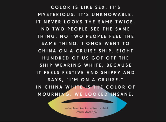
Tackling that question requires a bit of willful estrangement. I love this quote about color from Stephen Drucker (pictured here in an illustration by Oliver Munday) His point: Reawakening the eye to color first requires reawakening the brain.
|
Red and blue
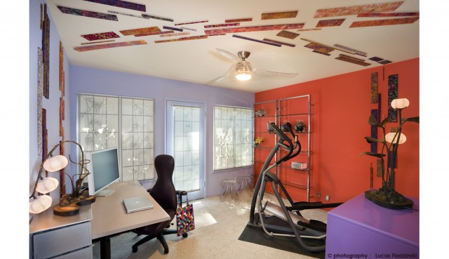
Let’s start with an age-old color pairing, red versus blue, and these colors' potential atmospheric effects in a home office. Cognitive psychologists think red rooms make people working in them more accurate and cautious, while blue rooms turn their inhabitants more creatively loose — so claims a 2009 study in the journal Science, not for the first time. |
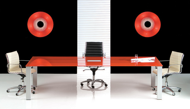
Red and blue cast their opposing spells in other contexts, too. The same New York Times article recounting the Science study points out earlier studies in which Olympic teams wearing red uniforms enjoy a statistically significant edge over those clad in blue. Red answer-booklet covers on IQ tests can make us antsy enough to drag down our scores.
|
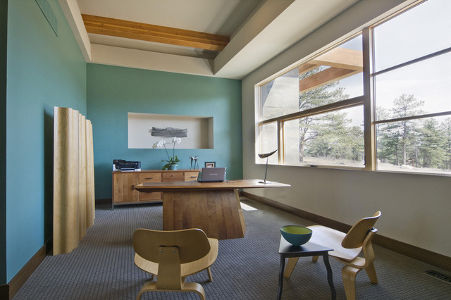
The takeaway for interior designers: Try playing both angles at once, as in this Mountain View, California, home office. With contrasting blue-ish and red walls, occupants can swivel from a laser-focused mindset at work (red) to sweating it out after-hours on the treadmill, letting the imagination romp while gazing at blue walls.
|
No comments:
Post a Comment